Enrique
WFG Retired-
Posts
2.338 -
Joined
-
Last visited
-
Days Won
96
Everything posted by Enrique
-
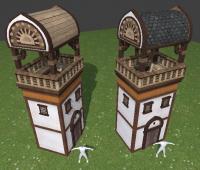
I had some time today at work and I made another tower sketch, this time following placeholder shape:
-
Then should I stick more to the wooden-structure style, keep the fortress design with the suggested changes, or try a different fortress layout? There are any other building that looks out of place or weird? Someone with drawing skills wants to throw some designs? It'd make modelling process faster
-
You're probably right, the huge barrel roof looks unreal. They carved them in the rock and made them really big though... which still quite impressive. I read somewhere that they constructed similar counterparts of the caves in wood, that's why I tried this. I guess it's harder to maintain the arch over a "built from the ground" structure and should have extra parts to hold it or something. Which are the other structures you think are exaggerated?
-
-
More work on textures/main colors: Once finished the texture, I plan to post a .blend file with assets if anyone wants to play with them :
-
Thanks lilstewie! Why you don't see it incorporated into any building? do you have any suggestions for the fortress layout design? Also what do you think the predominant colors were? (apart from brown from the wood)
-
Do you have by any chance a pic of a "tower" structure or something like that? those pics you posted are like the current Civic centre, or richer people houses.
-
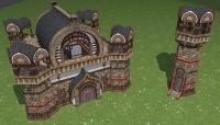
Hey, I'm sketching some Mauryan structures. Heavy wips... just for new non-fancy texture testing and building shapes and modules. I sketched them with nothing specific in mind but the middle and right structures turned into fortress and barracks in my mind. I'm still working on the second set of textures the Mauryans will use for "non-fancy" buildings like houses and such. Since there's very scarce references, suggestions and feedback are highly appreciated, also for textures and main colors.
-
Well, that's not what I call an easy model to get started with. We're still finishing the textures for Mauryans, that may be an inconvenience. Actually I'm working on some models testing shapes and textures and one of them was turning into the fortress But I haven't posted it on the public forums yet. Now that we have moved the art development forum to public, you can start there a thread of your own as a task in the title "task - Mauryan docks" for example. And there you post your wips, questions, updates... Take a look here: http://www.wildfireg...showtopic=16056 There are a lot of pages on the thread, but is full of information and pics. The best way to get the scale properly is importing an already existing .dae file of a building similar to the scale you want to create and use it in your 3D program as reference. (importing unit meshes is also a good way to get the scale right for doors and such). Don't worry, we're here to answer them
-
The pivot point should be at the bottom in the center of the structure. This point dictates how the building is rotated and the height over the terrain: is good to extend the building under the pivot point to avoid floating parts on uneven terrain. The pivot point of the object is not the "object center point" (at least in blender) The pivot point will be the origin of the scene (0,0,0) and when the building is exported into .dae it automatically creates an empty-object (prop-point) called root. If with "versions" you refer to level-of-detail versions, just one. If you refer building variations (different shapes but same building-type) depends on the type of building. Houses needs variations because this building is constructed several times and usually placed together, so it needs variations. No problem about textures. Structures textures for each civ are done. You just use the texture to map the UVs accordingly. Supported maps are normals, parallax (on the alpha channel of the normal map), specular and Ambient Occlusion (texture color multiplied) You just have to worry to make a second UV coordinates where the UV islands do not overlap to bake/map the AO
-
You can ask here all the questions you want. I work with blender, but you can also ask 3DMax questions and somebody may help too. How to optimize.. is keeping the polycount as low as you can, but don't hesitate to add details everywhere When I model buildings I usually make all the details I want. When finished, delete all faces that are not seen/occluded, and if the polycount is too high, delete excessive detailing Also keep in mind that the polygons are not "double-sided". Only the part where the normals are facing is rendered in the engine. Another thing you should know is that textures do not "tile". If the UV map is out of the texture space, the last pixels are stretched to the end of the polygon.
-
Hello Alexandros! Welcome to the forums. What do you prefer to do for your first model? we have plenty things to choose: animals, flora, organic assets, Mauryan buildings... Before starting you can take a look to the Art design document http://trac.wildfire...tDesignDocument (there are some things outdated, but there's also useful info) Here you can also take a look to a thread our Art dept lead made about art assets that needs to be done http://www.wildfireg...showtopic=16198 I suggest you to start with a small asset to get used to the workflow and importing models into the game and then jump to a more complex one. Feel free to ask any question you may have here and also post wip pics of your work for review, critique etc... Looking forward to your creations!
-
I actually think the shape is correct, but with the legs "contracted" (excuse my vocabulary xD) it should look wider/bigger than it is now. Look at this for example: http://www.butlersta...ID_no_23601.jpg
-
I disagree changing civilization on the tutorial, this may get the viewer a little confused. I don't think the basics will change much from how they work now. I also think that these video tutorials should be narrated instead of text-based. I was bored at work and I've written a draft following Pureon's scenario (narrator italics and actions taken in bold) Please note that I'm not an english native speaker, excuse any grammar errors and such. Modifications and suggestions are welcome.
-
Nice start man! The layout looks good, but the barrel-roof looks a too big right now in compared with the building's size. By the way, those awesome textures are made by Eggbird, not by me and they're are wonderful indeed
-
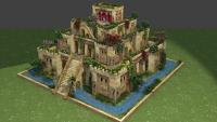
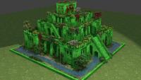
Nice suggestions Bruno Leaves falling is a nice idea and will be added definitely. I read about the screws and some hypothesis about how they transported the water. But my impression is that if it was done with screws, these won't be visible from outside. However, I thought on the possibility to add an animated chain pump (more realistic/historical accurate ¿?), something like this or this on the side of the building but I finally discarded it thinking that it would be too much resource-consuming (it's already very heavy polied). But hey, you are the devs you say what is too much and what is reasonable ^^ I'd love to add some little particle waterfalls falling to the surrounding water but I haven't found anything like that in atlas
-
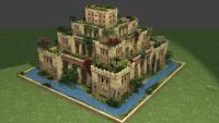
Thanks for your feedback Ludo! I'll explain: -The flowers are a little oversized to give them more visibility even from a distance, I know they are not 100% accurate in scale, but I think it looks prettier even sacrificing some realism. -The red color that you see is where the playercolor is going to be shown. If the player has blue color, those details would be blue instead. -The water is just a placeholder. Myconid has plans to implement pretty water with reflections on buildings in the future, and I'll replace that ugly blue water once it's implemented (until then it'll be blue water texture with partial transparency). -I also thought to have like mini-isthar gate at the entrance of the garden but it didn't fit well with the design I had in mind. Besides the "isthar gate" texture that we currently have is player-color based, so just first player would get blue. Also, since there's no historical illustration of the gardens I had some artistic freedom
-
@Myconid I think it won't be necessary, I'm adding extra flora with just 4 planes now, it's not much geometry and not wasting time modifying textures. On the other hand I'd like to make some tests to make building damage using detail maps... I tried some time ago with the "default" UV sets but due to the texture sharing and tiling it looked very bad
-
Yes, you should model a different animal, we already have a bull for the iberian altar statue. I'm not sure which animal may be historical accurate besides the bull... a lion maybe? Someone with more knowledge on the area may post and enlighten us?
-
Challenge accepted Any suggestions for the building?
-
Wow! nice design! I agree with Jeru, and maybe making the outer ring a little skinnier will give you more space for the images. Nice work
-
Hola marcosbm! Bienvenido a los foros!
-
I understand your point, and I totally agree with you (it will also make much easier to import entire models) but with flora assets there's an inconvenience (not problem per-se): Several "branches/leaves/bushes" textures (if not all) are mapped into triangles that expand further away the texture space, this helps keep the polycount low for flora assets (can be mapped in one single triangle because the "outside" uv space is just transparency stretched) but merging them into one big texture means creating the texture with notable transparency margins between them which may result in a bigger than necessary texture and some extra work. Anyway, I'll start merging textures for future structures, don't know what to do with this one though...

