
-
Who's Online 4 Members, 0 Anonymous, 1103 Guests (See full list)
-
Topics
-
-
Posts
-
By Ultimate Aurelian · Posted
The variety of weapons in this period is pretty limited. They seem to have mainly use spear, javelins and short swords. -
 I'm only talking about timings, what someone is first confronted with, the rest is a different matter. Really? Is that what you are going to quote as "utterly offensive"? People wanting timings 3x faster than SC2 and someone's experience? And I would have thought the mild trolling (not gigantic, though) is what bothered you. Disappointed. You can keep being dismissive of the reasons people give for leaving, threads here, opinions outside, foundational documents, variables from other games, statistics regarding their players (labelling all that "telling everyone how things should be done", no, I agree with that, you don't, just get over it), if I play the game at all (no, I got what I tell newbies from reading the non-existent manual), non-gameplay detailed posts (labelling them as "spam"), and those that apparently have "demonstrated so little" no matter how much time they actually invest (because, have you already gotten any sensible grasp of the time needed to summarise the information I have, or are you going to keep coming with laughable criteria like sign-up date?) in trying to make content more palatable for the astounding majority who doesn't give a single d*mn about competitive play. Nice mentality.
 -
.thumb.jpeg.67ef5b5dc6d918163efa04cd5336830d.jpeg)
By Nicolaus_von_Kues · Posted
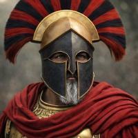
You can train her to make weird helmet shapes; sometimes these drawings are even useful for drawing. Even if they are just conceptual sketches. I'm currently recreating troops from Palmyra; I'll have to draw them, since people call this AI slope, but it's always useful for inspiration. They are precisely lacking in illustrations, and although there is documentation and even visual material, no one has dared to depict these warriors. Niederbieber is another helmet that the AI doesn't know how to replicate. -
-
By wowgetoffyourcellphone · Posted
A horse hair crested bronze Attic helmet. Chrysaor emblazoned shield (sourced from pottery). 7-foot spear with butt spike. Scale reinforced tube-and-yoke linothorax with shoulder flaps, pteruges, and Gorgon medallion centered on his chest. Greaves. Sandals. Aegean seaside background. The face is a canonical master I trained into memory I can use over and over again. The only major problem I see is the length of the butt spike at the bottom of his spear.
-

.thumb.png.ce58cea22940c255f5b0a735d5abee36.png)
