LordGood
-
Posts
2.762 -
Joined
-
Last visited
-
Days Won
207
Everything posted by LordGood
-
You're a darn fine artist Pureon! I wonder how many artists have been swayed into their craft by video games? It's kind of hard not to be ill say, but hey, that's coming from me
-
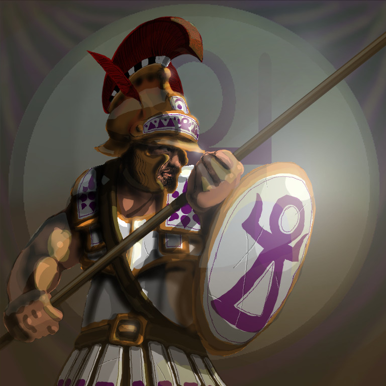
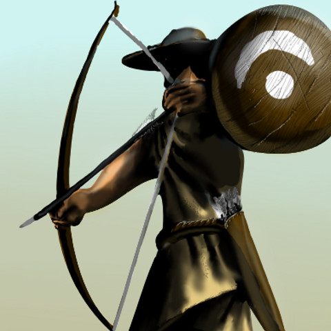
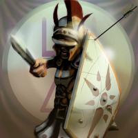
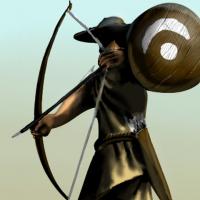
Excellent! If all goes as planned I should be taking a figure drawing course next fall. My insistence on exaggerating muscle structure tends to destroy any anatomical correctness I manage to put forward >.< Also, I like shiny things, so I exaggerate that too lol I'm kind of new to the whole rim lighting idea so let me know it looks eeh, I should drop the shoulders a bit
-
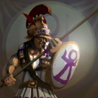
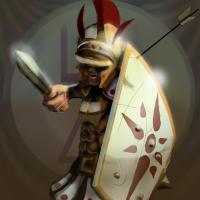
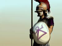
Red is nice and bright and would help push the contrast a lot more, but I want to distinguish the sacred band as the upper class soldiers of a wealthy empire I could brighten the crest, of course. Gotta do a little blendy bloo on that arm I'm afraid I'm having trouble moving away from the heavyset value contrasts, when the pictures are all big it looks more dramatic and cool and stuff but it wipes out color saturation ;-; aaah I am very glad to know I'm doing better though
-

Good Voice to Dub the Tutorials
LordGood replied to Revan Shan's topic in Applications and Contributions
How 'bout Bostonian English? Lol Most American English speakers have some degree of regional taint -
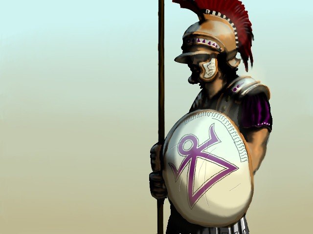
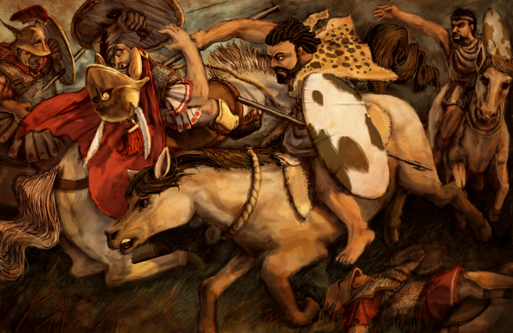
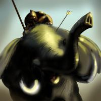
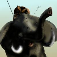
Right, classes are starting back up so I have a teeny bit less time to do stuff. Good thing I don't sleep I did a redraw of the Mašal. 'Tis my favorite Carthaginian unit :3 The spearman and archer definately need a redraw too ... well maybe they all do, but ill just doodle here til I strike gold also, should the sacred band have gold and silver armor or should I leave it bronze? And purple too, talk to me about the purple
-
Keep in mind the Italian cavalryman in 0AD is a spearman, not a swordsman. I'll see what I can do
-
yes it is the /Italian Allied Swordsman/ lol i always wondered why the Italian cavalrymen had a Punic translation but the swordsman didn't the translated titles are supposed to resemble Punic phonetically right?
-
Good Voice to Dub the Tutorials
LordGood replied to Revan Shan's topic in Applications and Contributions
The 0AD team is very multicultural, and I'm going to assume so is it's following. I'm sure a slight accent won't be too big of an issue. It's very well presented, and if the subtitles stay there should be no reason for a misunderstanding by the listener. If it's a choice between an American accent and a Spanish one, I think the Spanish accent should win out in this particular context. -
I think the problem I'm encountering is that this 'cartoony' style just happens to scale down well, which is what I'm really trying to push across That, and I'm more used to the dramatic sweeping light sources, which happens to dull colors, I'm noticing. Maybe I can bring out the brights in a direct light and a saturated dark color in the reflected
-
Alright, im getting some mixed critiques xP Thank you for the feedback! I do appreciate it. From what I gather, I need to dull the background contrast, and draw over the figures with some brighter colors (not necessarily from exterior light sources) So the foreground contrast isn't quite as dramatic. And replace the purple! ( though I think the sacred band pikemen could afford it, I'm not too sure) I can understand the 'shiny' bit may work with the armor of the soldier but not for the softer textures of cloth and skin, a little blurring and dulling should help at the very least Now as Enrique said, I can't add too much detail, the scale down won't retain it. I'll save that for the menu backgrounds!
-
I can see how these might be difficult to quickly distinguish
-
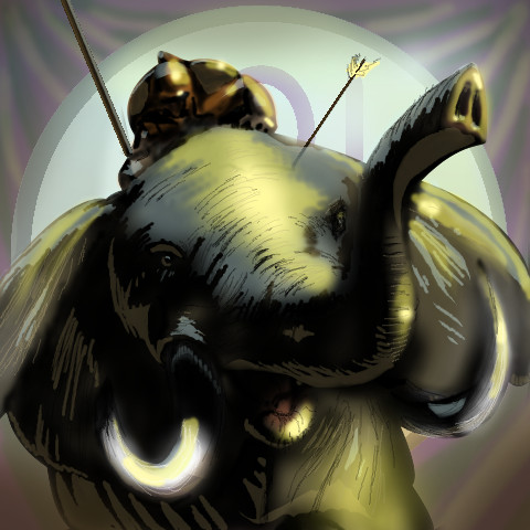
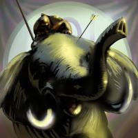
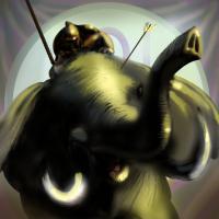
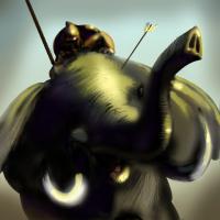
I am here to learn Enrique! If I accomplish nothing but that I'll be happy. I just hope the Greek portraits are here to stay. The multiple menu screens sounds awesome, I always thought this game had a bit of a bias towards the Greek States the menu screen probably has something to do with it xP If it's a slow Back/mid/foreground separate pan will I need three images or will I have to animate that myself? I kind of hoped the reflected light and the bloom around the tusk would balance out the composition, not sure it worked.
-
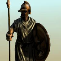
I cleaned it up a bit and added a reflected light source from the ground watered down the front sfumato, brightened the colors, and darkened the area behind the shield a bit I personally kind of like the soldiers with the concealed eyes, but I can mark up some of the icons I plan to overhaul
-
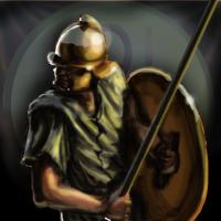
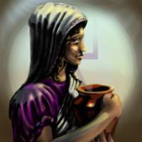
JustinOperable, now THAT is a critique! I switched up the background, that last one is the one I was hoping to use across all of the portraits eventually, and I know I'll have to completely start from scratch on a couple. Ill do some more experimenting with the cropping, lighting, and backgrounds; I'll tighten up those edges, thanks for that critique, It'll help me out a lot As for the framing, I'm going to try for a similar layout to the Greek unit icons, they seem to have just the head and torso in a dynamic pose for the most part
-
Excellent, Thanks for the feedback! How about this? Can you guess what this one is at a glance?

-
Well, the icon is barely noticeable
-
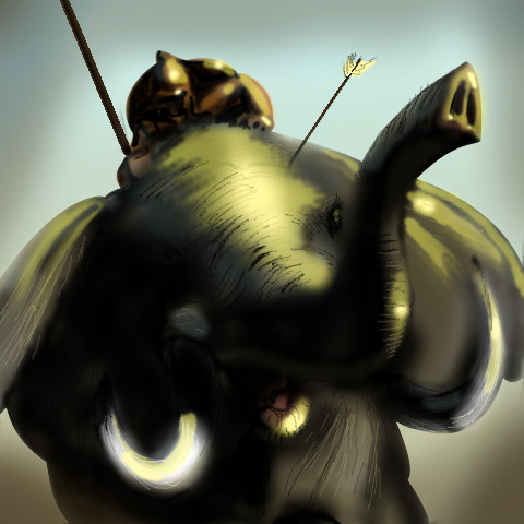
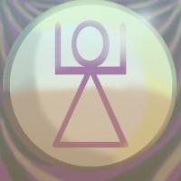
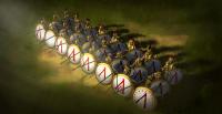
Right i did a quick markup on the elephant, the size matter will take a little more time it seems to scale down better but is it enough? also, i could put a faint carthage... thing in the background. the triangle with the arms and the head thing. It could tie the units together as Carthaginian Purple looks silly there doesnt it?
-
wow that small? alright, that helps a bunch thanks
-
That makes sense, you wouldn't happen to know the icon resolutions would you?
-
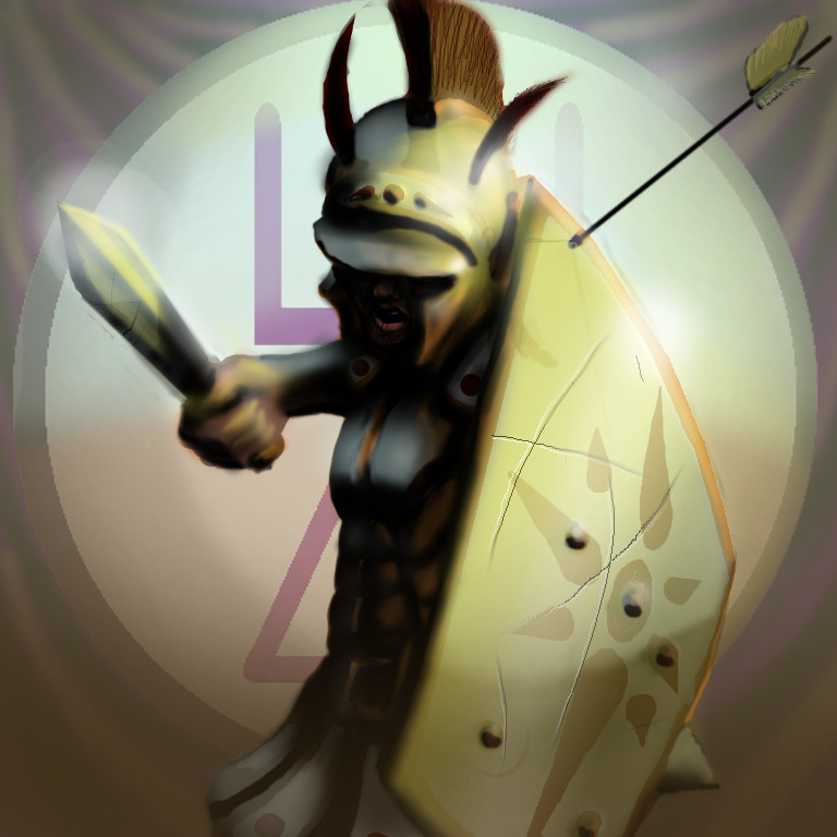
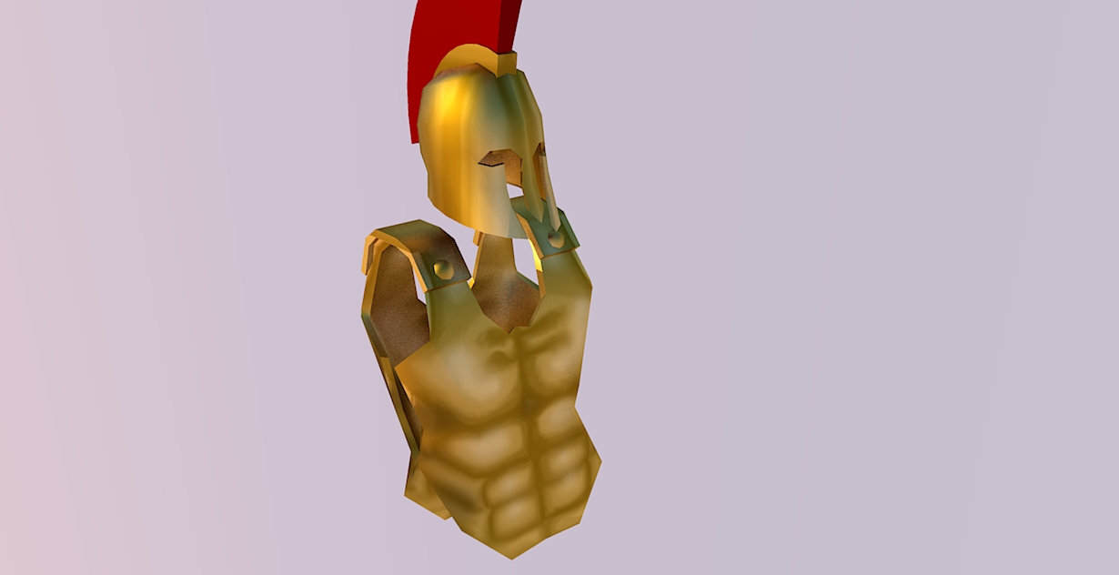
Simply put, I'm willing to replace the Carthage unit icons with hand made ones, but I'll need some ruthless criticism ruthless Muster up every ounce of criticism you have and throw it at me, don't even worry about sounding like a jerk and hurting my feelings because I'm wearing my feeling-proof armor. I put it on after a bluescreen took out my Italian allied swordsman mercenary icon and yes, that is an African elephant.


-
Portraits styles can differ between cultures though right? If I do all of the Carthage units the styles should remain consistent with one another. Another artist can do Rome in a different style, if they choose to do so for example?
-
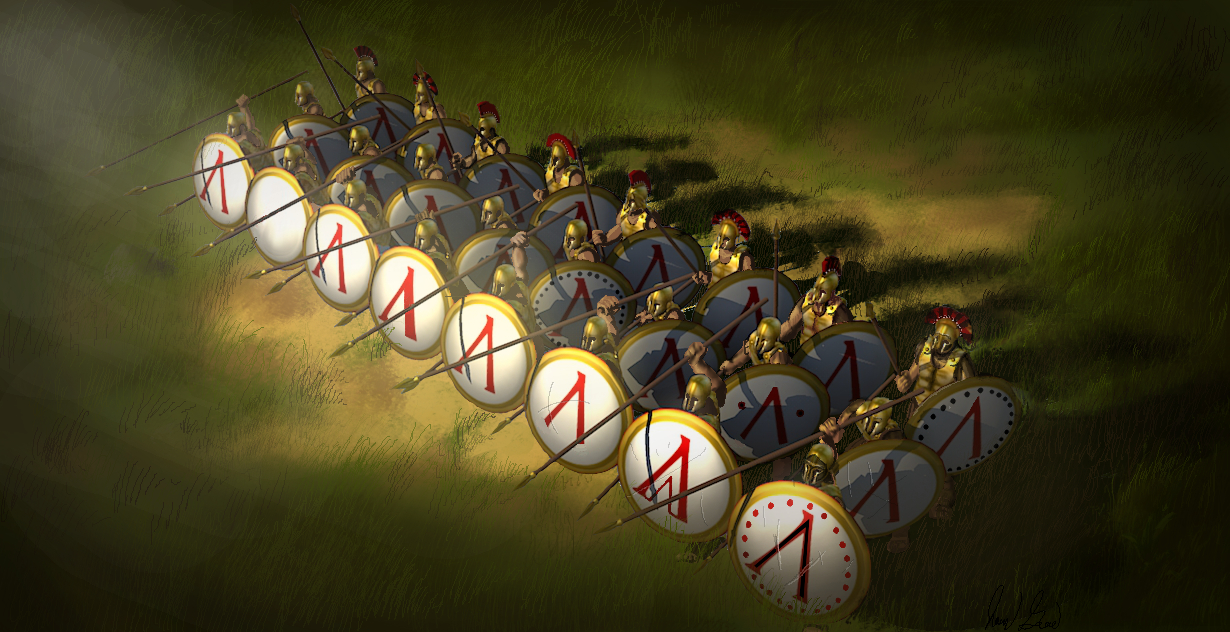
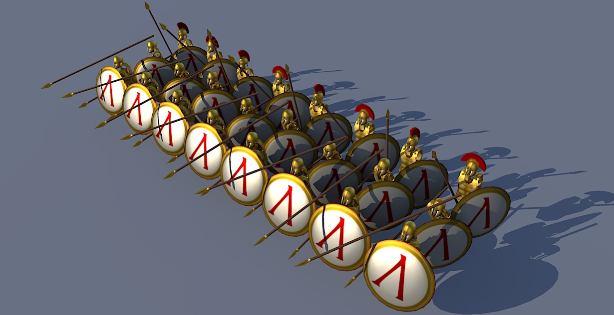
I have a crazy idea why not have the percentile be a hit/miss chance instead of percentage damage taken. seems kind of silly for some armored soldier to get run through with a spear and take 50% damage from it. I feel like a chance between all or nothing would better reflect a realistic combat mechanic I feel like this sort of thing would work well with formations too where it's blocking oncoming attacks but is vulnerable to rear attacks
-
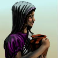
Can we do unit portraits? Please? Pretty please? I'm not quite as good of a painter as JustinOperable, but I'll do Carthage! the Greek ones look really good and are more believable than the model shots :3

-
I don't really have figure modelling expertise, so I painted everything else in GNU
-
I dunno what qualifies as high poly armor, I did my best with what sketchup has to offer on a side note, I finally figured out how to map without seams in SU! Look! wee! made my own textures in GNU and erryting