JustinOperable
Community Members-
Posts
43 -
Joined
-
Last visited
-
Days Won
6
JustinOperable last won the day on December 3 2013
JustinOperable had the most liked content!
Recent Profile Visitors
The recent visitors block is disabled and is not being shown to other users.
JustinOperable's Achievements

Discens (2/14)
33
Reputation
-
Open Source Tabletop Wargame
JustinOperable replied to JustinOperable's topic in Introductions & Off-Topic Discussion
Ok, registration is fixed, I really hope some folks with excellent knowledge of different factions will hop on board and help make army lists, or point out good reference. -
Open Source Tabletop Wargame
JustinOperable replied to JustinOperable's topic in Introductions & Off-Topic Discussion
Actually we're having some issue with forum registration, but it should be fixed tonight. But if anyone knows of good sources for visual reference for different civs, or feels they know a particular amount about their favorite army, we can chat about it here in the interim -
Open Source Tabletop Wargame
JustinOperable replied to JustinOperable's topic in Introductions & Off-Topic Discussion
Actually, we aren't using 3d plastic pieces, though I am interested in that intersection, and think it would be cool to have open source .stl files people could use to print units. If this project really took off, it might be possible to use funds to have either artists sculpt and then 3d scan in unit designs, or else just have 3d modelers do awesome printable model files. -
Hi all, My name is Justin, some of you may have seen me working in the Art Development section on some portraits. I wanted to approach everyone here about another project I'm launching as I believe there are several people who frequent these forums who likely would be able to help in the project. I'm founder of a collective that aims to create free games media for all to enjoy and build upon as their own without needless proprietary restrictions. A new project I am now launching it's earliest stages is an as-yet unnamed Historical Wargame ruleset. From our introduction on our own new Forums: "The main idea is to make a strong, elegant ruleset for pitched battles starting in the Ancient World and advancing forward in time until either the Renaissance or until the Modern Era as the rules allow. It may be such that the rules don’t foster Pike and Shot and Napoleonic Warfare well but it is our initial intention to have rules and Army Lists that cover the Bronze Age until the 19th century. To facilitate this, we are going to be releasing armies of gorgeously illustrated chipboard units. They will be much cheaper to produce than sculpted plastic or metal models but still be aesthetically appealing. For those who love their models, the ruleset will still be usable with models, we just wont likely provide our own as theyre expensive to produce and there is plenty of a market for that already. What creating pieces in this way will do is allow us to provide freely licensed print and play copies of all of our armies, and provide professional quality play pieces fairly cheaply for those who want them. Maybe most importantly, it will give us low enough overhead that we will be able to cover a much broader number of historical militaries than would otherwise be possible, so we can have civilizations that other games simply don’t cover." Not to mention the fact that if successful, we will have dozens of freely licensed pieces of historical illustration showcasing these ancient warriors. Part of my interest in creating such a game is due to the fact that though I have enjoyed Wargaming, it is difficult for many (including myself) to pursue the hobby to its fullest extent because model armies are so expensive, just one army of romans can cost 300 dollars, the way we would do it would allow for an experience that was still beautiful to look at but much more affordable. Another part of my interest is the desire to learn about history through one of its most dramatic facets, Warfare. And I hope in taking part in the game, those who play it will learn more about history and the people who died creating it. The first collection of armies we will release will be early Iron Age civs, very similar to those being produced for 0ad part one. As such, I am confident there are people on these forums who have a deep understanding of the military history of their favorite cultures and civilizations, and can aid us in choosing the proper units, maintaining a sense of authenticity in our depiction, and in doing justice in our rules representations of the units. Each army will have between 10 and 15 unit types and we want to be sure to present as authentic and iconic a selection as possible. So if any of you find the idea interesting, please follow the links below to register and contribute to the conversation. Also, if you know any other people who might enjoy taking part in the project, or know of a particular forum on ancient hittite warfare that you just know I have to contact for constultation on such and such an empire, let me know that too. Thanks all, and I am enthusiastically hoping to see a few of you in our new forums, contributing to the game. Forum here: http://blackflaggame...orical-wargame/ Register here: http://blackflaggames.org/register/
-
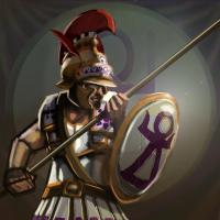
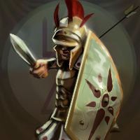
Here's two paintovers. as you can see, rim lights are helpful in pulling the figure out of the background. I've also darkened the background some and you should make sure you are thoughtful about making the figure clearly lighter or darker than the background. You also have a bad habit of doing blown out highlights that have an atmospheric shine, it muddles your values and makes things less legible. You need to learn the difference between a plane in light and a specular highlight. Most highlights are darker than you expect, and requires value control, speculars are quite light, but are typically harder edged than you'd expect, especially on metal. Lastly I sort of did a little drawover on the arm of the spearman. You should study analytical figure drawing if you can, as you were lacking form in that arm. Think of the arm at it's simplest as two tapering cylinders, it makes them easier to draw in perspective. Keep working at it.
-
It looks cool and the background is cool, but if you squint you'll see the shadow shape blacks out the better part of the image and the shield is kinda blown out value-wise. If it were a 200pixel image I'd offer different crits, but for now I think you need to resolve how to get it to read at 40 pixels with that big shadow shape, I'll do a paintover tomorrow when I have my tablet to offer some more constructive advice on your images.
-
Glad it was well received, I'm eager to see the next round of revisions.
-
Lastly, you seem to like moody lighting with sweeping shadows, please start introducing bounce light and some theatrical touches like rim lighting and hair lights, it's ridiculous how much a film lighting look adds to a portrait. It almost feels like cheating. It'd help a lot on your elephant.
-
I'll be a lot more critical since I actually think you have some talent and want to see you push these. I think the looseness works well since they will be viewed at such small sizes, and your speed seems to be excellent. I think a few of them could stand to be tightened up a tad even at such small sizes, and I think you need to heighten contrasts in a few key areas as currently a lot of information is hidden in shadow, likely areas that you felt less confident in tackling. You also want to be more choosy in your shadow shapes, you have some dramatic sweeping shadows that look cool at 200x200 but I don't think are working perfectly at 40x40. Additionally, please tighten up some of the shield shapes, you can use the ellipse tool if you have trouble drawing ellipses, but some of the shields are getting kinda mushy looking. I think the biggest thing your painting overall requires right now is for you to get a stronger grasp of edges, so far most things are painted softly, and it's not such a big deal at these sizes, but if you start trying to really observe and implement a hard edged transition between values and learn when to let edges be soft selectively, it will improve your painting dramatically. If there's anything I really dislike about any of them it's the background, it's too obviously a gradient and I don't think it does justice to the units. If needed I could paint a quickie sky background that you could just take chunks of to use for your backgrounds, or honestly, just grab a picture of a sky from the public domain or the CC section of flickr and paint over it with a soft oils or cloud brush to get it look painterly, some of the best painters in the entertainment industry use tons of photo collage that they drop into their paintings and paint so it looks seamless. Please for the sake of what you already have done,d on't keep those backgrounds. No offense intended of course. That said, I do actually like the last background you posted. Also, is there any consensus from an art director or any of the dev leads as to precisely what framing is desired? Are we going head and shoulders for heroes and torso and head for vanilla units or what? I think clarity on this subject is important. In fact, I've seen your architectural drawings, there's no excuse for your edges, I know digital is weird and tends to make you wanna have everything smooth, but you can draw, bring some of that sense of plane and edge into your figures, it'll really help.
-
Battle for Wesnoth is a free and open source turn based strategy game. www.wesnoth.org. I have contirbuted to that project, they've had at least a dozen different portrait contributors, and the bulk of their portraits are standardized aside from some campaign specific ones that have yet to be replaced. 0ad has a high aesthetic standard and I don't think that should change, and most portraits should undergo revisions as a matter of course, although yes you are correct, it is a free project and care must be taken to keep artists on board. I'm sure the art director will be careful in committing only useful artworks. Wesnoth actually has it's own portrait director as a sub-art director specifically for their portraits (which are numerous).
-
Wesnoth is a free project too, but they have quality standards, specific framing guidelines and a specific style. I think lord goods portraits are nice, though I would put them through a round of critiques or two, but I thought the issue was more one of framing than quality.
-
I'm not the art director but if i were, I would not have serious inconsistencies even between civs. it's not a big deal if different artists have slightly different painting styles, but intentionally framing or executing the portraits in much different ways will detract from the games aesthetic, but i'm not the art director.
-
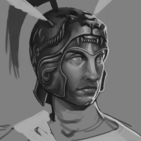
Here's a rough of Alexander the great. I'll try to finish a bit of a repaint if ashoka and finish scipio as well soonish.
-
Can you post an image of such a turban that isn't a painting. Ie a photo of that turban style?
-
http://www.thestrengthsfoundation.org/wp-content/uploads/2009/01/Slide023.jpg That was the reference I was using. I figured the others wouldn't show their hair so it provided design variety. Also I liked those reference images but I just didn't imagine even an emperor would go into battle with no armor and lots of jewelry. Like I said, I might do another pass but a significant repaint isn't likely for a while.


