

Atrik
-
Posts
882 -
Joined
-
Days Won
48
Everything posted by Atrik
-
I bet the regret is mostly that you realized you cannot make the last point, and probably never will on any subjects, even something you know better about.
-
@Stan` seems like some other mods have mismatch : "name": "xiiiad", "label": "XXI Century AD" https://mod.io/g/0ad/m/xiii-century-ad But isn't the file creation something we control and could make more flexible in the engine? Or we just want to enforce the rule anyway for other reasons?
-
Thanks for the report @namename, I can reproduce. It seems it would happen for any mods that have uppercase name, as the folder seems to be a left-over from the temporary download files. It might be possible to fix this at it's root I'll investigate.
-
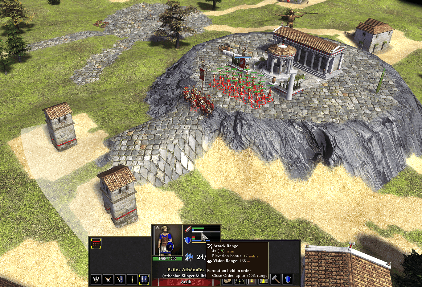
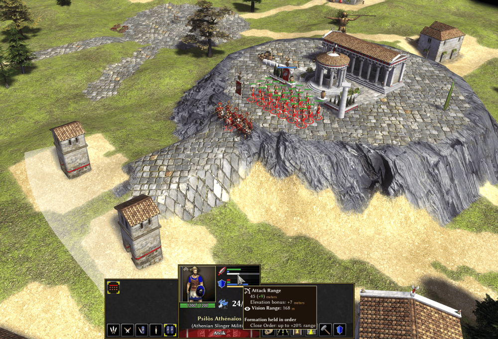
!! I'm so glad! You've been pushing for battalion system, I've been hoping you'll take a look at this! Yes, I'm not entirely sure of the direction I would take from here. The battalions are using, as you might have guessed, barely modified UnitAI and Formation code as normal battles/vanilla 0A.D. So currently, the way you could do it is simply to have units in stand-ground stance. While playing the campaign, I had opportunities where it made sense : for example ranged units on high ground defending the acropolis, phalanx formation to defend a choke-point.. Example reproduction of the scene : Here I switched units into stand-ground so the melee block the choke-point and ranged units stay behind. The battalion cohesion (blue bar above the formation) gives extra bonus : The phalanx gives ~+5 armor but -50% speed at full cohesion. The ranged units get +20% attack range due to staying at high cohesion, and even more from terrain. So now I'm wondering : Is it worth rewriting all UnitAI and Formation code, (more work; diverging too much from base 0A.D.; unknown difficulties)? OR Keep it, and try to embrace the gameplay impact. But of course, it's not going to play exactly like TotalWar games. I tend to want the second more (also because I'm lazy) but it's possible I'll come to realize it's going to have too much cons.
-
Ah.. Well I guess you are right on campaign map, right click should just garrison the army. Basically here the city is just like your classical 0A.D. building. So to garrison you need to hold Ctrl+RightClick, as you would do to garrison a CC or any building in a game. It's true that because the campaign was built from ground, It didn't came to my mind that maybe some things could simplified with the hotkeys.
-
Not sure how to respond to that... Anyway the branch is designed to support creating campaigns with an adapted toolbox/framework (or would have the ambition to be). The campaign I created showcase the new possibilities, but my work is mostly on creating the features. And I suck at the rest. A great campaign could be much more worked out. If @Lopess , or some great moder, would want to create a campaign on it, that would make things interesting. I know there have been posts, from different people, about ongoing work on campaign map but this one has probably the best perks and it's provably already playable. On this branch I think many things can be done, for example making a dragon capable to land on a melee fight with good effects, could already be done easily but it needs the art.
-
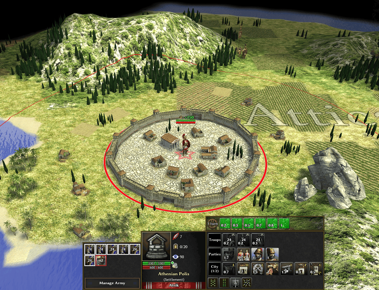
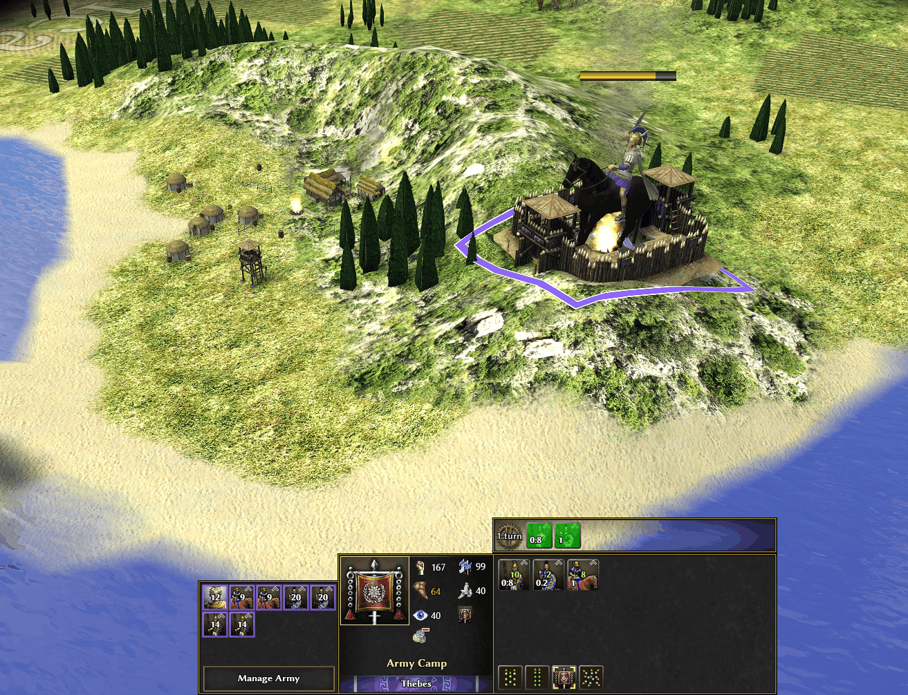
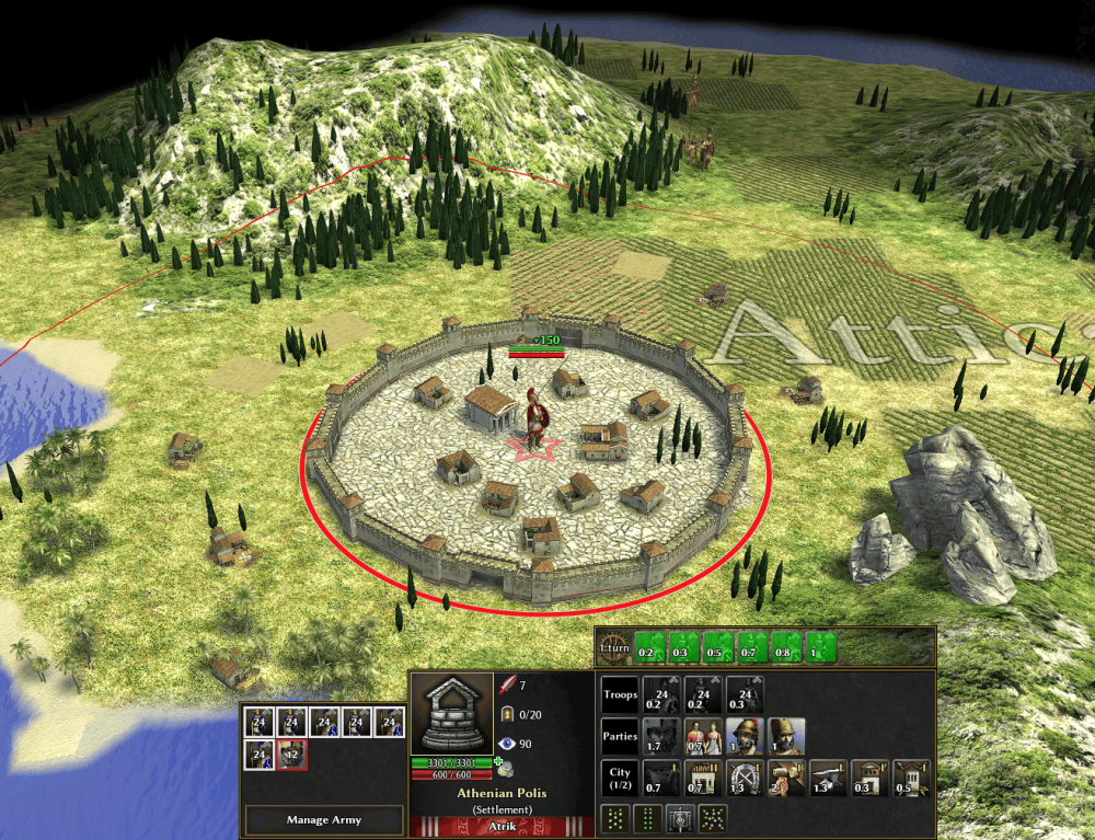
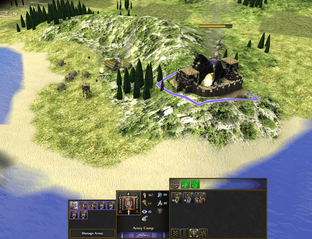
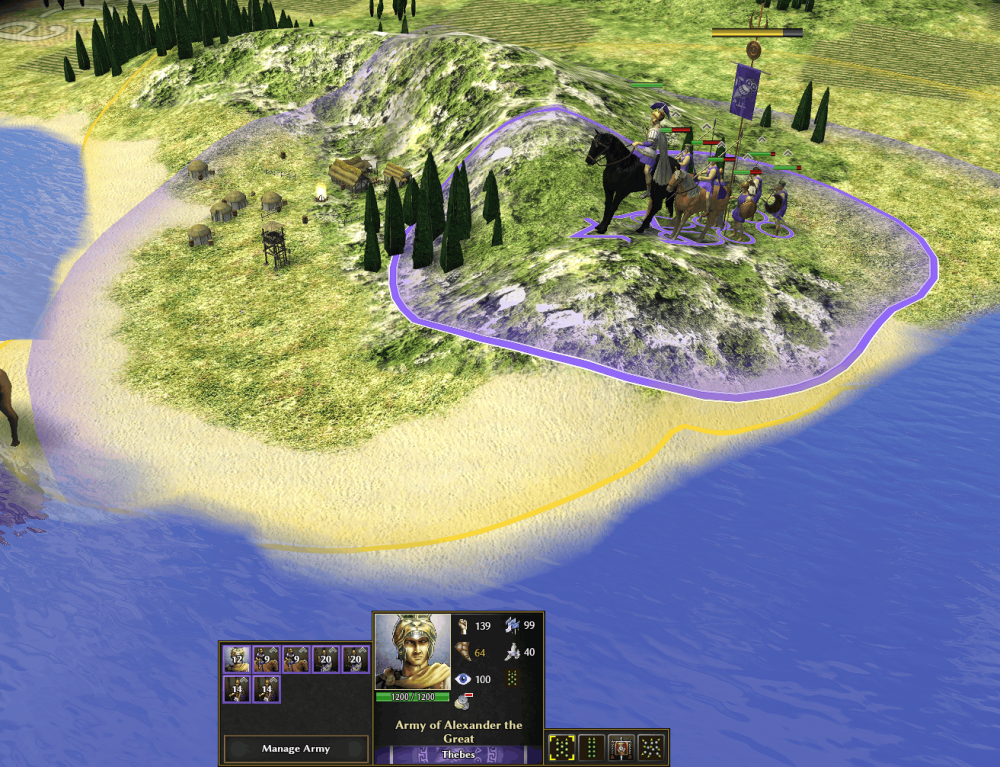
Yes @guerringuerrin, thanks for trying it!! The main way to recruit is to station an army in a city. There, the recruitment is faster then from making your army into a camp; and some building/city upgrades can make it even faster. For example here I'm recruiting 6 battalions (full regiment) in a single turn from a full grown city with a barrack: Changing an army state to encamp also unlock recruitment as you found out, but it's slower. However it's very convenient forgetting back a battalion where some units might have fallen. My army have weakened battalions after a battle : I can encamp and refill some of my battalions under a turn : But noted, I'll add a small step to the starting tips/walkthrough on how to recruit units
-
@El Maker The links for windows or linux are there : https://kleos.quest/
-
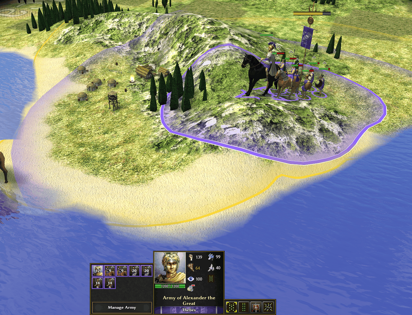
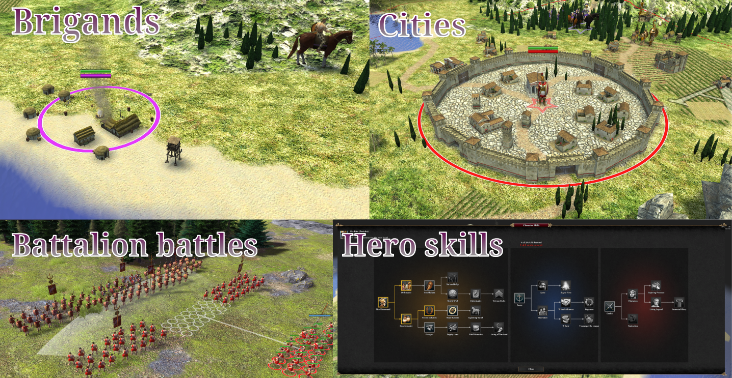
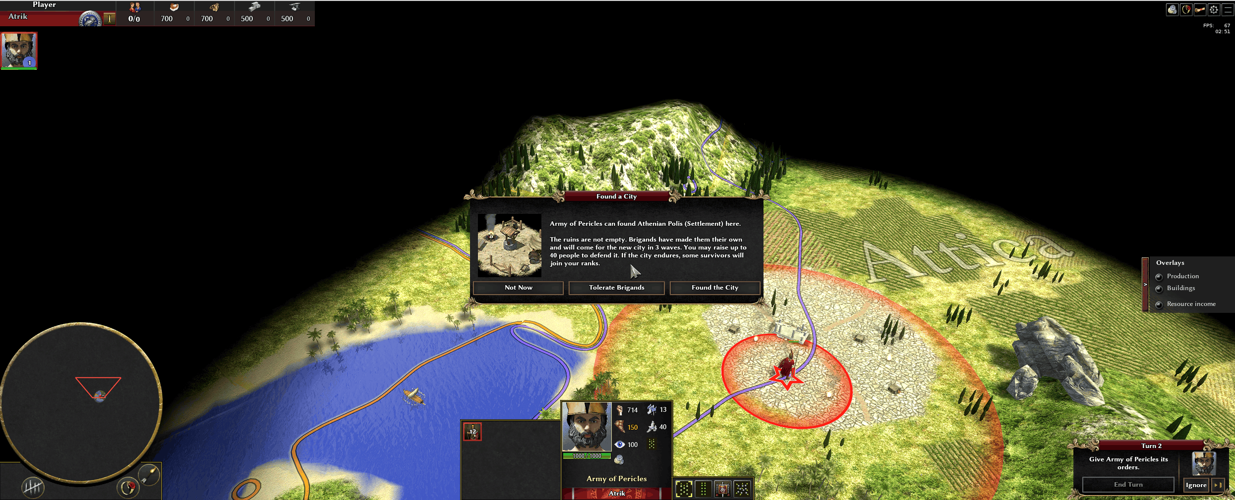
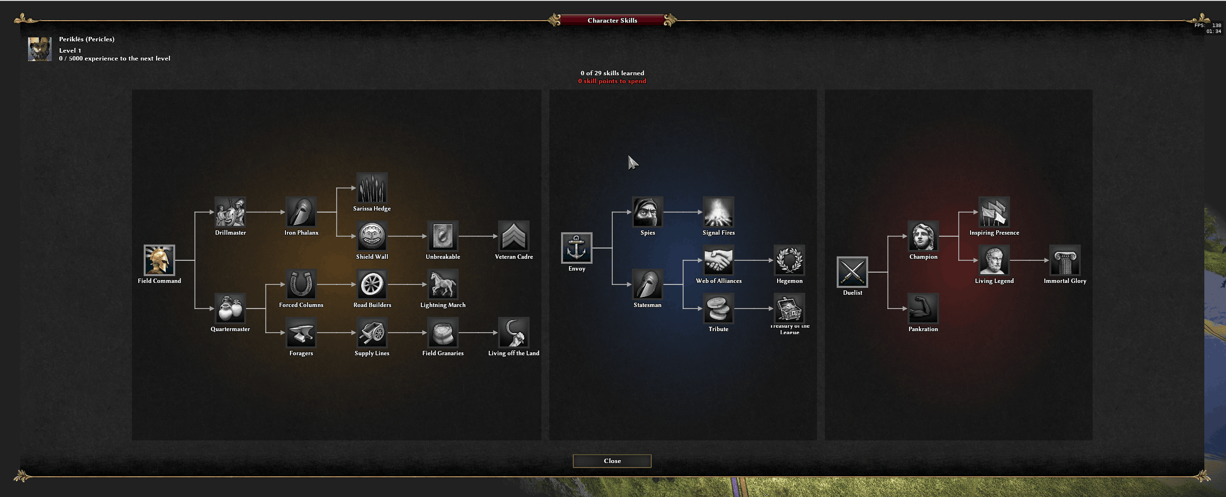
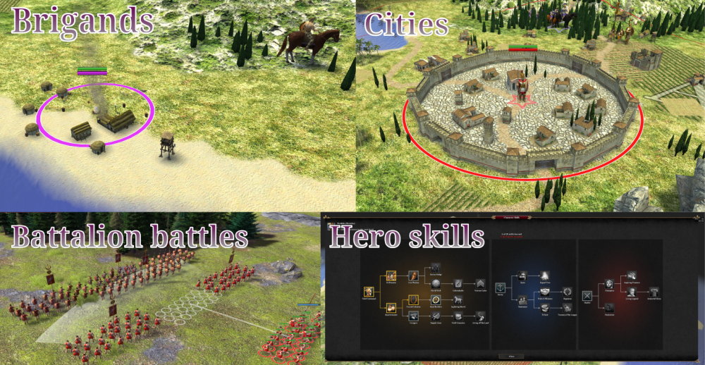
Major update : I recreated a battalion system and worked on a campaign map. A first campaign is playable: Two layers of play. On the campaign map you develop your economy, train battalions, organize them into regiments and armies, and move them around the map. Meeting another army, or besieging a city or camp, starts a battle. Battles are fought by controlling the battalions, with controls similar to Total War. The campaign is a playable demo: you start as a single battalion of bodyguards attached to a hero, and raise a city from ruins while dealing with brigands spawning around the map. Your hero gains experience, and at each level you spend skill points on campaign or battle effects. It's technically a fork, because it introduces some engine changes, mainly the rework I've been doing on UnitMotion and Formation. For convenience, you can download a Windows installer or a Linux AppImage at https://kleos.quest/ Hope you'll test and like it!
-
Yes it is although even the map is broken I think. "Strategic Campaign ..." under Skirmish maps.
-
It kinda is at the moment actually. It's structured for having one turn where players can play (but armies have movement cap, and everything like training, building is counted in turns), then at the end of a turn, bots do they own moves. Well I haven't got multiplayer as a focus right now so it's missing some piping but nothing is being built that would make it too hard to do. Not yet, I want to put together all the work I've done past year to make it possible to have some "battalions battles", and maybe go on with a good naval system. I'd like it to have good variety of gameplay, for example currently you have the mini-mission for founding a city under waves of brigands attacks. So an economic battle. Then army battles where armies fight in battalions, and hopefully both sieges and naval battles can be unique too. Another goal is to mostly support creation of campaign ideas. The campaign I'm going to create will probably be very basic story that just try to show all the gameplay features.
-
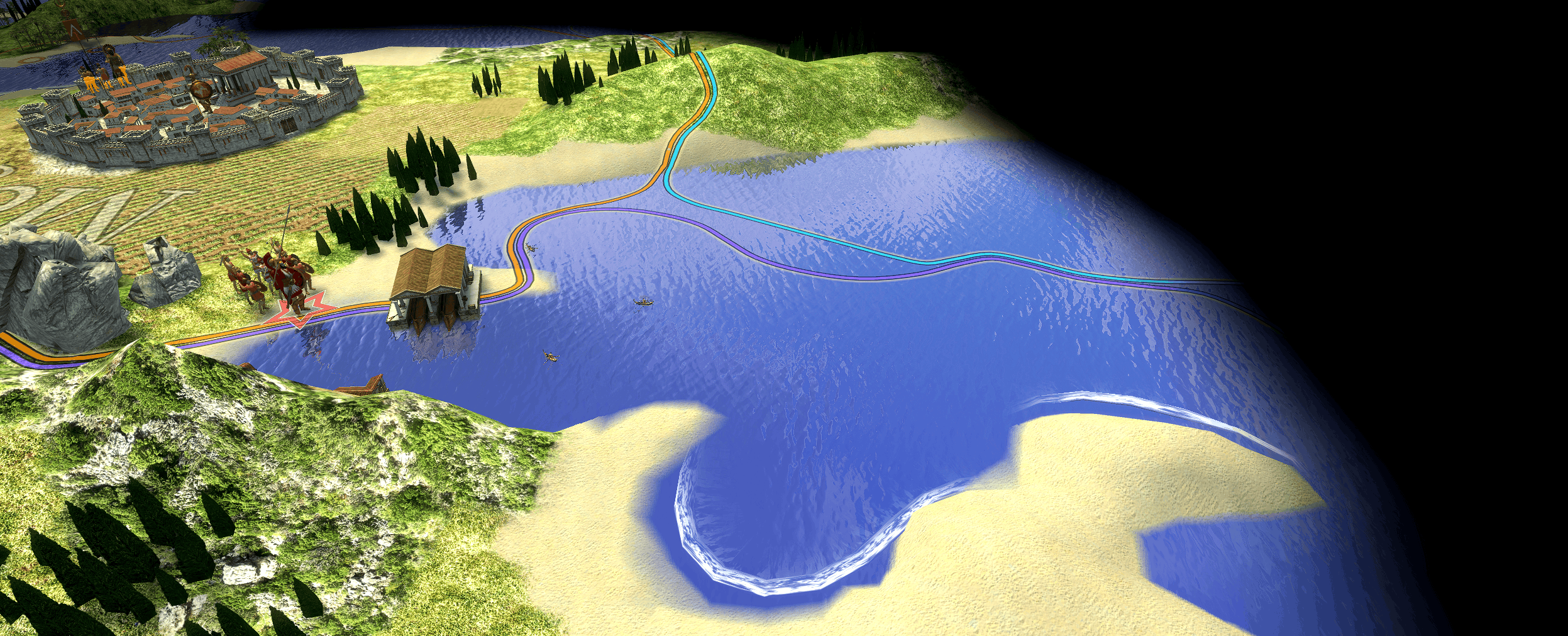
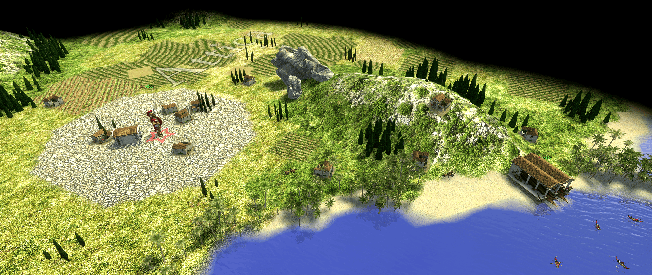
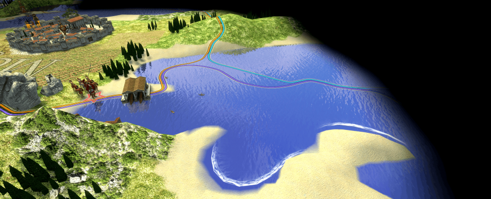
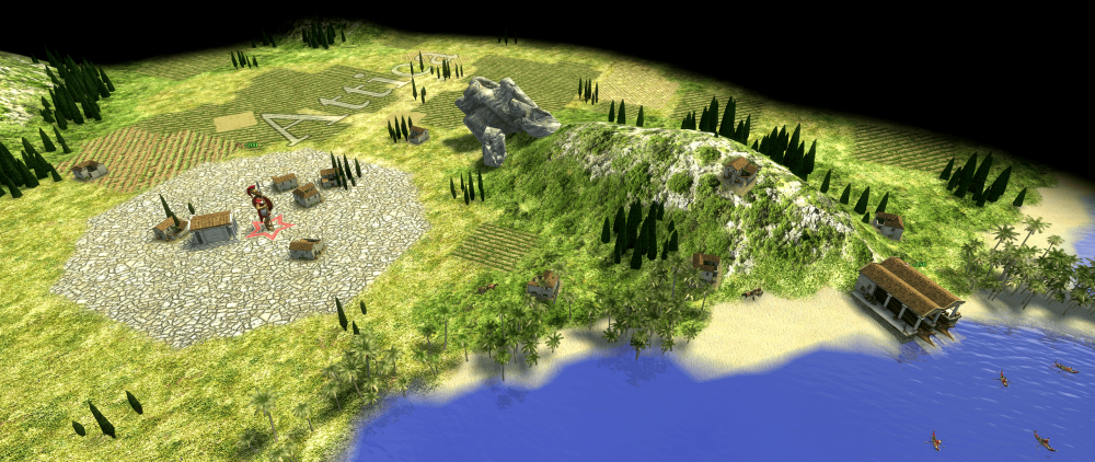
Using @Mythos_Ruler's map, I've been developing the idea of a campaign mod for 0A.D. The gameplay is inspired by other games with campaign mode like Total War, or developing cities like in Civilization. Develop your city : Cities can research upgrades that create economic activities around it. Campaign the map with armies, interact with other armies or points of interest : Get into battle missions by exploring ruins, or interacting with other player's buildings. Below an attack on a encamped army. The map generate a camp fitting defending army size and composition : Screencast from 2026-10-13 10-16-39.webm
-
Implementing forces in Unit Motion (HELP WANTED)
Atrik replied to Atrik's topic in Game Development & Technical Discussion
@Thalatta come on... The reason you had to build it to test it, it's because it changes the engine (like 90%+ of the change of this PR are engine improvements). -
Implementing forces in Unit Motion (HELP WANTED)
Atrik replied to Atrik's topic in Game Development & Technical Discussion
There is no IP on anything here so you can do whatever you want. Just note that this is not merged yet so we don't know for certain when it will be part of the game. It is tested (thanks to those who did!) and ready for next release but the timeline is tight so it really depends on if someone awesome pick it up for review. -
Implementing forces in Unit Motion (HELP WANTED)
Atrik replied to Atrik's topic in Game Development & Technical Discussion
Almost not terrible. Screencast from 2026-10-06 22-06-11.webm For those who don't know the muskox in 0AD have 0 animations, so they look awful when they walk around.. -
Hi @marga_, I'm only seeing mention of animations from @Stan`, not from you, so I'm not sure if I missed something.. I think they are a different skillset then modeling? However if you are actually into animations I would love for you to consider helping with some that would heavily enhance : With the above, units can be kicked away, staggering, and they can charge (attack while moving, or attack while turning). Each of them would look so much nicer with proper animations! If this is something that get your interest, it could be very helpful.
-
Hopefully you will even be able to get proper interpolations for flying units next release. https://gitea.wildfiregames.com/0ad/0ad/pulls/9253 I even started this PR when I saw your helicopter video
-
Implementing forces in Unit Motion (HELP WANTED)
Atrik replied to Atrik's topic in Game Development & Technical Discussion
The damage is scaled with relative speed. And it has a threshold* you can set in the template (could be 0 too). It's called charge in the code but trampling could be somewhat descriptive too since it's any collision that would trigger the effects. *the threshold is only checking the charger own speed, so 0 for elephants makes the unit coming into contact to also count as hit. So it is somewhat a bit trampling. -
Implementing forces in Unit Motion (HELP WANTED)
Atrik replied to Atrik's topic in Game Development & Technical Discussion
If we give them "charge" but with 0 damage it's indeed what that would be. They'll be pushing immobile units a bit better, like current cav and archer elephants. But they cannot push a entire crowd (They would need to be 'solids' for this). -
Implementing forces in Unit Motion (HELP WANTED)
Atrik replied to Atrik's topic in Game Development & Technical Discussion
Thank you so much @guerringuerrin for the deep testing and helping and pushing me for the elephant deadlocks issue!! Together with the balancing of states, I also think we got it to somewhere where they became very nice to play with. What mainly changed in the last commit is that when two elephants push each other, the one that would push the other into wall yield, and let the other one push him. A few other small tweaks for when there are in large group pushing each other too should make deadlocks temporary there too. -
Implementing forces in Unit Motion (HELP WANTED)
Atrik replied to Atrik's topic in Game Development & Technical Discussion
We don't decompose the collision vector. We calculate the resulting impulse from the contact normal, and the spin actually comes from calculating the torque given the impact position to the center. Since the shape is (almost) a rectangle, then it's just about calculating the lever effect on a axis - the contact point projected on it. Velocities are also calculated based on this closest point. I think to apply your idea it would be to add a scaling to the lever effect? But I'm not sure it's always desirable, for example on the choke point wouldn't that create more units facing the wrong direction of movement? -
Implementing forces in Unit Motion (HELP WANTED)
Atrik replied to Atrik's topic in Game Development & Technical Discussion
Wait, but I told you it does for collision, just not for the 'soft' push who are mostly meant to keep units apart more then simulating a collision. So for 'soft' pushs you don't really want to scale it down with velocity. It's not so much about complexity you even tried yourself it's just less then 10 lines of codes, less if we refactor with the one for collision. But why would it help rotation here? -
Implementing forces in Unit Motion (HELP WANTED)
Atrik replied to Atrik's topic in Game Development & Technical Discussion
The shape is a radius around a segment, a 2D capsule, which you generally picture as a rectangle but for small segments, it start being more circular. They are, and for boats their footprint shape was displayed as it was (the champion ele had the triangle one because it's a champion). Since they are long shapes, there it looks more like a rectangle then for elephants. So I was approximating them as being all rectangle, but now that it is drawn for elephant, it's obvious that it's a bit less true for them. Although they are still pretty close to a rectangle. For buildings, it was always was one contact point anyway, as it doesn't use the hitbox used for pushing. But the example you gave was still trickery! The wall was blocking the unit from complying to the push because of having one less degree of freedom. -
Implementing forces in Unit Motion (HELP WANTED)
Atrik replied to Atrik's topic in Game Development & Technical Discussion
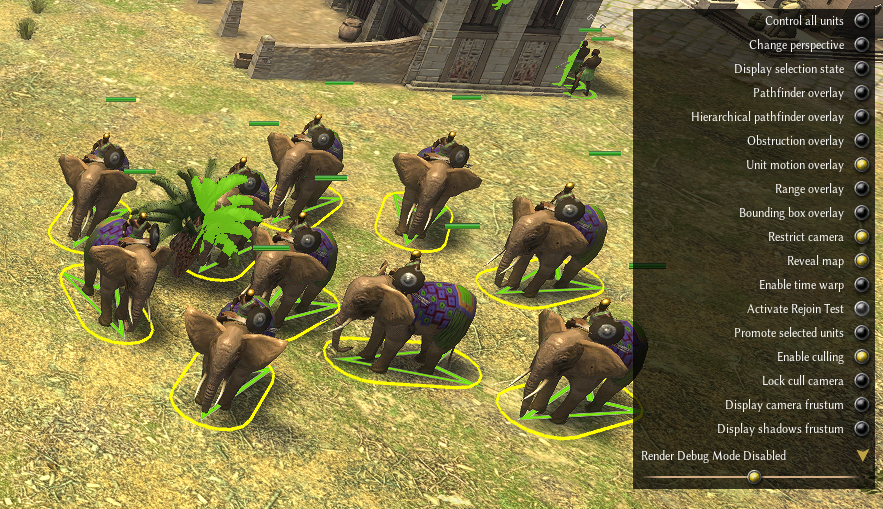
This hitbox you used are the model's bounds but aren't accurate to see what the unit collide with. It's my bad for not doing the obvious : adding a debug for visualizing the actual footprint used for collision. I was debugging mostly using boats to this time because they have everything more extreme than elephants : inertia, size, and they even have drifting effects. For them, the footprint is already accurately displayed when you select them, but now I added the debug so we can also see it for elephants. Also it made me realize that for boats it's fair to approximate their shape to a rectangle, but not so much for elephants who have different ratios, so when we spoke about corners, we highly exaggerated their extent for elephants : Yellow is the debug footprint. You can now display it by enabling Unit motion overlay and selecting the elephants. I'm convinced that a lone elephant pathing got better. He'll be more resilient to solving hitting a building corner for example. Lone elephant with other non-solids that used to block them it's even more obvious. I'm doing the tweaks I can to make herds of elephant not too terrible but they will always be less agile then normal units @real_tabasco_sauce do you think we could also slightly increase both their pop cost/res cost, and make them a bit more tanky? So that you get their new ability with micro but getting tones of them is still not as easy?