-
Posts
1.426 -
Joined
-
Last visited
-
Days Won
28
Everything posted by FeXoR
-
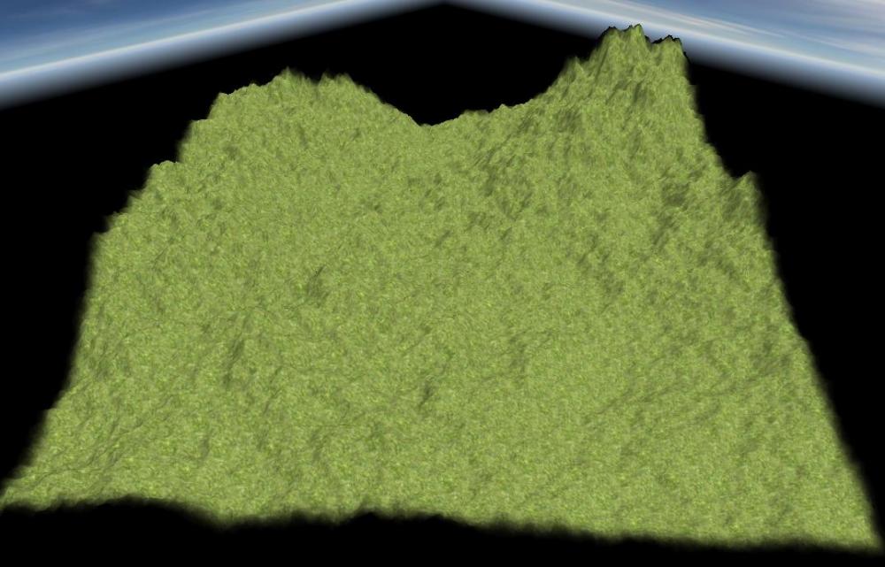
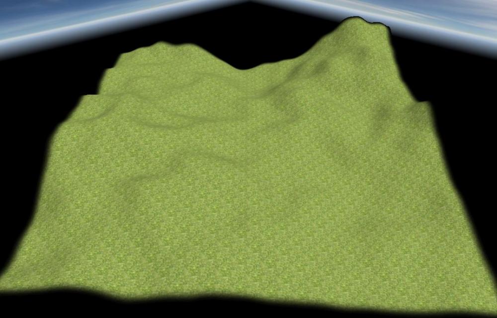
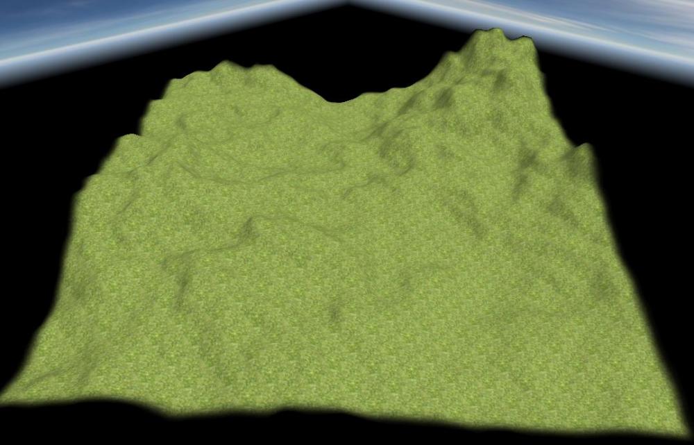
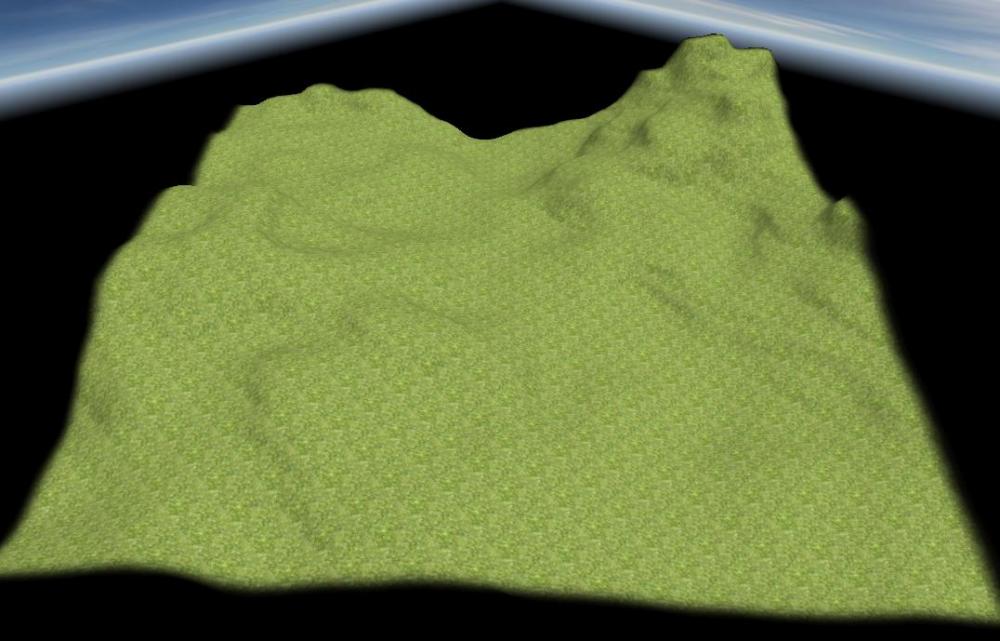
Well, I got a bit done here though focussing more on usability and speed than perfection ... and found out that water erosion works, well, without water x) I call it "Splash erosion" - for it's like letting go a water baloon above each vertex - but before the next step all water is drained/evarporated ... so there's no need for a water plane whatsoever ^^ From left to right: 1) Base terrain (nice but unplayable) 2) Decay eroded (smooth but boring) 3) Water eroded (slow) 3) Splash eroded (Fast but conserving most of the structure) Got that idea when playing arround with erosion_demo_simple_water.js (feel free to do so, see setup line 26 ff) which kept working when basically all parameters where 1 erosion_demo_maps.zip
-
To clarify: If a unit is automatically replaced when low (meaning not dead) the strength against capture won't drop (or?). If a unit is automatically replaced when dead micromanagement becomes vitally important to keep the units alive (and, at least to me, that seams annoying). So why have units on top of garrisoned buildings when it will have bad gameplay impact (Edit: If not just for visuals)? (though this might of cause be a matter of taste)
-
In that case the thing I would want to vote for is not present: Let units on buildings only be a visual thing (maybe representing the ratio of garrisoned units to garrisoning space or don't show them at all). The main reason is that micro managing unit cycling of the units on top would be annoying (at least for me that is). And IMO defensive structures where there to protect units inside while still being able to return fire (relatively save). Unit cycling could be automated so that, if low, units on top are replaced with fresh units (Or just deal the damage to the highest health unit). However, that way targeting a unit would likely be very ineffecient and the unit AI will feel even more stupid than it allready does. What's wrong for you with the current concept?
-
IMO this concept is not ready to be voted on (or even beeing discussed as such) since there are several questions that come to my mind immediately that aren't mentioned at all: - Would garrisoned units not visible still add arrows (and/or damage/attack speed) to the structure itself? - Do the visible units help against capture? - Can the visible units be targeted? - Can the visible units be selected? - Can the visible units be replaced with non-visible garrisoned units? If so how (GUI wise)? All that questions and the chosen answer have a potentially very bad impact on gameplay, the need of micro-management, the clumsiness of the unit AI and the balance of such structures/ships. Note that this list is quite likely not at all complete.
-
@Orpheus Do you remember what map that was on so I can try to change that?
-
IMO to manipulate a heightmap in Atlas the grayscale can be imported as is while there should be tools to globaly manipulate the heightmap like raise all vertices by x meters, (log/exp/linear) height scale, global smooth etc. Than it could always be used, not only at heightmap import.
-
It might be simpler is just change the contrast (and mybe brightness and gamma) of the imported grayscale image in an image editor.
-
Beeing large is only part of the problem AFAIK. Another is their rectangular obstruction IMO.
-
EDIT: English Wikipedia (Trait) states: ...suggesting trot is definitely a natural gait. EARLIER: I can't find any solid reference for if trot in general is or is not something used by wild horses (or if not when it appeared in the history if riding and if it's a genetic or a trained gait). English wikipedia (trot) just states: ...which can mean both, that there is no natural trot so that this kind of trot is just the "most natural" or that this is actually a natural gait and also feels most natural to the rider. German Wikipedia (Pferdegangart) states: ...suggesting that at least some horses have a gait between walk and gallop, in this case inheritable (so likely not trained). This specific one is not considered trot though.
-
Nice! Walk and gallop really look great! Trot seams a bit mechanical/artificial (well, it is unnatural to horses IIRC and I'm not even sure if horses where trained for trot at 500-1 BC at all). Thanks for posting. I hope I'll be available for at least some of your streams
-
Adjusted some maps and removed duplicated code. RealisticTerrainDemo2016-04-10b.zip EDIT: Added the diff for r18014: RealisticTerrainDemo2016-04-10b.diff EDIT2: Current sate: RealisticTerrainDemo2016-04-10c.zip RealisticTerrainDemo2016-04-10c.diff
-
Adjusted to be compatible to SVN r18013. Changes: - Removed random biome for realistic terrain demo (The random biome lib is not sufficient yet to be used here) - Adjusted random biome for base terrain diamond square - Diamond square heightmaps are now applied centered (so e.g. islands are not shifted any more on some map sizes) RealisticTerrainDemo2016-04-10.zip
-
In general there is nothing wrong with university/school projects working on 0 A.D. If they come here, ask for a task or choose one and work on that and seek for help in #0ad-dev that's fine. However, in general it's not that simple as the school likely wants to have some feedback about the progress/quality of their students work and a mentor to guide the students through their task. There are several difficulties involved when it comes to 3rd party contributions like those of student projects IMO: - New contributors in general need time to get familiar with the code base needed for the chosen task - You usually have a limited ammount of time to work on a project (that may be nearly up when the participants got an idea how to fulfill the chosen task) - Mentors need to be familiar with that codebase, too, meaning they could likely get further within a given ammount of time not mentoring - The mentor has to actually have the time/will to guide the participants through the project (which might not be available in the first place) - We had some bad experience with students not actually working at the task/disappearing (That is no harsh critique, just the outcome - maybe they underestimated the complexity of the codebase or the workload - I don't know)
- 8 replies
-
- dev
- collaboration
-
(and 1 more)
Tagged with:
-
Hallo ArferBrick and welcome to the 0 A.D. Forum Thanks for your uplifting comment, it's nice to know of everyone who enjoys this game! All the best to you while exploring the forum and the game
- 1 reply
-
- 2
-

-
@elexis: I agree. Belgian Uplands and Schwarzwald allready use them and the functionality is extracted in a library in my working copy. @wackyserious: I also argee with a recategorization of random maps. However, for the climate there should be a setting to chose the biome. Biome: There is no real biome system implemented yet. Historic bruno had some ideas about using it not only for random maps (I guess skirmish maps as well?). In that case we should make chosing the biome a map setting. Categorization: Since maps like this (realistic terrain demo) are not always very fair IMO we should categorize maps optimized for multiplayer games and fairness that also should have about the same starting resources and large space for each player to build a base (and to allow the Iberian civ bonus walls to be placed without problems). The other maps focussing more on realism or beauty should go into another category. For now this could just be "demo map" but in the long run I don't think that those maps likely more interesting in the long run should be categorized that way likely hidden for manny players and thus much less likely played. However, the map size should be a setting thus not going into categorization. Same with the biome. Library (some variables going to another library and the needed changes to the maps using this functionality allready): RealisticTerrainDemo2016-1-31.zip EDIT: Actually I would be glad if this would be added ASAP because it's interferring with the wall placement functionality in my working copy.
-
I'm lucky I have some free time right now to enjoy this. I won't add an account though so I would like to thank you here
-
Another thing to consider is that the info area is lost for interaction with the player since it will change the moment the mousover changes. So the player can only reach buttons there if the info area shows information about only the unit selected (cursor on info area).
-
@wraitii: So you would prefer an info section that displays contectual information dependent on selection (like a citizen soldier), mousover (like a resource) and the selected/mousover entities states (like attacking)? That info area could be shown if needed and otherwise non-present to enlarge the overwiew of the game world's view(?) Additionally an enceclopedia that can be accessed at the relevant page by a default button (like a questionmark) on many things. Do I get this about right? That would be nice. Consider though that this will involve a huge number of possible combinations of entity type/entity type (and maybe even their states). For each of those combinations there would need to be a seperate pool of information shown and thus the appropriate GUI elements layout.
-
I'd like to add that in multiplayer games pausing the game is inconvinient for all other players so in that case the game should not pause when entering the enceclopedia. (Multiplayer was what I was referring to in my previous post) For me personally in a multiplayer game no single player should have the ability to disrupt the game for the other players in any way. Nor should there be the ability for many players to interupt a single players game. At least not supported by 0 A.D. main branch.
-
wowgetoffyourcellphone: Yes, I am in favor of a hierarchic information structure: Show basic information any time a specific unit/building (type) is selected Show more information in a tooltip when hovering (or maybe only when clicking) over stuff (those should not be to big in general to not obscure oversight of the world view area). Show detailed information within an enceclopedia (so useng them within the heat of the battle is not really bossible but if you value this information over marco in calmer times of the game you don't have to tab out and open a .pdf or something). Yes, an option to disable the tooltips should be easy and thus be added. The part you marked bold is the shortest way I can think of to not confuse anyone after multiple games about the units base stats. This way it's easier to memorize the unit's stats and you could actually tell if an armor upgrade is missing for that phase you are in without going into your base and check at the smith. Note that this is in the tooltip, in the fixed GUI section it only sais 3/4/2. BTW: I like clean, seenthrough designs that show the values in the corners/above simple stylized icons. I have no problems with GUI elements changing entirely dependent on e.g. selection (so some GUI elements are there sometimes and sometimes not like in warzone 2100 - though it should only show things of that specific thing selected not all of that type). Actually I love Zero K's GUI (Sadly all things deal so much damage that anything feels like paper).
-
@ wowgetoffyourcellphone and flashing target: Yes, we will have to improve feedback to the player, both visual and audible. For any command there should be a feedback and it should not be annoying (e.g. soft sounds, brief flashing target unit/circle on ground).
-
Any attempt to make things clearer by dragging the explanation further away from how the game's ruleset actually is will not work well. Selected unit's basic stats should be directly shown in a manner that fits the games ruleset as well as being easy to grasp. A tooltip can be used for more details like derivated values (e.g. damage reduction in 1/100th - also known as percentage - derived by the armor rating - likely just 1 to 9 - for each damage type and the formula which is of little importance within a game - besides of cause a short but descriptive name for that stat like "Health" or "Armor"). For stats anhanced by upgrades the tooltip could show the calculation rather than the final value (that's shown in the info GUI allready) like: GUI (The icon could actually be behind the value if made simple, clean andclear enough): [Armor Icon]: 3/4/2 Tooltip of the armor area: Armor: Pierce: 2+1 (27% damage reduction) Slash: 3+1 (34% damage reduction) Hack: 1+1 (19% damage reduction) Hovering above a units icon should show a table of all the unit's stats to get an overview. For the production queue icons a tooltip should state the units more general capabilities (e.g. "fast" for cavalery and or it's general purpose like it's role) in a wordy manner. The detailed information about units including historical descriptions and their ingame stats as well as the game's ruleset should go to a "enceclopedia" or something that can be accessed from the main menu as well as from the matchsetup screen and ingame (similar to Age of Empires II). There the purpose of the units should also be described thoroughly including what stats makes the unit fit for this role.
-

Interview: Let’s Talk RTS User Interface, Part 1
FeXoR replied to Lion.Kanzen's topic in Tutorials, references and art help
Thanks for sharing this, Lion.Kanzen! Since this interview is from another webpage please add a link to that page (hopefully the original one), the title of the original post and the user that posted it (and if known the name of the person making the interview) at the top of your post (above it's content to make clear that the following is a copy/citation). Yes, you have the link at the bottom of your post but IMO the original page and it's creators including the interviewer should get the credits for their work.


