-
Posts
25.684 -
Joined
-
Days Won
302
Everything posted by Lion.Kanzen
-
.thumb.png.ce58cea22940c255f5b0a735d5abee36.png)
Audio Design 5 - Voice List
Lion.Kanzen replied to Acumen's topic in Game Development & Technical Discussion
In Latin some of the phrases were performed by me. TTS It could be useful if we narrated the campaigns. -
.thumb.png.ce58cea22940c255f5b0a735d5abee36.png)
Audio Design 5 - Voice List
Lion.Kanzen replied to Acumen's topic in Game Development & Technical Discussion
I forgot, Hebrew too. We do not have any Phoenician language, we are going to use Hebrew. We are going to use Basque for the Iberians. -
.thumb.png.ce58cea22940c255f5b0a735d5abee36.png)
Audio Design 5 - Voice List
Lion.Kanzen replied to Acumen's topic in Game Development & Technical Discussion
Vulgar (Like Vulgata latina) I think. From there the other one is medieval, it does not go for the main game, only mods. -
.thumb.png.ce58cea22940c255f5b0a735d5abee36.png)
Cannot login on Game Lobby after trying to register
Lion.Kanzen replied to Quintus's topic in Help & Feedback
we change the names of the minerals in the atlas. Why are you spamming? -
.thumb.png.ce58cea22940c255f5b0a735d5abee36.png)
Audio Design 5 - Voice List
Lion.Kanzen replied to Acumen's topic in Game Development & Technical Discussion
Classic latin? -
.thumb.png.ce58cea22940c255f5b0a735d5abee36.png)
we need volunteers ... There are many absent members
Lion.Kanzen replied to Lion.Kanzen's topic in Gameplay Discussion
It is very subjective, it is to test if all the gameplay is balanced, as changes occur and features are added. Mainly testing patches and creating patches, in case of reaching agreements with other players. -
.thumb.png.ce58cea22940c255f5b0a735d5abee36.png)
we need volunteers ... There are many absent members
Lion.Kanzen replied to Lion.Kanzen's topic in Gameplay Discussion
You can do that, but those of us who don't program, we wait for the autobuild. -
.thumb.png.ce58cea22940c255f5b0a735d5abee36.png)
Audio Design 5 - Voice List
Lion.Kanzen replied to Acumen's topic in Game Development & Technical Discussion
Greek. What you mean? Specifically. -
.thumb.png.ce58cea22940c255f5b0a735d5abee36.png)
Audio Design 5 - Voice List
Lion.Kanzen replied to Acumen's topic in Game Development & Technical Discussion
The first post. -
which one exactly?
-
.thumb.png.ce58cea22940c255f5b0a735d5abee36.png)
Mercenaries in p1: Bad or Good?
Lion.Kanzen replied to BreakfastBurrito_007's topic in Gameplay Discussion
The advantage is that they would not be standard unlike your suggestion. -
.thumb.png.ce58cea22940c255f5b0a735d5abee36.png)
Mercenaries in p1: Bad or Good?
Lion.Kanzen replied to BreakfastBurrito_007's topic in Gameplay Discussion
first of all you would have exotic units, such as archers, camels, which the other factions do not have. Units of each region. You would have advantages of using mercenaries, which allow you to create a balance, suddenly the Romans will have eastern archers. In modifications it already exists. Delenda Est for example. -
Take your time. Take care.
-
.thumb.png.ce58cea22940c255f5b0a735d5abee36.png)
Mercenaries in p1: Bad or Good?
Lion.Kanzen replied to BreakfastBurrito_007's topic in Gameplay Discussion
for the same reason, which has no historical basis, it said that it is better to implement it after capturing a mercenary camp (neutral entity). -
.thumb.png.ce58cea22940c255f5b0a735d5abee36.png)
Mercenaries in p1: Bad or Good?
Lion.Kanzen replied to BreakfastBurrito_007's topic in Gameplay Discussion
I accept that. It could be optional too. -
.thumb.png.ce58cea22940c255f5b0a735d5abee36.png)
Mercenaries in p1: Bad or Good?
Lion.Kanzen replied to BreakfastBurrito_007's topic in Gameplay Discussion
I prefer to train them from a building captured to Gaia. -
that's dangerous. I've already run out of food and lost games because of that.
-
Isn't a release blocker problem. You can make a ticket, so nobody will forget it .
-
.thumb.png.ce58cea22940c255f5b0a735d5abee36.png)
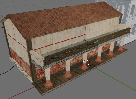
Roman buildings --village phase reference---
Lion.Kanzen replied to Lion.Kanzen's topic in Tutorials, references and art help
It has good details. Tiene buenos detalles. -
the error was mine, I must be clear, the suggestion was not from the first post, but in the derived conversations.
-
.thumb.png.ce58cea22940c255f5b0a735d5abee36.png)
we need volunteers ... There are many absent members
Lion.Kanzen replied to Lion.Kanzen's topic in Gameplay Discussion
how many people still needed at least? -
.thumb.png.ce58cea22940c255f5b0a735d5abee36.png)
Roman buildings --village phase reference---
Lion.Kanzen replied to Lion.Kanzen's topic in Tutorials, references and art help
-
.thumb.png.ce58cea22940c255f5b0a735d5abee36.png)
we need volunteers ... There are many absent members
Lion.Kanzen replied to Lion.Kanzen's topic in Gameplay Discussion
I am going to consult on how it should be better. I think that if we push a single mod to do weekly tests and from that mod patches could come out. @Stan` we have many proposals, what would you like to know or what is most useful to developers? we can make a single mod for A 25 - A26 and this one can be tested a lot. or what you do with patches, but it is less popular and less people can test it. -
it could be a couple of months. could be less. this is voluntary.


