Leaderboard


Popular Content
Showing content with the highest reputation on 2013-03-18 in all areas
-
It's in!! looking great! Nice work Paperkat!
 2 points
 -
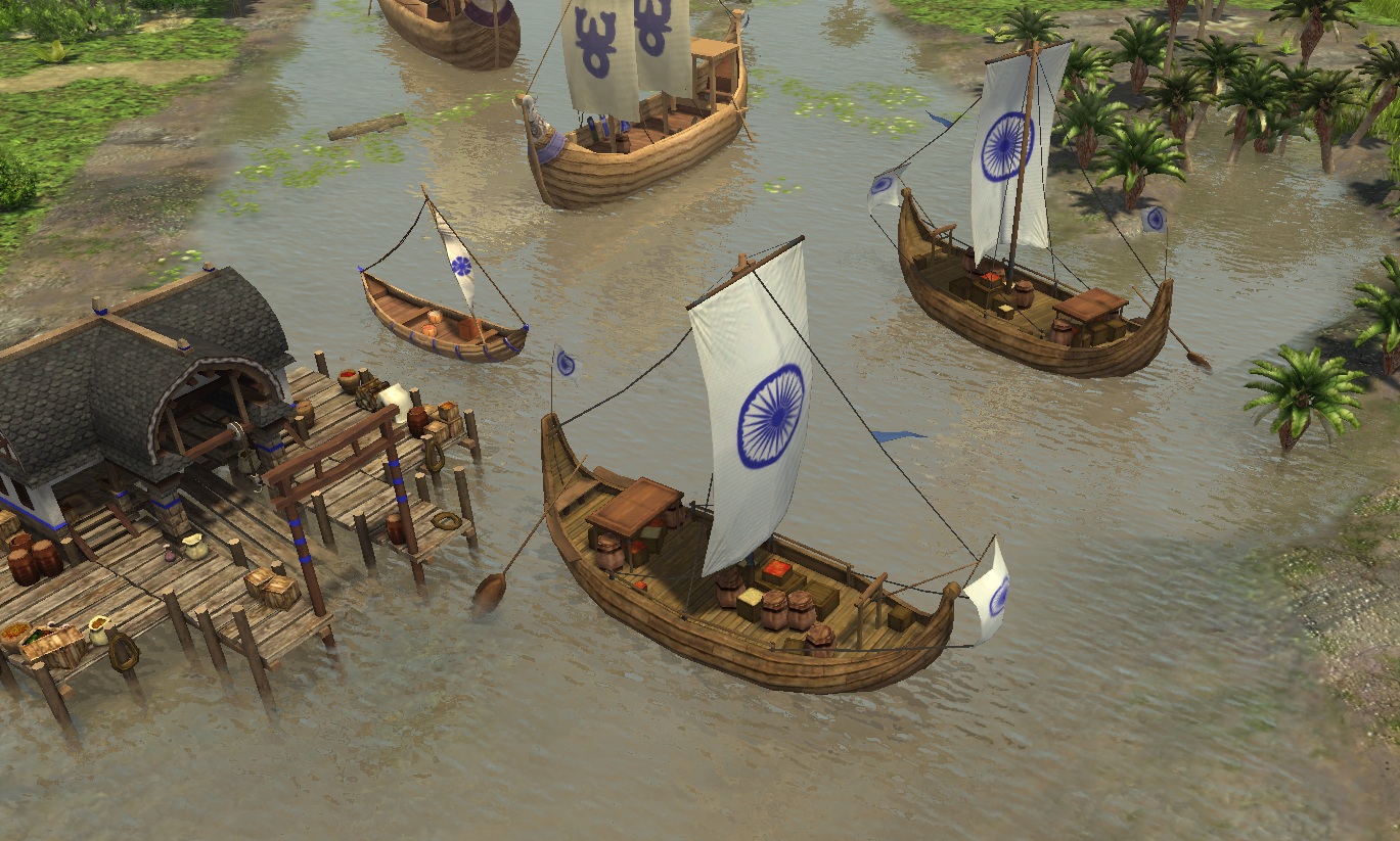
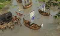
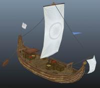
Here we go! Changes made: Crates texture & Goods Oar length ( it WAS definitely too long! ) A few others here and there Ropes & Sails are double sided and the player alpha is done. I didn't create a second UV set I have performed a mesh cleanup so it should be game ready. Here is the dropbox link: https://www.dropbox.com/s/w2lzfehniniind8/Merchant%20Ship.rar Let me know if there are any problems
 2 points
 -
Yes, any good research methodology class in the fields I mentioned would definitely discuss reliability and validity. But if you're just being evaluated for your writing, Perhaps you can make up the data. The prof will probably never tell the difference.1 point
-
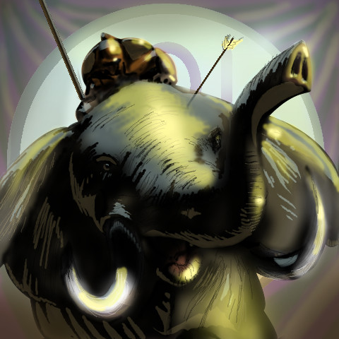
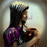
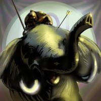
Oh and to explain more about colors : the purple of the woman clothes don't look good to me. I'd rather see a more natural color, or at least a purple with no "shiny reflection". For now the light effect on it makes it feel plastic ! Also, your elephant now looks too green. Can you come back to its original grey tone ? That felt much better, on my opinion. Apart from that, congratulations for working on this, that's always a pleasure to enjoy some traditional art on 0 A.D.1 point
-
No time right now, but do you have any YouTube video examples to show? You can just paste the URLs here.1 point
-
Nice work Lordgood ! On my opinion, your paintings have too strong contrasts and too much black. They need to be brighter, more colorful, simply more in the tone of the game. If you can stick to the color and light style of the existing icons, I think that will be great. The elephant looks pretty good. The soldier too, but it has almost has a "cartoon" style that contrasts too much to the existing game icons. If you can rework it toward something more realistic, that will be awesome. The woman is fine, though needing recoloring and less contrast as explained before.1 point
-
I can see how these might be difficult to quickly distinguish
 1 point
 -
I am here to learn Enrique! If I accomplish nothing but that I'll be happy. I just hope the Greek portraits are here to stay. The multiple menu screens sounds awesome, I always thought this game had a bit of a bias towards the Greek States the menu screen probably has something to do with it xP If it's a slow Back/mid/foreground separate pan will I need three images or will I have to animate that myself? I kind of hoped the reflected light and the bloom around the tusk would balance out the composition, not sure it worked.
 1 point
 -
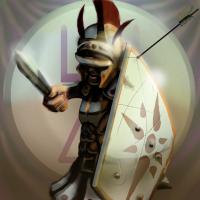
I cleaned it up a bit and added a reflected light source from the ground watered down the front sfumato, brightened the colors, and darkened the area behind the shield a bit I personally kind of like the soldiers with the concealed eyes, but I can mark up some of the icons I plan to overhaul
 1 point
 -
Glad it was well received, I'm eager to see the next round of revisions.1 point
-
I'll be a lot more critical since I actually think you have some talent and want to see you push these. I think the looseness works well since they will be viewed at such small sizes, and your speed seems to be excellent. I think a few of them could stand to be tightened up a tad even at such small sizes, and I think you need to heighten contrasts in a few key areas as currently a lot of information is hidden in shadow, likely areas that you felt less confident in tackling. You also want to be more choosy in your shadow shapes, you have some dramatic sweeping shadows that look cool at 200x200 but I don't think are working perfectly at 40x40. Additionally, please tighten up some of the shield shapes, you can use the ellipse tool if you have trouble drawing ellipses, but some of the shields are getting kinda mushy looking. I think the biggest thing your painting overall requires right now is for you to get a stronger grasp of edges, so far most things are painted softly, and it's not such a big deal at these sizes, but if you start trying to really observe and implement a hard edged transition between values and learn when to let edges be soft selectively, it will improve your painting dramatically. If there's anything I really dislike about any of them it's the background, it's too obviously a gradient and I don't think it does justice to the units. If needed I could paint a quickie sky background that you could just take chunks of to use for your backgrounds, or honestly, just grab a picture of a sky from the public domain or the CC section of flickr and paint over it with a soft oils or cloud brush to get it look painterly, some of the best painters in the entertainment industry use tons of photo collage that they drop into their paintings and paint so it looks seamless. Please for the sake of what you already have done,d on't keep those backgrounds. No offense intended of course. That said, I do actually like the last background you posted. Also, is there any consensus from an art director or any of the dev leads as to precisely what framing is desired? Are we going head and shoulders for heroes and torso and head for vanilla units or what? I think clarity on this subject is important. In fact, I've seen your architectural drawings, there's no excuse for your edges, I know digital is weird and tends to make you wanna have everything smooth, but you can draw, bring some of that sense of plane and edge into your figures, it'll really help.1 point
-
Wesnoth is a free project too, but they have quality standards, specific framing guidelines and a specific style. I think lord goods portraits are nice, though I would put them through a round of critiques or two, but I thought the issue was more one of framing than quality.1 point
-
Ideally it would be important to get the same level of quality across the entire set of portraits. Minor differences in style can be compensated for, but they should all be a consistent quality and have a similar general look.1 point
-
I'm not the art director but if i were, I would not have serious inconsistencies even between civs. it's not a big deal if different artists have slightly different painting styles, but intentionally framing or executing the portraits in much different ways will detract from the games aesthetic, but i'm not the art director.1 point
-
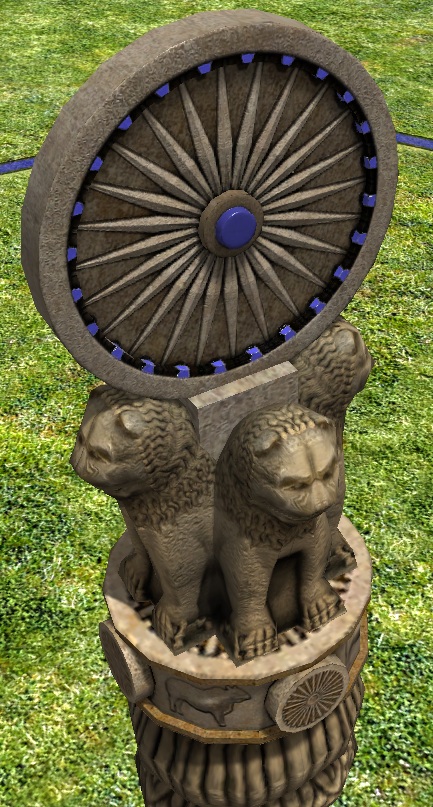
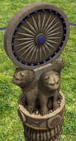
Added chakra wheel to 4 lions pillar by request:
 1 point
 -
Known issues, zoot, but thanks for reporting them, this could be useful. I'm assuming it's a punjab map? Basically to fix this requires rewriting many things or improving upon many things, which is planned but not for now. sanderd17: might be fixed actually, defense and attack were not mixing together so well because of an issue.1 point
-
The mod, though hopefully once I learn enough I'll be able to help out with 0 A.D. as well. =)1 point
-
Looks great guys, keep up the good work! On an unrelated note I wanted to publicly announce that I'm now enrolled in classes for my BA in Game Art & Design and very hopeful to soon be working with Giant Lynx Studios on this project. =)1 point
-
I am in favour on exponential armour. It means that techs are evenly weighted across units, so that already strong units don't get even stronger (relatively) with upgrades. It can be displayed as a percentage to players and the effect of technologies should be easy to describe, so players can understand what is going on.1 point
-
This is fixed in alpha13, see the ticket for more info.1 point
-
Since no one still did it, I opened a ticket myself (#1856).1 point