All Activity
- Past hour
-
 A27 has a new bug that occurs, reasonably often where a player will make the game freeze or incredibly slow. What we currently observe : This isn't some kind of lag, the player won't experience network, nor cpu lag when this occurs. Since this isn't creating any logs, how can we help document this bug?
 -
Same feeling about the vague description of this tech...
-
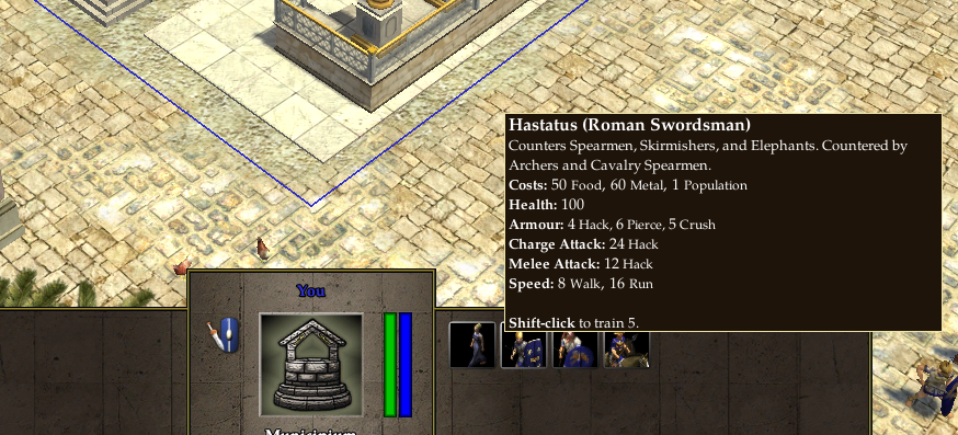
Perfection. If anyone wonders, this is from Alpha 9 Ides of March. Yes, swordsmen had a charge attack.
-
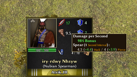
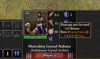
@guerringuerrin does inline rly make it better? I'm kinda neutral on this. However I also wanted to wait to show the color scale idea depending on upgrades, inspired from @Dakara idea but trying to keep it agnostic of how upgrades currently works (tiers would also make limited sens if you have WTF for example). Above, p3 upgraded spear vs p3 + wtf. Below p1 upgraded camel + Cleo aura. Thoughts?

-
Mythos_Ruler's Playlist
Gurken Khan replied to Mythos_Ruler's topic in Introductions & Off-Topic Discussion
RIP Tom Lehrer. For our math fans: He snuck this song as a source in a NSA paper he wrote and no-one noticed for sixty years. I will always remember him with this though: - Today
-
Yeah that's pretty much what we have been discussed with @Atrikin the previous messages. I do like more a vertical layout design rather than an horizontal you propose (as the vanilla is) because I think it's much more easy to read and identifies the different stats as can be seen here: @Atrikmaybe you could share a screenshot of this same damage tooltip of a melee unit so we can see how is shown? ( I'm at the cellphone rn ) About DPS number shown next to the unit portrait. I rather put the final damage of the unit instead of the DPS calculation as I find it a bit confusing. I guess some would say it's better to compare different units damage per second as different units have different attack intervals.
-
I'm not a designer... dozens of ideas could exist... Either change the color of the sword and shield, bow, etc.? Or highlight it with that color. It's up to you to have fun with what seems best to you.
-
I love the idea, however the current stats are displayed agnostic of sources of the bonuses. I'm still going to try to see if a grayscale of the icon (proportional of the bonuses amount) can look good.
-
Thanks Atrik for these interesting charts, for Kush is it possible for you to tell us the proportion of mercenary spam for these top evenings? I'm curious Ptol are not bad yes , they have a different way to play them, but why they are "slow"?
-
Yes and no, It can give new players bad shackles with advice that is situational. Who will change these tips when the balance team decides to remake pikemen into tank unit? It is better for the player to discover his own strengths and weaknesses by instinct (reading statistics) and experience. ---- To determine the opponent's improvement progress and avoid memes (which are only identifiable by experienced players), we could consider a system of colors. stacked? Or a color system, for example, bronze, silver, and gold (this easily resonates with people). Tech 0: Grayed Tech 1: Bronze Tech 2: Silver Tech 3: Gold Tech 4 (Iberian and Maurya): Diamond To satisfy everyone, we have two display options accessible via a button: the arcade button with the bare minimum of vital information and the detailed button with the full list (stats and future idea like counter kill etc) example just for bronze color, but keep the design of 0AD of course
-
yea, but thats why i like vanillas system; you dont get the stats on your screen all the time, but you can hover over the icon and read them all if you want
-
Yeah, I never look at stats in game. But making them completely hidden, including on the structure tree is just hiding the ball. It's something that is frustrating about some techs like the Mace Silver Shield. I shouldn't need to go into the directory to understand how different units differ from one another or how a tech impacts units. This is especially annoying when stats like spread (accuracy) or projectile velocity vary from one unit (or building) to another. There's literally no reason for it
-
Or learn by just reading the tooltip that says that Light Cavalry does bonus damage to monks?
-
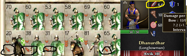
1)Yes the sword icon and number display dps. 2)Why Redundant would mean it's displayed elsewhere? I like to have it clear when some units are trying to chase others (like cavs) to see if enemy have a speed bonus, or just base unit movement. 3)The screenshots scale the icons a bit. In game they look perfect for me. That being said, the stats calculated and displayed here are from base template and unit state. This means you, or anyone could extract theses parts of ModernGUI and tweak/play around with it, without having to import too much of it's code. Probably easier then starting from the vanilla panel if you have an idea of what you want to do. @TheCJ I hate when a games hide stats. Feels like they think your too dumb to compare numbers. In mods like Historical I would go crazy if I couldn't read stats, and having fast/easy way to understand the stats are even more critical.
-
I actually agree with you here. The game had some tips in earlier alphas that had listed counters for every unit, but never descriptive text like in AoE2 games. Also, we had this in early alphas. The gather rates, in particular, were shown just as "Bonus in gathering food" for females and "Bonuses in gathering wood, stone and metal" for male soldiers in the tooltips. Maybe we can return to those days of showing the bare minimum of stats, but told the info in tooltips? In any case, it needs to be consistent with the overall UI design.
-
Well, the art is nice. But we could remove every number (resistance, percentage, gather rate) from the players view and it would not matter too much
-
What is much more desireable is a short description of their role in combat (if there isnt one already? Would the encyclopedia contain smt like this? I dont know tbh). Like "The Spearman is a versatile melee unit especially strong against cavalry, but weak against siege units.", "The pikeman is a heavily armoured melee unit with relatively low damage but long range.", "The Swordsman is an offensive melee unit with high damage but a short range. It excels at taking out siege." Much more useful for new players.
-
Going by your logic, we don't need to show anything. Let's just play the game blindly and have fun, ey?
-
Do new players need to know? And do you think not knowing about the hack damage of halbs made the veteran play worse?
-
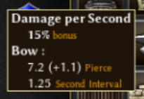
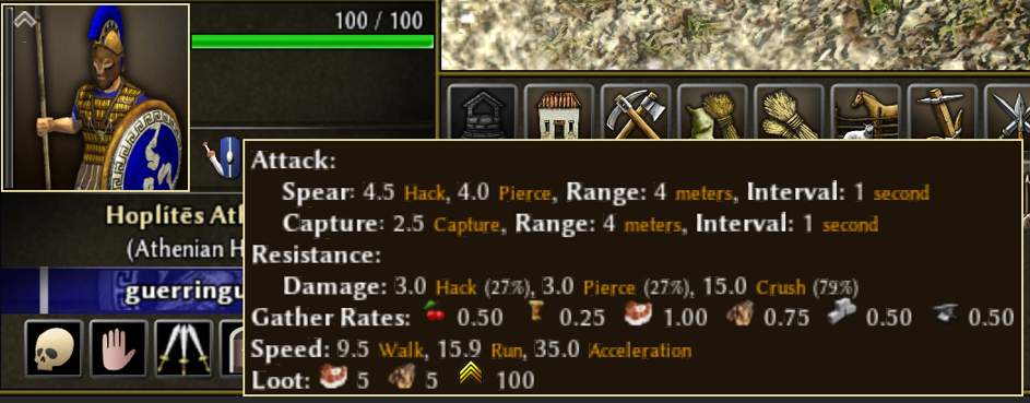
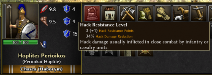
1) Does the number beside the sword icon show the current total damage, or some derivative stat like DPS? It should show all damage types, because of the way damage reduction is calculated in 0 A.D. Example: (sword icon) 3.8 (arrow icon) 6.0 On mouse hover: Damage: 3.0 + 0.8 hack / 5.0 + 1.0 pierce This way, we can also show upgrades cleanly, without cluttering the UI. 2) Movement speed stat is redundant here, no need to show it on combat stats. 3) The icons that are showing resistance levels should look a bit nicer. Too much blue. Perhaps it could look better like this: (gray armor icon similar to AoE2 or AoM) 4/4/15 On mouse hover over the armor icon: Resistance: 3+1 hack (34%) / 3+1 pierce (34%) / 15 crush (79%) You don't need to know it by the time you've learned the game. But new players need to know, and even one of the veterans didn't know about the hack damage of halberdiers. So, more obvious display of stats is desirable.
-
I like the way vanilla does it. You dont need to know any damage or resistance numbers, really. Atleast not of your own units while playing. Either you know how to use your units, then that knowledge is way more useful than a damage stat, or you dont, in which case the stat wont really help you. And you shouldnt see your enemies upgrades anyway. If anything, you should find out about them by doing some sort of spy tech. So not showing the units stats at all is perfectly fine, and having the option to look at a breakdown of all stats is useful if you want to strategy-craft, make balance-change mods or just calculate stuff for fun.
-
I prefer that the more stats possible are displayed and not having some hidden. But @guerringuerrin indeed, It would be nice to not look like in this meme you posted every time you need to figure out what is the stats of a unit, or how much upgrades enemy has. And the tooltip with the 40 stats vomit could/is still available, just the breakdowns are much faster to read / easier to understand.
-
 Aiysha UAE joined the community
 -
This is an example for the opposite point because in aoe2 there are lots of different hidden stats per unit that aren't shown. Its actually a great system to only show the basic stats of the unit, because showing all the stats would take up too much space and cloud out critical basic stats that can change with upgrades. I'd say going from this: To this: Is definitely an improvement in that direction
-
This is an example for the opposite point because in aoe2 there are lots of different hidden stats per unit that aren't shown. Its actually a great system to only show the basic stats of the unit, because showing all the stats would take up too much space and cloud out critical basic stats that can change with upgrades. Players in aoe2 actually learn the massive variety of different unit and civ specific bonuses and technology effects without having to see them. For example the light cav doesn't say that it has +10 versus monks which is essential for gameplay, but players simply learn this by doing (or looking at wikis/tutorials).
-

Linux download not working?
ShadowOfHassen replied to Essential Strategy's topic in General Discussion
The flatpak should have had the update for a while. Maybe try flatpak update in your terminal if the software center is acting strange.


-
Latest Topics
-
.thumb.jpg.b21ca1d0c15fb56b42c39b25a0a40815.jpg)