All Activity
- Past hour
-
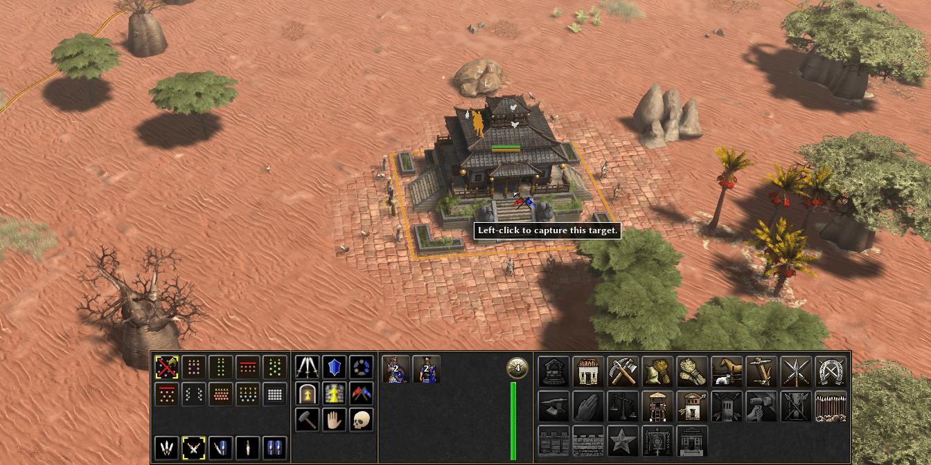
I think I'll consider this proposed layout, I see a some benefits. One of them might be an option to hide it as some players like myself already know each unit command hotkey. I also like that you get 10 slots for unit commands which is the exact number to not have any overflow for single-type selection even including new capture button (the 10th is "back to work") but doesn't have much dead space. The overflow in multi-type selection (worker + building) will overflow but that's somewhat fine, not worth adding space for this. About the construction panel layout, it's not worth pursuing your attempt to order building, in my opinion. Due to the fact that the list of construction is very variable : across civs, mods easily add some, and in a multi-type selection (if any of the selection is a trainer, a researcher or can be upgraded) then you cannot keep the ordering. Also on your mock the order isn't even done by any entity classes that would make it possible.
-
The button does work, but after clicking on it you need to left-click the terrain to issue the command, just like with the other command buttons in the panel. You can try the same with Patrol, Guard, Repair. When using the hotkey instead, the command is issued with a right-click.
- Today
-
 ergtrytu joined the community
 -
Closing Old Issues
Gurken Khan replied to ShadowOfHassen's topic in Game Development & Technical Discussion
Good! -
Closing Old Issues
ShadowOfHassen replied to ShadowOfHassen's topic in Game Development & Technical Discussion
That would be a LOT of issues probably at least a thousand of the 1.6k issues we have -
Yes and no We created more templates, so it's: template_structure_civic_civil_tribal
-
It seems there is little hope left for the development of the standalone game; could the development team share the model assets so that someone capable might create a mod?
-
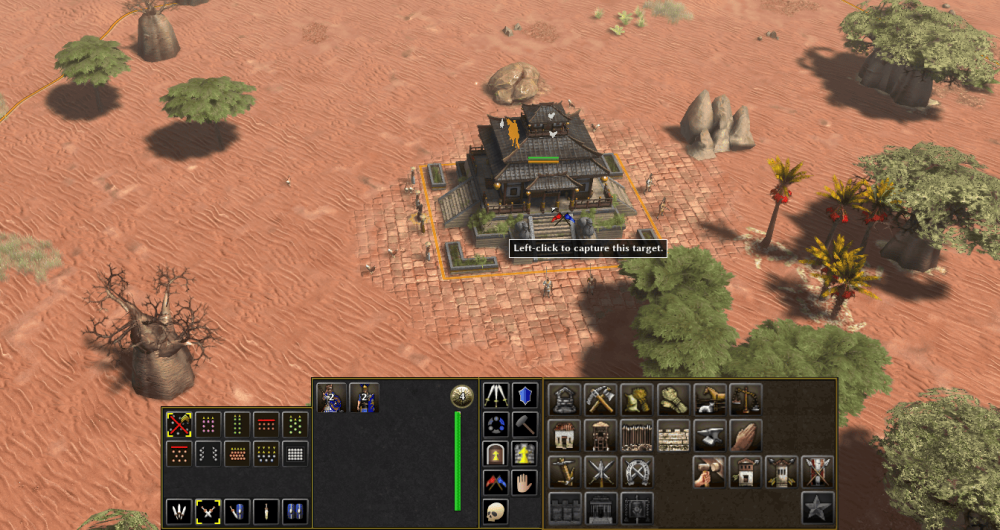
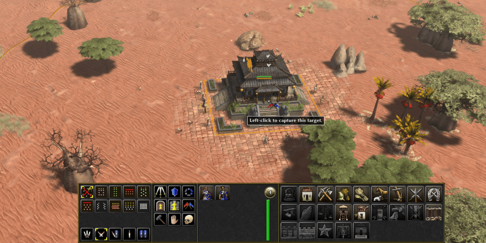
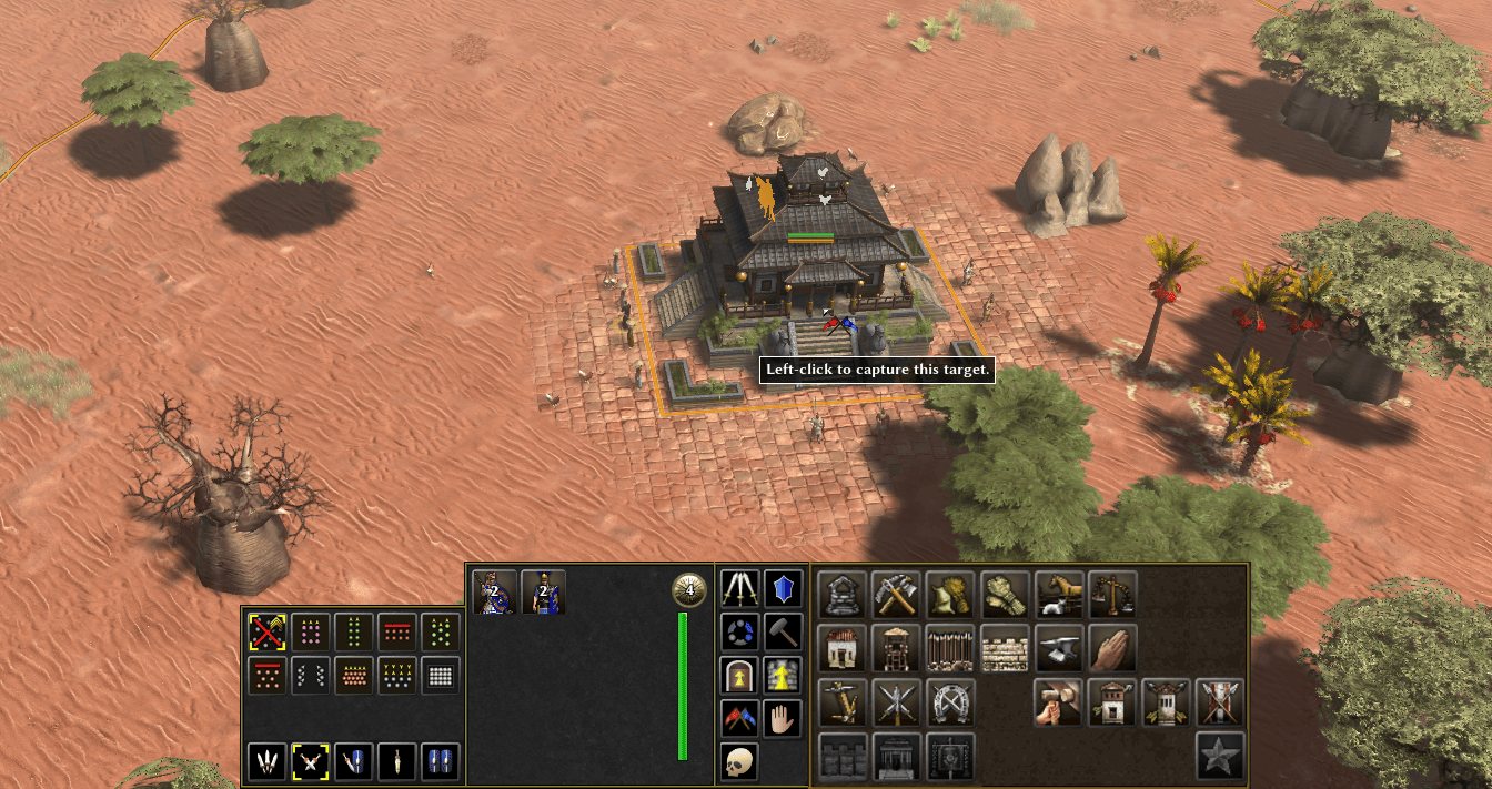
@Atrik considering your four points, and using the Construction Panel layout I proposed long ago, I end up with this, which has the same height as your panels, and the additional width is less than the width of a small button:
-
As a military colony?
-
.thumb.jpeg.67ef5b5dc6d918163efa04cd5336830d.jpeg)
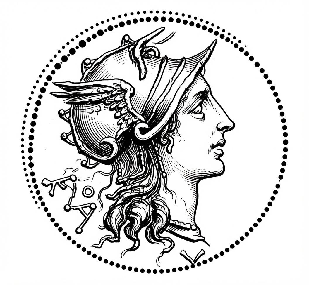
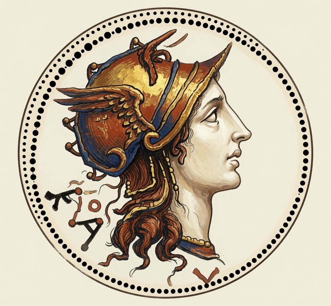
Some AI experiments....
Nicolaus_von_Kues replied to Lion.Kanzen's topic in Tutorials, references and art help
Things have changed so much. Alexander as Amon(Baal-Amon?)..thumb.png.c53bb82293213aee5e9de71e5e83c461.png)
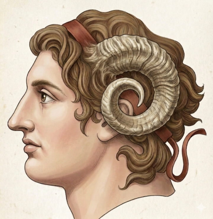
-
At least this should improve some details.
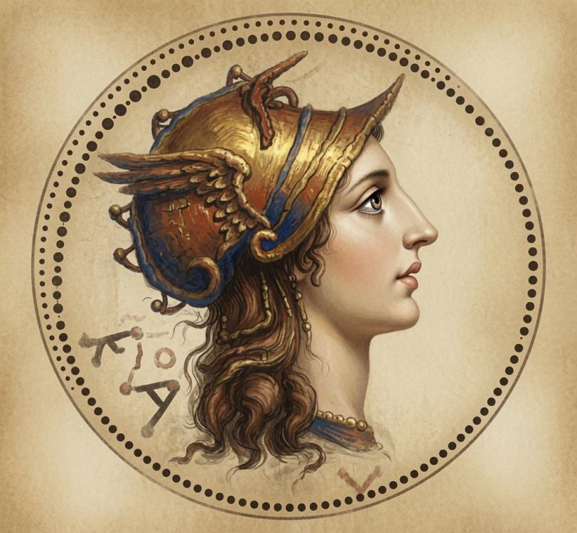
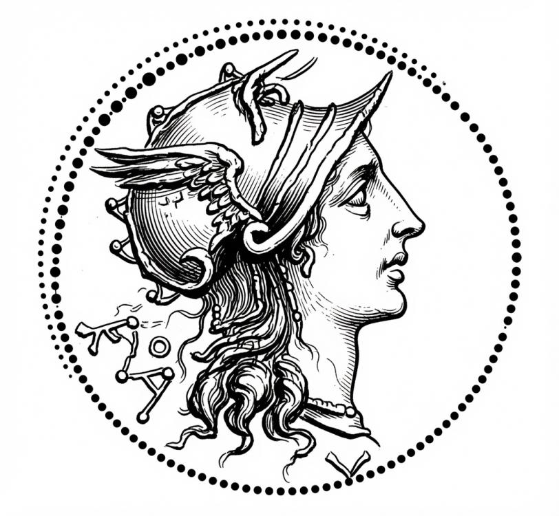
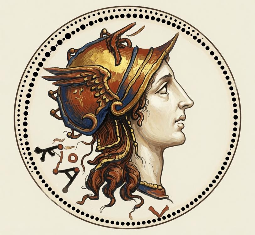
-
so britons build hill forts to 'expand'. We give them (and other trible civs) only one "main civic center" then they expand through "colony" type buildings, brits, gauls, germs can all start doing it p1 with their hill forts, oppidums and encampments. Iber is a tribal civ but cant expand utnil p2 like other civs with its "castro". Castros are a liuttle closer to colonies, maybe a little stronger, id have to check all the stats. Where as the other 3 are weaker than a normal colony and defintely weaker than a cc.
-
I'm not familiar with the mod, what are you using these images for?
-
Icons aren't the issue. Im working with ChatGPT to help with things. But we had a problem when we tried to recreate actors to look like some of our ICons. IE the brit hill fort and great hill fort pictured here: I actually don't mind the "cc" actor too much, but it would be nice to get it to include some palisades and look likes its more up on a "hill" if thats possible.
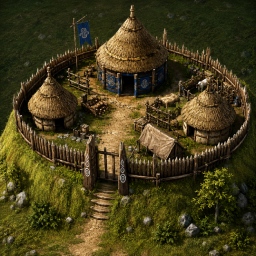
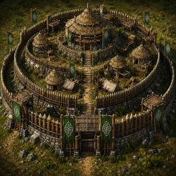
-
What do you need? Which icons?
-
already have a topic
-
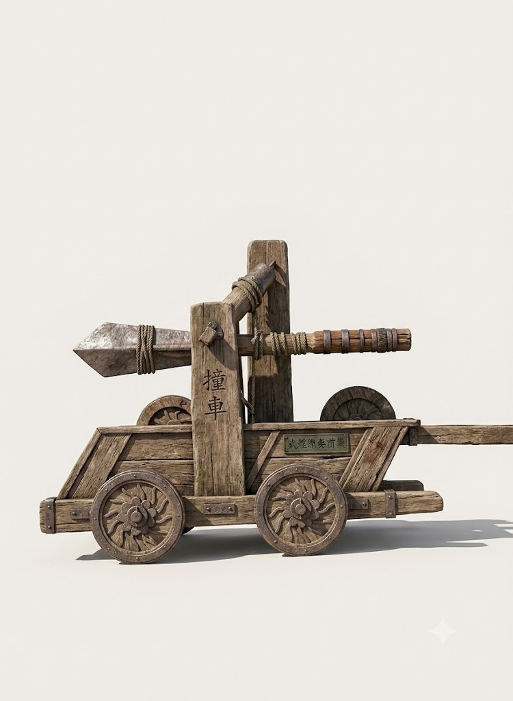
Chinese Greek battering rams.
Nicolaus_von_Kues replied to Akira Kurosawa's topic in Art Development
I can create some things and draw others. Open a topic in the mod forum and I'll see how I can help you. -
Arg, unfortunately I am neither But would love to work with people who can help create props, art work for CWA. We have a lot of new ideas, like brit hill forts etc, but cant use any new actors yet
-
Chinese Greek battering rams.
Nicolaus_von_Kues replied to Akira Kurosawa's topic in Art Development
I know how to do some basic things and I have contacts with some artists. What I sometimes need is people who program. -
1) Yes, I realised I might be occupying too much horizontal space, but instead width can be reduced and height increased, after all I proposed this redistribution of the construction panel some time ago: https://wildfiregames.com/forum/topic/143192-construction-panel-layout/ 2) I'm not sure what you mean by this, but some panels could be reordered. 3) Yes, I realised that and I almost swapped the 2nd and 3rd panel because of it. In any case, actions are divided in what structures to build, and the rest, which seemed a bit different to me. 4) Yes, I thought about the single selection case, but considered that the username could be placed somewhere else, like in the upper panel. After all, why does that appear for single selection, but not for multiple selection? That doesn't make much sense to me. I proposed plenty of things in my preceding posts: first said "maybe "stations" would be a better word", that "a more generic "Occupy" button could be used, which could also act as a Capture button", and later said that, in case one wants "to have structures that can be both garrisoned and posted (this should be the term, instead of "turreted"), the Occupy Turret button could be renamed to Post", and that "Capture could still be achieved with the Garrison and/or Post buttons". Since on the latest layouts there seems to be plenty of space for extra buttons, that last thing doesn't seem necessary (could still be an option). In conclusion, right now the simplest thing would be to rename "Occupy Turret" to "Post", or "Take Post", and to change its description from "Order the selected units to occupy a turret point" to "Order the selected units to take a post", and with the present icon I think things would be clearer. Or "Order the selected units to take a post on the battlements", if all these external points are going to be behind parapets with crenellations.
-
Chinese Greek battering rams.
Nicolaus_von_Kues replied to Akira Kurosawa's topic in Art Development
You just select the artistic style and ask it to do it that way. I used Gemeni AI with Nano Banana 2. -
I love these! I would like to do stuff like this, but I only know how to create icons with AI. I tried to get it to help me create some new props and what not for buildings but it said 0ads coding/way of doing it was too complicated and not worth it. OR at least something along those lines. Do you know how to actually make new actors, props etc? Or just created the images?
-
Chinese Greek battering rams.
Nicolaus_von_Kues replied to Akira Kurosawa's topic in Art Development
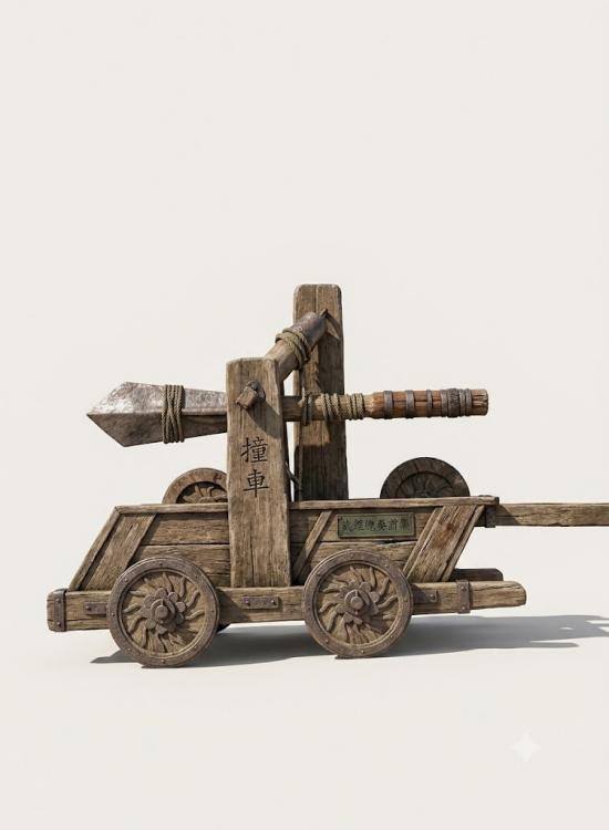
-
I like the gain in clarity and the attempt to normalize panel's heights. There are a couple reasons why I still couldn't go for this. Lateral space is already scarce in ModernGUI if you don't have a big screen Although your suggestion takes as much total space as what's implemented in the mod, it adds the clutter a bit more to the center of the screen. For users that use hotkeys for unit action anyways, or at least for myself, this is not desirable (maybe it's just something you could get used too idk) Contrary to what you say, the placement is logical. All possible actions are on the right side, all attribute-like options on the left (formation stance..) Currently the single selection detail panel wouldn't be able to shrink down height without losing something. You are basically saying the wording "turret point" is confusing but you aren't suggesting anything.
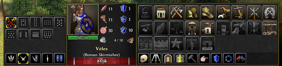
-
Chinese Greek battering rams.
Nicolaus_von_Kues replied to Akira Kurosawa's topic in Art Development
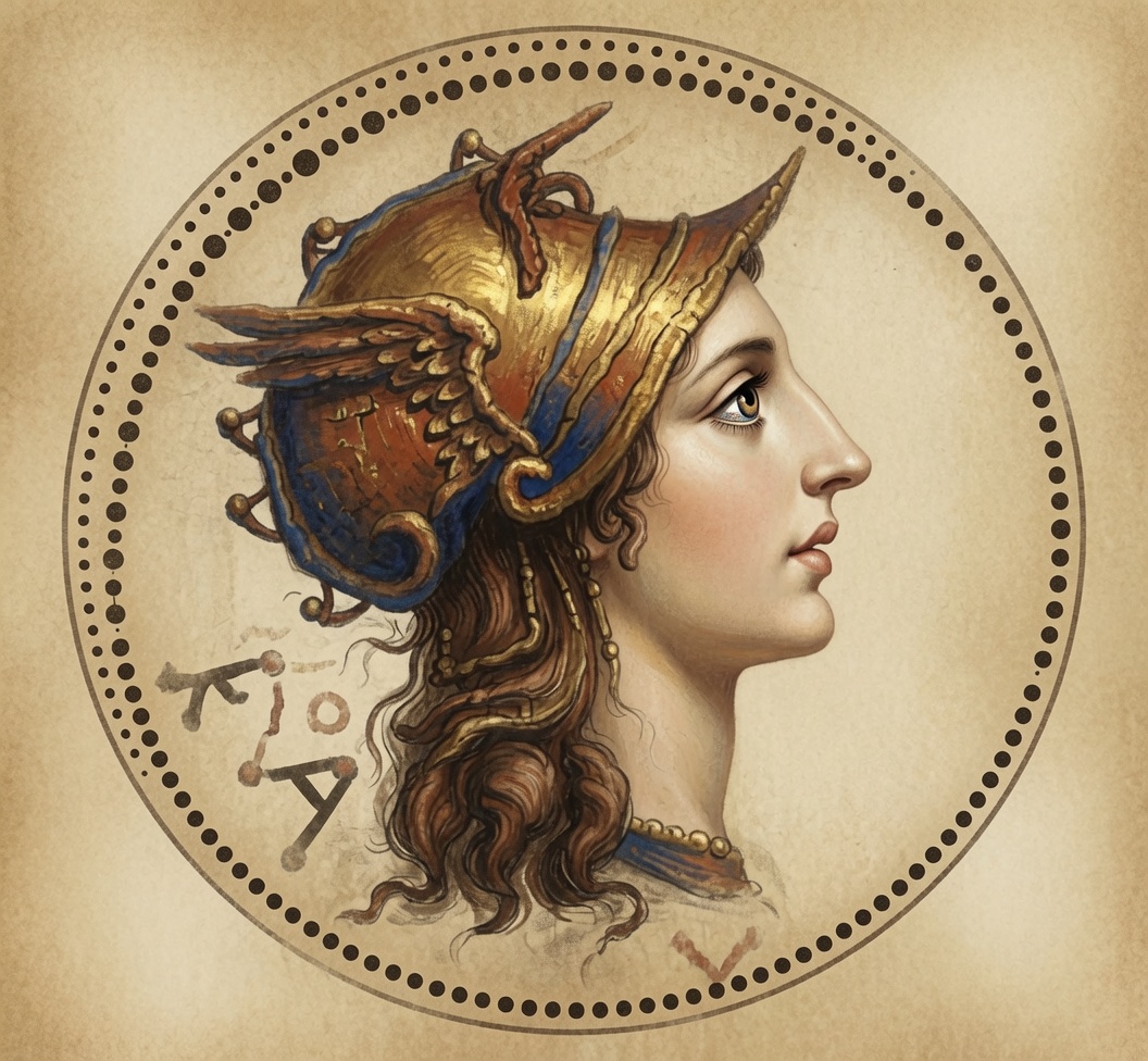
Playing with ai..thumb.png.3eda66aafde91c3b969f458647973b40.png)
.thumb.png.4b5159cc4ae99f0838735688f527809f.png)
- Yesterday
-
It seems to me that those buttons are placed on a panel dedicated to something else… What about something like this instead? (I also changed their ordering to something a bit more thematic): There would still be the issue I mentioned that many turret points have nothing to do with turrets, which was confusing me from the beginning.







.png.2dd9c28b1139f16f3d84f06acc051eef.png)
.png.5b59a171c3d4245f602aee9658d22b06.png)
.png.888127a316d85044a8fd4ad5f7d59d27.png)
-
Latest Topics
-