Thalatta Posted Wednesday at 17:34 Share Posted Wednesday at 17:34 I think the same things should be indicated by the same icons in both the Civilization Overview and Technological Tree, otherwise there’d be a confusing multiplicity of icon representations, and both would look aesthetically disconnected. Link to comment Share on other sites More sharing options...
wowgetoffyourcellphone Posted Thursday at 08:23 Author Share Posted Thursday at 08:23 14 hours ago, Thalatta said: I think the same things should be indicated by the same icons in both the Civilization Overview and Technological Tree, otherwise there’d be a confusing multiplicity of icon representations, and both would look aesthetically disconnected. Yeah, the headers, buttons, etc. would all be consistent. Also, the little motifs and UI elements for each civ would be consistent across the different windows. 1 Link to comment Share on other sites More sharing options...
wowgetoffyourcellphone Posted Thursday at 22:19 Author Share Posted Thursday at 22:19 On 01/07/2026 at 5:19 AM, hyperion said: The structure tree mockup is also much better then the current one, do you have one for in-game ui as well? 2 Link to comment Share on other sites More sharing options...
wowgetoffyourcellphone Posted Thursday at 22:21 Author Share Posted Thursday at 22:21 3 2 Link to comment Share on other sites More sharing options...
wowgetoffyourcellphone Posted Thursday at 22:52 Author Share Posted Thursday at 22:52 Potential Athenian design elements, which would be re-scaled obviously. They could even be combined into a texture sheet. 4 Link to comment Share on other sites More sharing options...
wowgetoffyourcellphone Posted Thursday at 23:11 Author Share Posted Thursday at 23:11 ======================================================================================== ================================================================================================ 4 Link to comment Share on other sites More sharing options...
Lopess Posted yesterday at 01:19 Share Posted yesterday at 01:19 @wow, larga o celular In the current version of 0ad, is it already possible to implement customized for each civ? Link to comment Share on other sites More sharing options...
Thalatta Posted yesterday at 01:56 Share Posted yesterday at 01:56 3 hours ago, wowgetoffyourcellphone said: Very nice, clear, and useful. I hope something like this is eventually implemented in the base game. I guess it's also a mock-up because there are a very few small issues. But my questions are: does hovering over classes give some info regarding them? If so, maybe showing them as tags would be nice. Are those base stats (which I'd state with small icons, their names shown if hovering over them), or already include the applied techs effects? If so, it would be nice to have some break down of that anyway, maybe by hovering over them. Finally, when I see that aura, I wonder if it's "passive" or "active" (if there are active auras at all), and if that wouldn't be better as a Formation effect or similar. Link to comment Share on other sites More sharing options...
wowgetoffyourcellphone Posted yesterday at 02:34 Author Share Posted yesterday at 02:34 1 hour ago, Lopess said: @wow, larga o celular In the current version of 0ad, is it already possible to implement customized for each civ? As far as I know, it's only implemented for minimaps. I am not sure if it's currently possible for other UI elements or if it would need new code beyond just creating sprite XMLs, etc. Link to comment Share on other sites More sharing options...
wowgetoffyourcellphone Posted yesterday at 02:48 Author Share Posted yesterday at 02:48 51 minutes ago, Thalatta said: Very nice, clear, and useful. I hope something like this is eventually implemented in the base game. I guess it's also a mock-up because there are a very few small issues. But my questions are: does hovering over classes give some info regarding them? If so, maybe showing them as tags would be nice. Are those base stats (which I'd state with small icons, their names shown if hovering over them), or already include the applied techs effects? If so, it would be nice to have some break down of that anyway, maybe by hovering over them. Finally, when I see that aura, I wonder if it's "passive" or "active" (if there are active auras at all), and if that wouldn't be better as a Formation effect or similar. I would of course love to have tooltips for most items you suggest! I'd prefer the base stats to stay text though, but that's just me. For auras, there is currently not a gameplay distinction between 'passive' or 'active' auras. The only distinctions we currently have are: ranged, global, formation, and garrisoned auras. And yes, such an aura is best as a Formation effect, but those only exist in 1 mod, not the base game or DE. Link to comment Share on other sites More sharing options...
Thalatta Posted yesterday at 03:12 Share Posted yesterday at 03:12 17 minutes ago, wowgetoffyourcellphone said: I'd prefer the base stats to stay text though, but that's just me. I was thinking that because it seems you'll need way more stats for some units (for kinds of damage, range, spread, etc), then icons would give you space for a 4th column, if not also a 5th one. Link to comment Share on other sites More sharing options...
wowgetoffyourcellphone Posted yesterday at 03:18 Author Share Posted yesterday at 03:18 7 minutes ago, Thalatta said: I was thinking that because it seems you'll need way more stats for some units (for kinds of damage, range, spread, etc), then icons would give you space for a 4th column, if not also a 5th one. That section can expand vertically to accommodate the extra stats (or there could be a vertical scrollbar). The Historical section can shrink vertically to give room, since it has a scrollbar. Link to comment Share on other sites More sharing options...
Perzival12 Posted yesterday at 03:35 Share Posted yesterday at 03:35 46 minutes ago, wowgetoffyourcellphone said: And yes, such an aura is best as a Formation effect, but those only exist in 1 mod, not the base game or DE. 2, I have them for the Hylians in Hyrule Conquest: Revival. 1 Link to comment Share on other sites More sharing options...
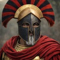
Nicolaus_von_Kues Posted 9 hours ago Share Posted 9 hours ago It's very beautiful, but some areas have a lot of detail. I started playing around with some concepts. You should keep the image backgrounds simple so they work. Link to comment Share on other sites More sharing options...
Thalatta Posted 5 hours ago Share Posted 5 hours ago @Nicolaus_von_Kues where are those images from? Things you are testing? I really like many ideas there. Link to comment Share on other sites More sharing options...
Nicolaus_von_Kues Posted 2 hours ago Share Posted 2 hours ago (edited) 2 hours ago, Thalatta said: @Nicolaus_von_Kues where are those images from? Things you are testing? I really like many ideas there. I thought of trying out some concept art using a screenshot. I asked the AI to modify the concept art from a screenshot. I told to AI: "Do this concept Diablo-style." I think the Wow concept lacks sobriety. Everything is so flashy that it loses balance. This is because many images seek to be the main focus, using the backgrounds as the main focus, when the decorative elements already stand out too much. It occurred to me to try other concepts that stand out but have a visual hierarchy where there is an order to highlight them. Just so that wow can see and compare how a visual hierarchy works with other concepts. Edited 2 hours ago by Nicolaus_von_Kues Link to comment Share on other sites More sharing options...
Nicolaus_von_Kues Posted 2 hours ago Share Posted 2 hours ago (edited) 7 hours ago, Nicolaus_von_Kues said: It's very beautiful, but some areas have a lot of detail. I started playing around with some concepts. You should keep the image backgrounds simple so they work. In the first photo I used a generic concept of the graphic style of Paradox games. If you pay attention, the backgrounds don't stand out; their role is not to stand out, they don't seek to take away the prominence of the sets or the titles. Edited 2 hours ago by Nicolaus_von_Kues 1 Link to comment Share on other sites More sharing options...
Nicolaus_von_Kues Posted 2 hours ago Share Posted 2 hours ago (edited) Change some details but I'm not convinced. The one above is better because the background is more conservative, without so much detail. The background doesn't seek to stand out, it seeks to fulfill its role. Edited 2 hours ago by Nicolaus_von_Kues Link to comment Share on other sites More sharing options...
Recommended Posts
Create an account or sign in to comment
You need to be a member in order to leave a comment
Create an account
Sign up for a new account in our community. It's easy!
Register a new accountSign in
Already have an account? Sign in here.
Sign In Now