-
Posts
702 -
Joined
-
Last visited
-
Days Won
38
Everything posted by Vantha
-

Adding storylines to scenarios and campaigns
Vantha replied to Vantha's topic in Game Development & Technical Discussion
- 71 replies
-
- 10
-

-

-
Well, yes, in scenario maps custom victory conditions for each team are possible, even for each player. However, the code behind the victory condition "presets" (the ones selectable in game setup -- Regicide, Wonder, Conquest, etc.) is currently not designed to work on a subset of players only.
-
Technically, any victory conditions you can think of are possible in scenario games, since you can mark players as won or defeated at any point in the trigger script (if any desired condition is met). And that can also be done "asymetrically". But to make a victory condition work on any map (also random and skirmish ones) and make it selectable in the game setup, the logic has to be centralised in a designated script -- which, however, isn't inherently more difficult than implementing it for a single map) So, yes, a tower defense scenario would be possible.
-
Hey @ffm2, thanks. As of now it's nowhere visible in the game, but since 1b797ce0a0 the tips are already divided into categories: "Basic", "Intermediate", "Advanced", and "Multiplayer" (not gameplay related). It was always my plan to add a dropdown to the tips page to switch between them. And also to add another category called "Expert" above the rest -- for the multiplayer community; for exactly tips like the ones you described above. So, yes, I can certainly add them to the game. But they will have to be shortened and we need some images to go along with the text. I'm rather busy with some other projects here at the moment, but I will note it down.
-
I have never worked with the statistics tracker in the past, unfortunately, but I'll keep it in the back of my mind.
-

Adding storylines to scenarios and campaigns
Vantha replied to Vantha's topic in Game Development & Technical Discussion
I will keep it general and go for just "page". It's not the 100% fitting term, but it's simple, and players will understand what it refers to. -

Adding storylines to scenarios and campaigns
Vantha replied to Vantha's topic in Game Development & Technical Discussion
I need some help with naming. How should one instance of the story parchment overlay, text and image together, be called in the game? E.g. for the button tooltip: "Switch to the next/previous ______". Something like a "chapter", but shorter than that. -
I think I have owed you all an update on this project for a long time now. Me and @ShadowOfHassen have neither forgotten about the encyclopedia nor given up on it. I'm as convinced by and passionate about the idea as ever. It's just that I don't consider the project as high priority as other ones (like making campaigns or a tutorial). However, I can promise I will get back to the encyclopedia eventually: My plan is to overhaul the UI completely (in terms of appearance). The current one looks alright, but it just lacks that artistic touch. And, good news, I am actually in touch with @whiteebony82, he's creating sprites for it, and what I've seen so far looks amazing. Something to look forward to. About the articles, I'd love to resume the writing process, I'm hoping I'd able to still write some texts every now and then, but because I'm now more involved in the technical side of things, it'll never be as much as it once was. I haven't talked with @ShadowOfHassen about it yet, but before picking it up again I think we have to find some more people interested in helping, if we ever want to see it finished. One thing I want to do for sure, though, is to go over all of my old art and improve them (as ShadowOfHassen did with his in the past) before adding any new ones. Looking back, I could have done a lot better and often missed the point. Regarding the code, there is still the PR I opened last summer: https://gitea.wildfiregames.com/0ad/0ad/pulls/6997. It contains only the core parts of the page, but also the most recent version of the code. It is marked as"WIP" right now, which means review progress on it has stopped because there are changes planned it -- the UI changes I talked about above. When I've achieved a UI that I'm happy with I will remove the label again, get it moving and hopefully merged soon. Then there is also the github repo I made a while ago: https://github.com/indoptogopt/GUI-page-for-0ads-encyclopedia The code in it is neither up-to-date with the PR, nor compatible with A27. However, the repo stores all of the articles in the latest state. I'm still unsure what to do with it; in regards to the code, it doesn't provide much value to me, maybe it would be better to make a new repo dedicated to just the articles. TL;DR I won't resume now, but I'll do when the time is ready. As a first step, I ported the encyclopedia demo mod to the A27 release version and as recommended created it with pyrogenesis' archive builder this time. To install it, left-click on the downloaded file -> 'Open With' -> '0 A.D.' encyclopedia.pyromod @Genava55 (This mod's purpose is really just to demonstrate functionality, my goal is to add the that to the game eventually, which is why I will not be putting it on mod.io)
-
https://gitea.wildfiregames.com/0ad/0ad/wiki/FAQ#what-shall-i-do-when-joining-multiplayer-matches-fails-with-an-error-message Also, Alpha 27.1 will include a patch fixing the automatic creation of port forwardings via UPnP, which should resolve the issue for some players entirely (to be precise, for those with UPnP enabled on their router).
-

Adding storylines to scenarios and campaigns
Vantha replied to Vantha's topic in Game Development & Technical Discussion
Alright, that's what I'll do, likely starting with the parchment overlay. There's some other stuff I have to finish first, but I will get to this soon. -

Adding storylines to scenarios and campaigns
Vantha replied to Vantha's topic in Game Development & Technical Discussion
I came across this a while ago, I have yet to try it out, but it looks fantastic. It's one of the things that I'd like to pick up or help with, if only I had more time. -
There's an old patch for it: https://code.wildfiregames.com/D4246
-

Adding storylines to scenarios and campaigns
Vantha replied to Vantha's topic in Game Development & Technical Discussion
Which of the two would you all prefer? If there's no clear tendency then I suggest to provide both options and leave it too up to campaign makers how and when to use them. -

Adding storylines to scenarios and campaigns
Vantha replied to Vantha's topic in Game Development & Technical Discussion
Point taken about versatility. It's probably best to provide options for both. We can discuss what style to opt for with built-in campaigns when the time comes to make them. Might make sense to do a poll. About the "hero talking" mockup: In what cases would it be preferred over the parchment overlay? Could they be used in combination? How do other games do it? -

Adding storylines to scenarios and campaigns
Vantha replied to Vantha's topic in Game Development & Technical Discussion
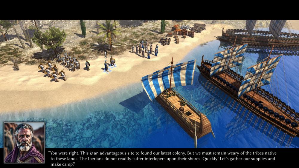
It would be really quick to implement. We already have a "cinematic mode" and apart from that it is literally just two black bars, a text field, and a portrait. The only thing a bit more tricky is that exclamation mark above the talking character. -

Adding storylines to scenarios and campaigns
Vantha replied to Vantha's topic in Game Development & Technical Discussion
-

Adding storylines to scenarios and campaigns
Vantha replied to Vantha's topic in Game Development & Technical Discussion
I agree. Any ideas on how could we use it in combination with that parchment? -

Adding storylines to scenarios and campaigns
Vantha replied to Vantha's topic in Game Development & Technical Discussion
Maybe we can do both. An introduction at the start like this: "It's the year ___. The ___ wars have ended a few years ago. ___ has died and was succeeded by ___... " and then switch over to a monologue of the main characters. We could communicate the difference between the two by adding quotation marks to the last one and showing an image of the character, for example. These images look indeed quite nice and I'll experiment with them. And I agree the charcoal style fits really well. In general, though, I'm very reluctant with using AI images. For actual campaigns we'll have to find an artist somehow. I'm sure this charcoal drawing effect can be replicated in Photoshop. Then there's also the option of having the characters talk in the game view directly (or a cutscene). Here's a mockup created by @wowgetoffyourcellphone: -

Adding storylines to scenarios and campaigns
Vantha replied to Vantha's topic in Game Development & Technical Discussion
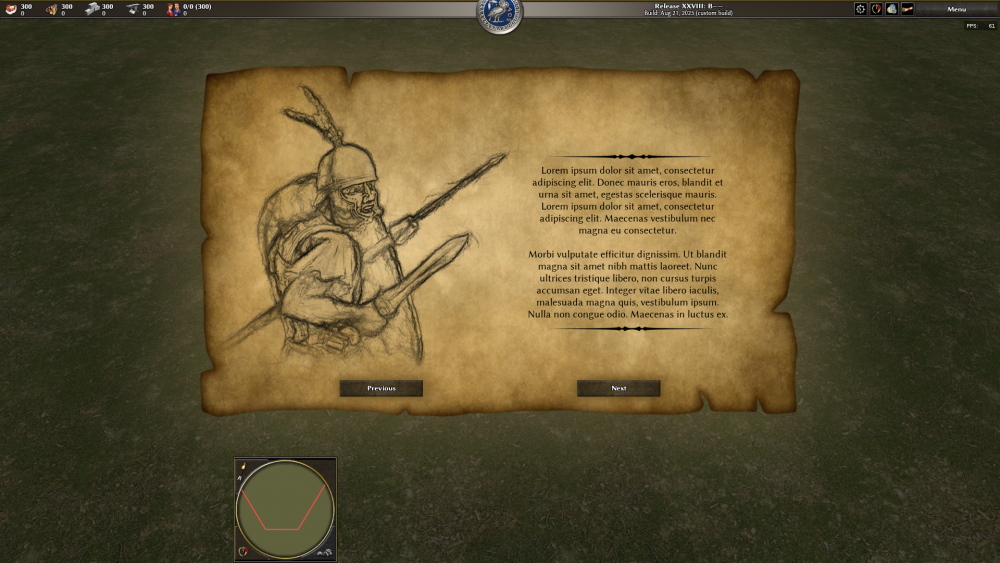
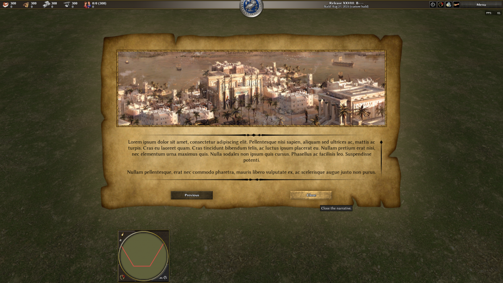
Ok, I'll make those changes. Actually, I quite like that "overlapping"; having the image cover everything and then placing the text on top in some free space of it. That's totally possible. The only downside is it could make the text "jump" around quite a lot between slides/screens. Also, it would require specifying the text position for each image separately, although that's a small price to pay in my opinion, and there could be a default layout to fall back on when no custom one is needed. I want to add an image to the mockup, but I don't know what. Do you think stories have to evolve around a specific character? Should they be told in first or third person? -

Adding storylines to scenarios and campaigns
Vantha replied to Vantha's topic in Game Development & Technical Discussion
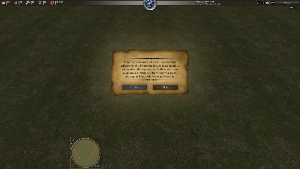
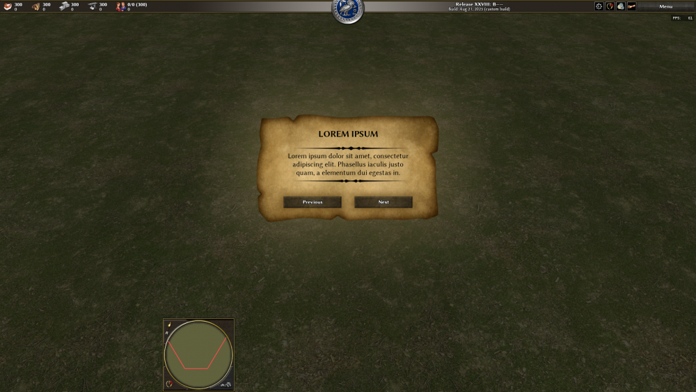
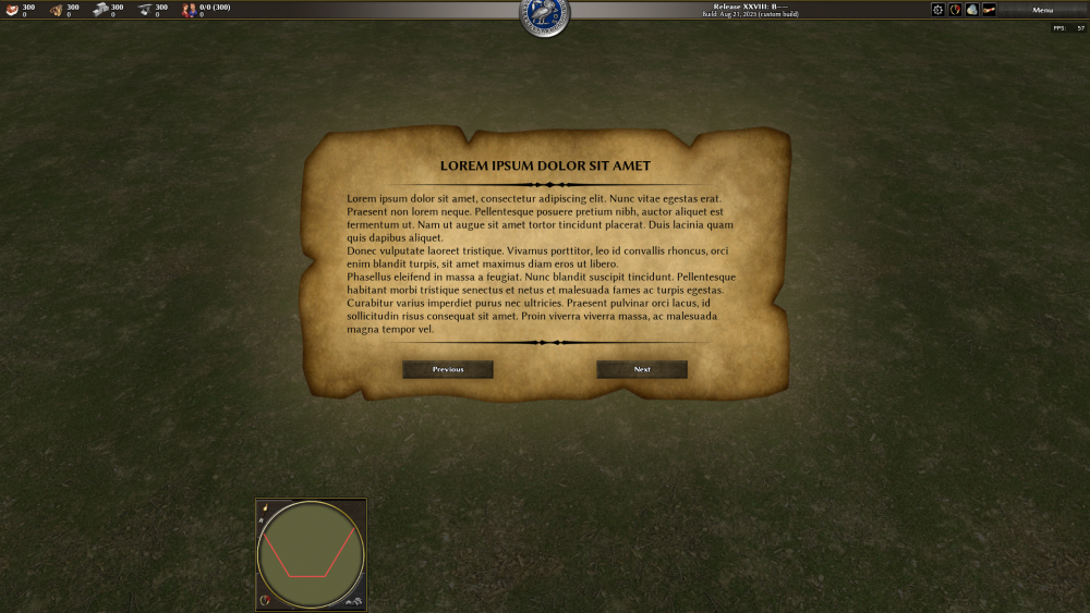
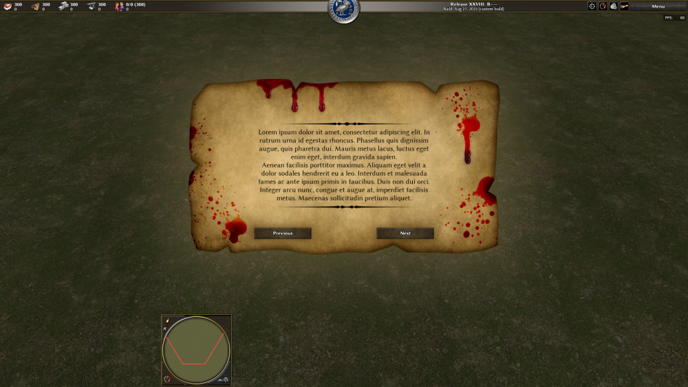
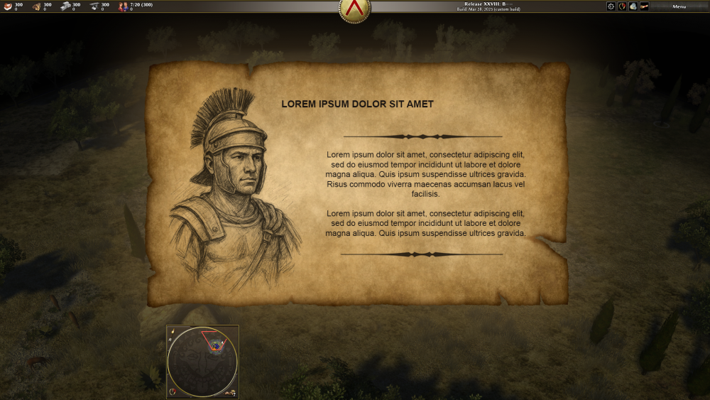
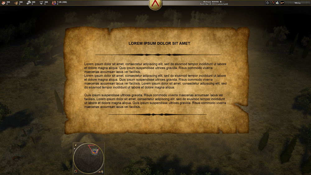
That's good inspiration. Here is a mockup I made a while ago: It's comparable to the storytelling screen of AOE2 DE, no? It's missing an image obviously, which is essential to achieve a more aesthetic look. The question is how to and where to place images on that parchment (in terms of layout) and where we can get them from in the first place... Can we maybe find an artist to draw characters or scenes for it? Or do you think there would there be enough royalty-free material available online to cover some basic campaigns? -

Adding storylines to scenarios and campaigns
Vantha replied to Vantha's topic in Game Development & Technical Discussion
Haven't looked into it in detail, but should there be a need for it in a specific campaign or game mode in the future, it can (and hopefully will) certainly be done. I wouldn't call it a "simple" change either, though. -
I think most players would agree that the single-player content 0ad offers is meager, especially in comparison to other RTS games. There are many great scenario maps, but there are no built-in campaigns. In my opinion the underlying issue is that there is simply no way for map makers to tell a story. I want/plan to make an interface for exactly that; the capability to tell the player about the historical context and events a game or campaign is based on, and to pack it into a plot that unfolds while the player plays through it. I'll disclaim it straight ahead: I'm not the typical and traditional RTS player that I know many other people in this community are -- e.g. I haven't player the AOE games. It might be because of that, but I personally dislike the idea of adding actual dialogue and voiceovers. I'd personally rather convey the feeling of reading a history book. However, I am well aware that there are players who would disagree with this. So why not do both? We could have history-book style prologues and epilogues and something alike at key points too. And to bring the story to a more interactive, personal level, add the ability to have character monologues and dialogues. What do you think? I made this thread to collect concepts and ideas on how to make it work and look. (By the way, I made some mockups for this a while ago, I'll post that in here when I've cleaned it up.)
-

What is the 'Arabia' of 0 AD?
Vantha replied to Thorfinn the Shallow Minded's topic in General Discussion
It is, albeit quite short:


