(1).gif.32c2bb713b57cac09a403d6da6e96fff.gif)
borg-
-
Posts
1.010 -
Joined
-
Last visited
-
Days Won
21
Everything posted by borg-
-
This confirms what I have said, many opinions and few decisions.
-
It's important because what keeps a game "alive" is its multiplayer and loyal players who play every day, even with a horrible balance. I think it's fair to give them at least a playable balance, regardless of whether they're ready or not.
-
I have already put me in total disposition to do the balance of the game, respecting the gamedesign of game, that is to say, with or without counters system. I'm sure i would do a great job. Probably the most experienced player of 0 a.d, with the most games, besides being the best player. Not only that, I am now 28 years old, and I have played rts games since my 8 years, most of the time competitively, a practical example is to be in the semi finals of an age of empires championship in this moment. I must be the one who understands the most here in the balancing part. The real problem I see is that with each small change, you should by voting and asking the opinion of many people, who most of the time do not even play the game, at least not multplayer. It makes no sense to me. The team should be small, with a maximum of 3 guys taking care of it.
-
A lot of opinion and little decision. This is the real problem.
-
(1).thumb.gif.b5909d3df98a8ec15dc452423f219bc5.gif)
Age of Empires definitive edition [remaster]
borg- replied to Lion.Kanzen's topic in Introductions & Off-Topic Discussion
it's so beautiful -
In my opinion, real game rts is really a strategy game if have a counter system. If it does not, it happens what is happening in 0a.d, spam random units without a purpose. Not to any strategy in that, you do not need to think about something that will overthrow your enemy, just in creating more units than he, I do not see anything rts in it.
-
This type of system can also give versatility to the game. You do not need to have the same 3x for all spearmans, sparta for example for u history, can have something like 3.5x.
-
I'm sure my system works because very similar systems are working on other rts, and also for the lot of experience I have with 0 a.d and other rts. If accepted, with adjustments in the balancing, we could make it work very well, I'm sure.
-
We have to keep in mind that the units will need new values, for example, skimirsher cav can never have an attack of 18, it should only be effective against a type of unit, so the general attack of the units will probably be lower.
-
Well, this has been discussed for some time, quite simply I'll put my idea of a counter system. I prefer a hard system where the bonus is high, and you have to use your units wisely, making it almost impossible to win a game with only one type of unit (which happens for some time). Spearman: 3x - All Cavalry; Pikeman: 4x - All Cavalry; Swordman: 2.5x - All Infantry; Archers: 1.5x - All Infantry; Cavalry Swordman: 1.50x - All Ranged (including ranged cavalry); Cavalry Archer: 1.25x - All cavalry, All Infantry; Cavalry Spearman: 2.0x - All Cavalry; Cavalry Skirmisher: 2.0x vs Ranged Infantry; Skirmishers: 2.5x - Ranged Infantry; Slingers: 2.0x - Ranged Infantry; The system includes champions. It is clear that the values may be smaller, but all in equal proportions. Of course, the system requires some changes in the overall balance.
-
Well, it's the first time I see this in the game. One guy was using my nickname, he came in, said some things in Spanish and left, then came back as chrstgtr and then we played a 3v3 match with two chrstgtr. Mapkoc explained to me that this can be done via ip, so I get it, but he asked me to post this in the forum anyway. print: https://postimg.org/image/ggnpt0e4j/
-
Desired gameplay(planned) features for A23
borg- replied to Lion.Kanzen's topic in Gameplay Discussion
The best games I played were in a16. On hotkeys, I would like something editable, that we could customized, as in other rts. -
Desired gameplay(planned) features for A23
borg- replied to Lion.Kanzen's topic in Gameplay Discussion
Well, I must be one of the few who would not want to see lots of new things. I'd like to see optimizations in lag (multicores) and mainly in pathfinder. Ony two new things that I would like to see: 1- Counter system 2- Hotkeys for buildings -
Age of Empires definitive edition [remaster]
borg- replied to Lion.Kanzen's topic in Introductions & Off-Topic Discussion
Units they are movement/animation very good. I would like to see something similar on 0a.d someday. -
y wololo vibe
-
If u rotating, what was invisible becomes visible, but part of what was visible becomes invisible.
-
Newbie questions (suggestions for the manual)
borg- replied to IkkeTM's topic in Gameplay Discussion
Welcome!!! 1 - How more units, more arrows (dont work with womans). 2 - Units are only promoted by fighting. 3 - The game does not have a counter system yet -
I made a patch with some changes about it, I do not know if it will be accepted. You can see in https://code.wildfiregames.com/D574
-
Expansion gamemode. Whoever has the greatest number of territory in a determined time, win the game I do not know if anyone has already proposed this.
-
Well I have one more suggestion: D I think it should be audible as soon as the population reaches the limit and you need more houses. A beep resembles when you create new soldiers.
-
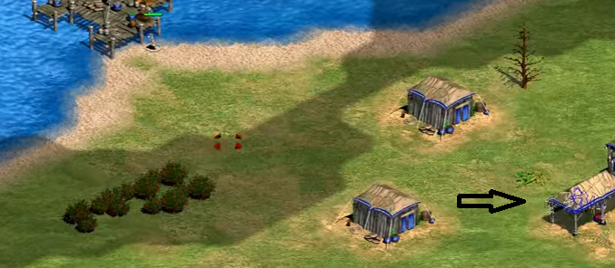
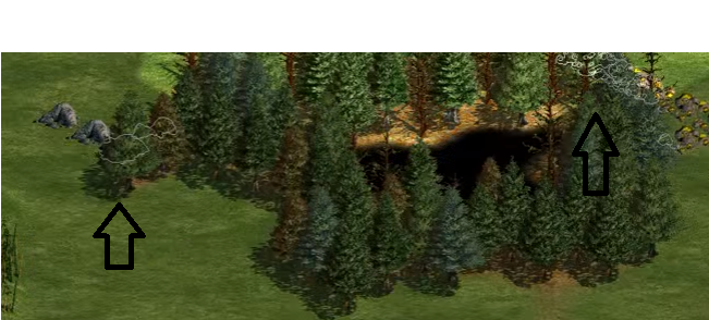
About the silhouette of the units, we know that it is possible to activate them through the options. But why not also expand to gaia? That would be something like the images I put down, animals (white), shrubs (green), stone (white), metal (golden). Especially small animals are a problem when they are in the trees, you waste a lot of time looking for them, I think this suggestion is valid and in great need. I also think it should be optional as well as for units.
-
I've played, and it's a good game, it's not my favorite style either, but it's a good fun.
-
1- In 0 a.d the units can pass through the trees, so the walls actually lose a little of their value, at least at the beginning of the game. 2- Wood Walls should be more a bit cheaper. As trees do not serve as walls, then you always need a large amount of walls to have a significant defense. This would easily cost you 500 wood, which is inpensavem at the beginning of the game. Towers cost 5 and walls 4, i think 3-2 more apropriate, I would certainly start using. 3- Stone walls are actually much stronger, in two situations, damage and defense. I would greatly decrease your hit points and a bit of your damage.
-
Wow thanks!!! I did not know, and I think most players do not know. Likewise, I think this should be simpler with just the right click, without the Ctrl.
-
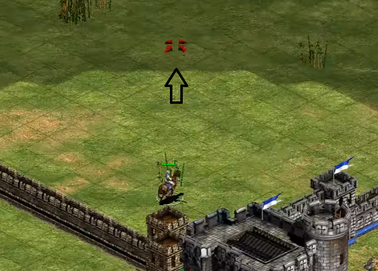
1- We need an indicator for minimap, For now nothing complex, (attack here, help here, etc..) just something to indicate. 2- I would like to see the units come out of different points of the constructions as indicated. They are always coming out ahead, this can sometimes be delayed (if you have only wood behind the CC, it takes a lot longer to get around), and also prevents you from ambushes or fleeing enemies that are around the building. 3- One thing I really miss, is to be able to create units and leave them inside the building as soon as they are ready. Currently you can not do this, they leave the building so you can put them in later, and they can often die carelessly instead of protected. 4- Rabbits should be domestic like chickens. Its very very hard kill them with horses range, are very small, and need more than one attack. I do not see any player hunting habbits, is very rate. They should be hunts like chicken. 5- What I'm going to put here seems to be something of no value, but I missed it a few days ago, and I'll expatiate because. As you can see in the picture, most games have an indicator of where your unit will move, after your click, at 0 a.d we do not have this, I never felt lacking to be honest, but days ago I was having problems in my Mouse, right click, then sometimes it ended up not clicking, so I got lost several times, (there were not few) because I thought I had clicked and had not, as we do not have the indicator I had no way to know. I relied on the audio, okay is a good indicator, but have you stopped to think about possible deaf users? I think an indicator would really be very useful, especially for users with possible hearing problems.