-
Posts
145 -
Joined
-
Last visited
-
Days Won
5
Everything posted by Ayakashi
-
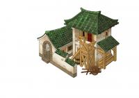
On another note. I still have an issue with the footprint of the houses. I have brought this up before but the problem isn't the size of the actual houses but the way you get all this impassible/unbuilable spaces around them so that if you build a bunch of houses together you get these wide gaps that you can't move your units through. It would be nice if the 2 smaller variants be scaled up or modified (add extra bits maybe) to match with the 2 bigger ones and to cut down on the useless empty space.
-
Would it be worth attempting to divide each individual field into 3 or 4 terraces of irregular shapes. Each terrace would then adapt to the terrain so that if one field is built on a hill you can get terraces of varying levels to each other. Perhaps not so different from these:
-
Of course crossbowmen are too common historically during the Han to be champion. Most of them were conscripted militia men makes no sense for them to be champion. Unless of course you make a separate stronger unit that uses a heavy crossbow. I think its find as it is making them unlocked at 2nd phase. Plz refer to my pm for champion unit ideas
-
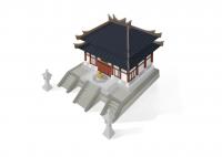
IMO it does look smaller than it should be but takes up about the right amount of space for a temple. Maybe you can give the impression of bigger scale without increasing the footprint too much by making it slightly taller and the roof just a bit bigger proportionally? Sorry my sketch don't really show it that well
-
Sorry I do find it a little bit small. Guess I originally envisioned it as big grand hall like the todai-ji in japan but of course on a much smaller scale! How does it compare it to temples of other factions? Sorry to be a pain!
-
Good work so far! I would suggest not having those windows stretch all the way to the ceiling though, it looks a bit funny. Personally I would like them to be a bit more simple, less is more sometimes I guess. Mind putting a unit or another structure next to it for scale btw? Those trees kind of make it look small but I'm aware that they're quite big trees!
-
Ok sorry that it took me too long but here it is a new concept for a Taoist temple: I know it's not as epic as my previous, but for the sake of historical accuracy I reckon this fits the time frame better. It also won't be as stupidly massive as well! We can always save pagodas for part 2 or for the 1000AD mod (and I rather draw completely new concepts for them as well) Some references for the 8 trigrams and Incense cauldron:
-
How do I run the SVN?
-
Could I have installed it incorrectly? Unzipped the folder into mods; made shortcut for pyrogenesis; target= "pyrogenesis.exe" -mod=(name of folder) But it was fine when I had the older versions :/
-
Yeah that's the version I got. Can't even put the missing stuff in scenario editor either that's where it has the validation failed message It seems whenever I select a male/citizen soldier unit there's no hud other than unit portrait. If I select a building or female citizen and then select the male unit I see the hud from the previous unit/building. Walls, towers, and fortresses etc can't be built (icons missing from hud) and can't be placed in scenario editor.
-
A16 with latest build of the mod.
-
Is everyone getting this? Several units and buildings are missing as in not trainable/buildable. Male units can't build and when you select them all hud elements are missing unless you selected a female just before. It says "validation failed". Sorry if I am stating something everyone already knows about. Haven't been keeping up to date with the msgs.
-

RotE list of missing things to the next release
Ayakashi replied to Lion.Kanzen's topic in Rise of the East
Sorry for being AWOL for so long and promising new pics then never posting them. Just got back from a really demanding job that more or less cut me off from the outside world! Anyways if a new emblem is needed perhaps there are better options than just using the Chinese text for Han? I've been working on this a while back but never got round to finishing it. What do you guys think would this work if I finish it? I also found some pics of ornaments from that period, perhapes we could base it on them? -
This might be good for reference? Found what appears to be a film set for Han dynasty period films.
-
Nice work so far but be careful of the Chinese symbols you are currently using a simplified character from the 1950s onward & its upside down. Try using this instead:
-
I would suggest against using my pagoda concept because it's not suitable for the time frame. I'll draw a new one soon! (If you are willing to gimme 4 days) Sorry for my absence lately btw. Been working 16 hours a day over the past month and 1/2 for some film project, will be over soon tho!
-
Oh snap dude this is amazing Great job on the roofs they look way better than the old rote ones! Keep up the good work mate! EDIT: That's a wheelbarrow not a wagon btw
-
@stanislas69: They are basically shaped exactly like the shields, which makes them look very weird. Found a nice reference for the gate, we can base it on this charcoal rubbing of a Han wall mural: The film Red Cliff probably used it too: Hope that helps!
-
@Hephaestion Sorry I forgot to specify for the roof I meant the texture. The roof tiles look all flat and square and Chinese tiles just don't look like that. for example: Also don't mean to be a pain but the sabres on the swordsmen unit looks wrong as well. The current swords they wield are post Ming Dynasty style. During the Han they didn't have curved scimitar shaped swords, they were straight with a single edge like these:
-
I looked through some of the textures and have a couple of minor gripes regarding accuracy and wonder if its worth changing. Firstly the writings. Currently the characters are in simplified Chinese, which didn't exist until 1956. For the sake of historical accuracy they should be in traditional Characters or more precisely Clerical Script which was the from of writing at the time. They should look like this: Secondly this is maybe nitpicking a bit but I find the roofs really off. The tiles don't look very Chinese at all. I'm also not a fan of how doors on houses look, they are shaped just like shields :/ Of course none of the issues will break the game but I just thought to throw it out there.
-
Thanks dude I'm honored!
-
Oops didn't know that! I drew it because of Lion's request. Totally up to you if you want to model this version or not thanks for the offer! Plz do let me know if you need concept for anything else! Tho admittedly I'm not the fastest guy ever because of super hectic lifestyle lol! So I'd normally take a few days to a week, depends (well, faster if its just pencil drawing I went too ballz out with this). I haven't seen the model btw, can I have a look? Is it in the github version already?
-
Not sure if it should go here or with the ROTE threads but here goes anyways... This topic is just to lump in all the art shizzle that needed to be done to help finish this mod. I'll help as much as I can with the concept art department, and if anybody want me to draw anything, gimme a shout! I suppose we still need (correct me if I'm wrong or missing anything): Stable Gate Fortress* Blacksmith Wonder Any possible special buildings Champion Units? More Cavalry? And here I got the Storehouse to get things started: (tried to keep it consistent with existing structures but dunno if I done a good job of it lol) EDIT: A couple of references that might help with modelling:
-
What I tend do with asian structures is to look at certain examples like a palace or temple complex, then pick out the part of it that stand out like the main hall for example, and then base the concept on that part while tweaking it here and there to turn it into an original creation that would look like a buildable structure in game. It's also useful to look at buildings already in the game to gauge out what scale and layout you want it.
-
Good work so far you are improving fast but Imho maybe a little humble for a CC? Perhapes a little more grandeur and complexity in the layout would better achieve that "CC" look? Examples: Byodo In Heian Soryuro


