-
Posts
25.684 -
Joined
-
Days Won
302
Everything posted by Lion.Kanzen
-
.thumb.png.ce58cea22940c255f5b0a735d5abee36.png)
===[COMMITTED]=== Iberian Unit Textures
Lion.Kanzen replied to wackyserious's topic in Completed Art Tasks
Por ahora no es posible separar a todas las tribus por razones practicas del juego. -
.thumb.png.ce58cea22940c255f5b0a735d5abee36.png)
===[COMMITTED]=== Iberian Unit Textures
Lion.Kanzen replied to wackyserious's topic in Completed Art Tasks
Por ahora los iberos estan mezclados con los Lusitanos y las demás tribus de España Pre romana. -
.thumb.png.ce58cea22940c255f5b0a735d5abee36.png)
===[COMMITTED]=== Persian Unit Texture Upgrade
Lion.Kanzen replied to wackyserious's topic in Completed Art Tasks
What was difference between Elamites and Persians?- 160 replies
-
- achaemenids
- persians
-
(and 2 more)
Tagged with:
-
.thumb.png.ce58cea22940c255f5b0a735d5abee36.png)
Bulding Snapping Feature
Lion.Kanzen replied to vladislavbelov's topic in Game Development & Technical Discussion
@Stan` Now you can do the sockets feature. -
Yes. I agree.
-
The unpacked mustbe more slower.
-
.thumb.png.ce58cea22940c255f5b0a735d5abee36.png)
Atlas Valleys Skirmish map (8)
Lion.Kanzen replied to LordGood's topic in Scenario Design/Map making
Developer version. -
That ehy im asking? Where we have this source? Is some Egyptian adaptation?
-
.thumb.png.ce58cea22940c255f5b0a735d5abee36.png)
Specific Name Review: Units
Lion.Kanzen replied to Doktoreus's topic in Game Development & Technical Discussion
what about sacred groves as SB 3 or 4 ? -
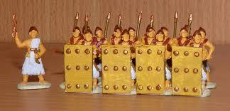
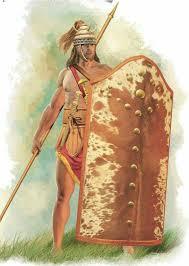
is an example of you said a "reinvention" so is a Scutum? but is small or is only an error by artist?
-
tower shield and similar big shields are more old than Romans. Sumerians did it first. So is normal see an older version. Mycenean.
-
In Rome II TW is assigned to Karian axemen.
-
.thumb.png.ce58cea22940c255f5b0a735d5abee36.png)
===[COMMITTED]=== Iberian Unit Textures
Lion.Kanzen replied to wackyserious's topic in Completed Art Tasks
-
.thumb.png.ce58cea22940c255f5b0a735d5abee36.png)
Bulding Snapping Feature
Lion.Kanzen replied to vladislavbelov's topic in Game Development & Technical Discussion
Great news. -
.thumb.png.ce58cea22940c255f5b0a735d5abee36.png)
===[COMMITTED]=== Iberian Unit Textures
Lion.Kanzen replied to wackyserious's topic in Completed Art Tasks
@Duileoga que te parecen? -
.thumb.png.ce58cea22940c255f5b0a735d5abee36.png)
Parthians (or Arsacids) and Sasanians
Lion.Kanzen replied to Mega Mania's topic in General Discussion
except the first in the upper left corner. And this defenitvely. -
.thumb.png.ce58cea22940c255f5b0a735d5abee36.png)
Iberians Culture / Cultura Íberia
Lion.Kanzen replied to Keinmy's topic in Tutorials, references and art help
@Duileoga Wacky quiere saber más sobre patrones en la ropa, especialmente rayas horizontales. -
.thumb.png.ce58cea22940c255f5b0a735d5abee36.png)
Parthians (or Arsacids) and Sasanians
Lion.Kanzen replied to Mega Mania's topic in General Discussion
Lets do it. -
.thumb.png.ce58cea22940c255f5b0a735d5abee36.png)
Extra units references
Lion.Kanzen replied to Lion.Kanzen's topic in Tutorials, references and art help
Wth... -
.thumb.png.ce58cea22940c255f5b0a735d5abee36.png)
Parthians (or Arsacids) and Sasanians
Lion.Kanzen replied to Mega Mania's topic in General Discussion
Parthian concepts. -
.thumb.png.ce58cea22940c255f5b0a735d5abee36.png)
Parthians (or Arsacids) and Sasanians
Lion.Kanzen replied to Mega Mania's topic in General Discussion
This color palette (blue look more suitable. See the color player blue and building natural,color. No very accurate architecture but nice colors. -
.thumb.png.ce58cea22940c255f5b0a735d5abee36.png)
Parthians (or Arsacids) and Sasanians
Lion.Kanzen replied to Mega Mania's topic in General Discussion
Check Sassanid Ctesiphon. -
.thumb.png.ce58cea22940c255f5b0a735d5abee36.png)
Parthians (or Arsacids) and Sasanians
Lion.Kanzen replied to Mega Mania's topic in General Discussion
Temple ruined by Isis. Hatra was one of capitals of Parthians. https://en.wikipedia.org/wiki/Hatra Parthian Even some Roman influence, like those archs. The columns look like colosseum no real column , more decorative. We have this with Seleucids. Im not sure about defenses. Palmira have some features similar to Hatra. -
.thumb.png.ce58cea22940c255f5b0a735d5abee36.png)
Parthians (or Arsacids) and Sasanians
Lion.Kanzen replied to Mega Mania's topic in General Discussion
Palmyra can work for both civs. Like greek style for city states in the past. @Sundiata knows better than me the middle east. -
.thumb.png.ce58cea22940c255f5b0a735d5abee36.png)
Parthians (or Arsacids) and Sasanians
Lion.Kanzen replied to Mega Mania's topic in General Discussion
Is important use some frontier building or cities. Dura Europos.


