-
Posts
25.684 -
Joined
-
Days Won
302
Everything posted by Lion.Kanzen
-
.thumb.png.ce58cea22940c255f5b0a735d5abee36.png)
Some LordGood's artwork
Lion.Kanzen replied to Stan`'s topic in Introductions & Off-Topic Discussion
No creas yo tmb. -
Add minimum distance to attack, i guess.
-
Yes, is WIP is last of factions of this mod. Isn't a surprise.
-
.thumb.png.ce58cea22940c255f5b0a735d5abee36.png)
Some LordGood's artwork
Lion.Kanzen replied to Stan`'s topic in Introductions & Off-Topic Discussion
Dibujas? Porvque no nos ayudas con eso? -
nice to see you active again
-
that is obviusly. like use hate speech or very political messages with our logo. In case you don't know, I have studies in social marketing and corporate image and making Brand books . https://en.wikipedia.org/wiki/Corporate_identity https://en.wikipedia.org/wiki/Brand_management https://www.thensmc.com/content/what-social-marketing-1
-
I'm learning to sculpt by myself, then I'll take a tutorial so I can help Alexander with some models and textures.
- 1 reply
-
- 4
-

-
of course you can. we aren't greedy corp.
-
If are merely SVG files I can design some for you guys.
-
.thumb.png.ce58cea22940c255f5b0a735d5abee36.png)
Millennium A.D. - Alpha 23 Release Discussion
Lion.Kanzen replied to wackyserious's topic in General
What we do is create a much longer base towards the ground, lengthening in the event of a fall on uneven ground. @Stan` -
Woe change the concept , that is the old. Now is very different. But there some portrait with wrong technique in the repo.
-
You can ask always you want. If you are asking art guidance, try post pictures about you are doing.
-
Nop, we haven't this feature to focus fire from buildings to the jnits yet.
-
This is the new graphics? @Stan`
-
Is convert an entity in other. @Stan`
-
Yes i noticed some lags from few last playtesting.
-
.thumb.png.ce58cea22940c255f5b0a735d5abee36.png)
Ideas for New Civilizations [Core Game]
Lion.Kanzen replied to Intellect's topic in General Discussion
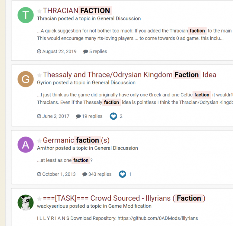
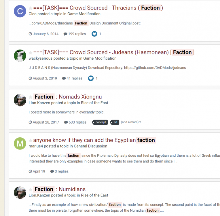
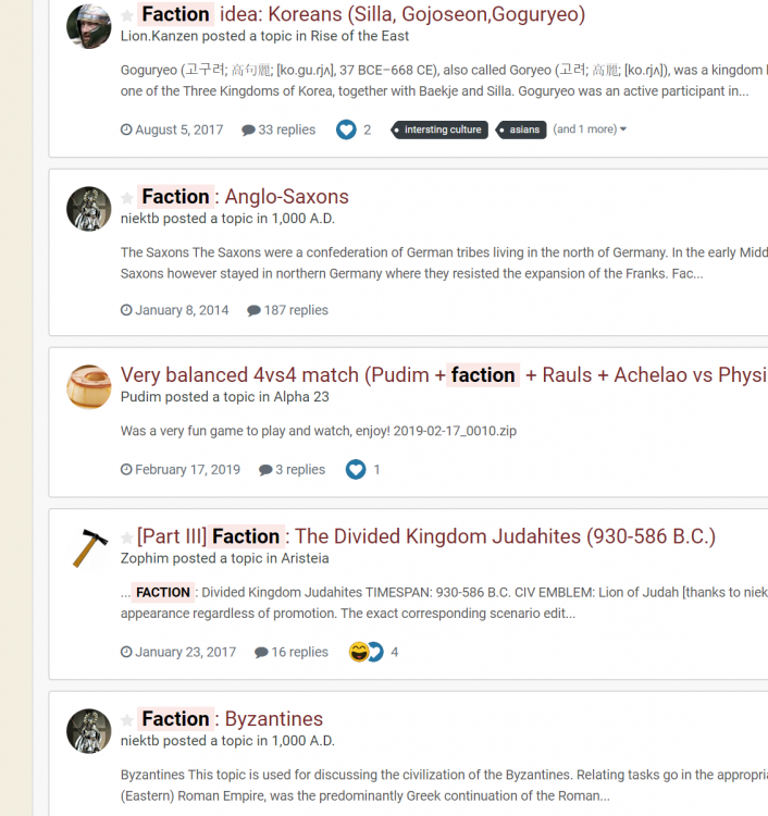
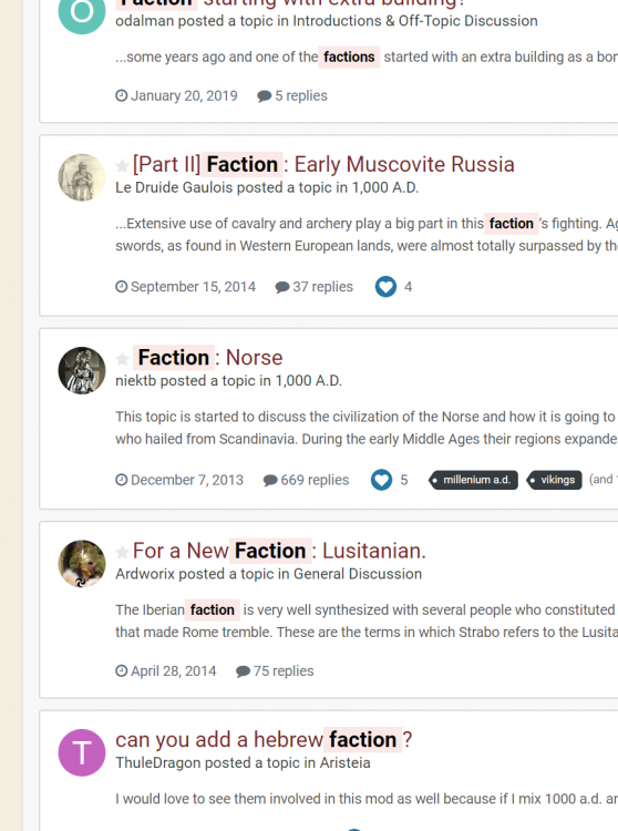
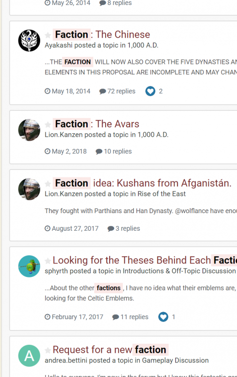
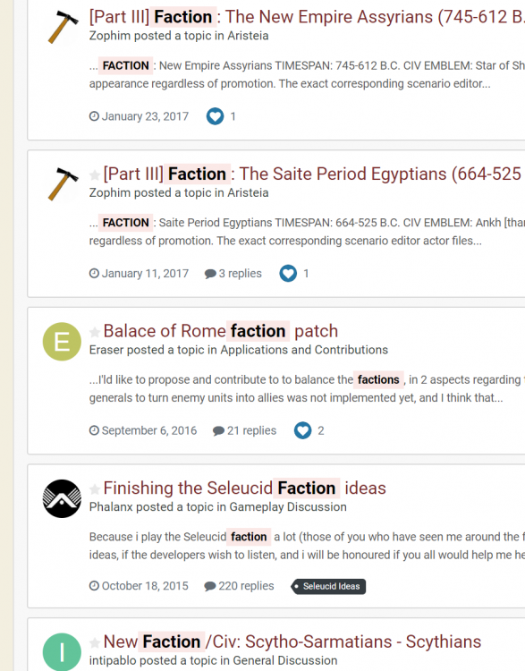
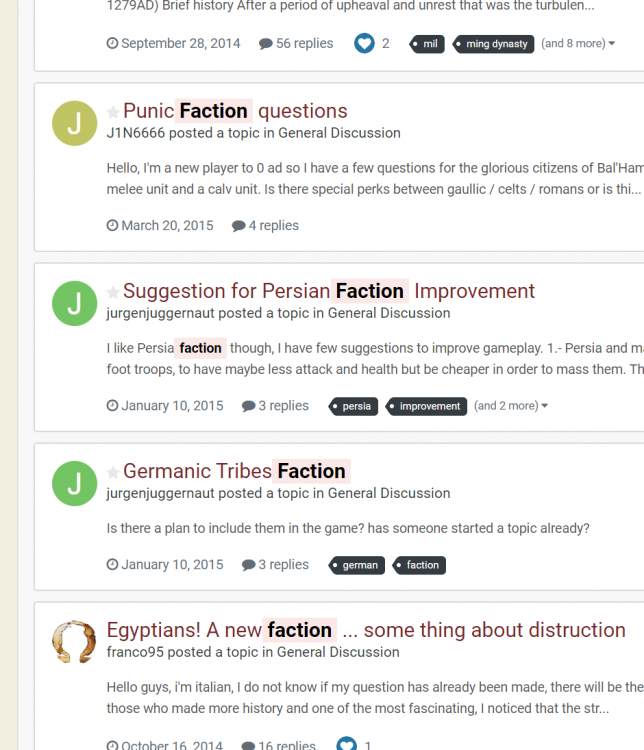
Yes , the game is some kind of little Total war mix with huge of AoE formula. Thats why TW uses term faction. And some point around 2012 we started use faction to split civilizations. -
Buen trabajo .
-
.thumb.png.ce58cea22940c255f5b0a735d5abee36.png)
Ideas for New Civilizations [Core Game]
Lion.Kanzen replied to Intellect's topic in General Discussion
This is simple, when you are new, you don't know many details about the game. When I asked this same question from my own ignorance, (I wasn't born knowing everything). Kindly Mythos_ruler (or was Feneur) answered that it was factions. I guess you must know who he is. Is only a little term that we use. Nothing personal. Im even sure why you are mad with me. My ignorance i guess. -
.thumb.png.ce58cea22940c255f5b0a735d5abee36.png)
Ideas for New Civilizations [Core Game]
Lion.Kanzen replied to Intellect's topic in General Discussion
No, that your own assumptions. Ok i dont want any problem with you. Isn't important at all. -
.thumb.png.ce58cea22940c255f5b0a735d5abee36.png)
Ideas for New Civilizations [Core Game]
Lion.Kanzen replied to Intellect's topic in General Discussion
We never change that , that I'm talking about. Civs are were we start making factions. Simply. Examples. -
.thumb.png.ce58cea22940c255f5b0a735d5abee36.png)
Ideas for New Civilizations [Core Game]
Lion.Kanzen replied to Intellect's topic in General Discussion
You know the definition of a civ? Then explinationnof your folder capture is quite simple. Theoriginal game have civs current don't. In A6 we had Hellenes as single civ, we had Celts as another civ. Sucesors are factions for examples arent civs. Sparta and Athens aren't diferent civilizations. The game was planned for civilizations since 2004, but since then it has changed a lot, I know you are new and you ignore many things here. Unlike AoE we divide the game by factions, instead of having one culture we divide them into periods like Persia Achaemenid and Sassanid AoE on the other hand is the same. For them Rome is the same from kingdom to fall. They only separated Palmyra. We have no Indians, we have no Mauryas, we have no Macedon as a single entity. I can keep giving you examples until I get tired. In fact it was not me who invented the term but if I thought of the mini factiones, or the first. -
.thumb.png.ce58cea22940c255f5b0a735d5abee36.png)
Ideas for New Civilizations [Core Game]
Lion.Kanzen replied to Intellect's topic in General Discussion
In 0 AD we haven't Civs we have factions And the tiny that were a mayor faction we call mini faction..


