All Activity
- Past hour
-

Wolf of 0ad Street - Market pump exploit
guerringuerrin replied to Seleucids's topic in Gameplay Discussion
Here: -
market is fixable ? and how
-
This is perfectly fine to do if its not a arranged pump of two players. Bad: 2 players decide to split the cheat one sells 100 batches of food for wood - sends the wood to the other player only for him to sell it for food in 500 batches. Normal: As a player notice good prices at the market and decide to convert resources for profit. Bad: Have a bot checking price fluctuations and automate converting resources at good prices
- Today
-
Wolf of 0ad Street - Market pump exploit
guerringuerrin replied to Seleucids's topic in Gameplay Discussion
Sure I guess one thing is to use the market another to exploit a vulnerability. I guess the important thing is this has been noticed and could be a fix of its mechanic to avoid this kind of exploits in the future -
Yes but if another player do the first part of trade, you are the second player and you need use the market...
-
Wolf of 0ad Street - Market pump exploit
guerringuerrin replied to Seleucids's topic in Gameplay Discussion
I think it becomes very evident when someone sell one Resource to buy another, incurring clear and significant losses, only to later use the second Resource (which was purchased very inefficiently) to buy back the first one or other assets with exorbitant yield rates. As can be seen in the Cube screenshot from the first message in this thread. And one could say the same kind of technique was used here: So the question is: why would someone make such inefficient trades, only to quickly reverse them with the exact same trade in the opposite direction? So if my math is correct, what Arup did was: First Trade 2800 Food for 1462 Wood Secondly Trade 2000 Wood for 3940 Food So u can do the maths 3940 - 2800 = 1140 FOOD 2000 - 1462 = 538 Wood And in the end is like he trade 538 Wood for 1140 Food. Which is like get 211 Food for every 100 Wood -
are we sure it normal ? its depend the game , if the wood have a big value compare food.. if one player really need food and have too much wood.. what he has to do finally? how he is supposed to know its cheat or no cheat
-
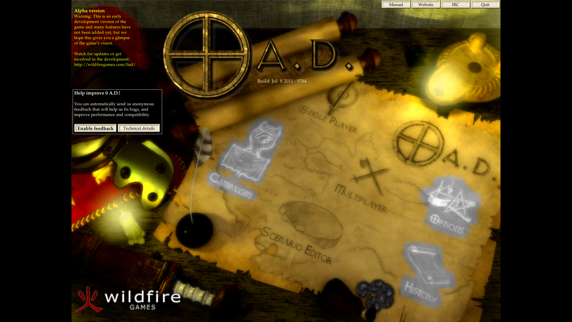
The old 0 A.D. start screen/menu (alpha 6 Fortuna).

-
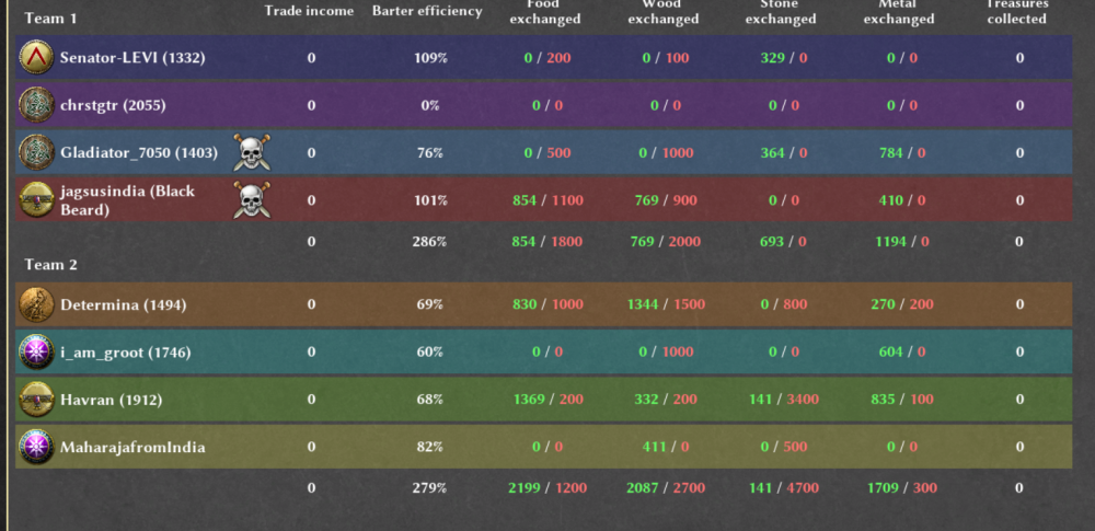
Thanks @ffm2 for noticing this. So I dug into this bug and this is actually due to a typo in vanilla, while ModernGUI have the correct identifier "barterEfficiency" instead of the misspelled "barterEfficency" found in vanilla summary. Edit: Nobody will makes a PR for a typo I guess so I've just overwritten the faulty function so its fixed anyways for ModernGUI.
-
 teenpattigoldapkdownload joined the community
 -
Wait so you updated the mod? To work for current version?
- Yesterday
-
I don't think this is a productive conversation. But apart from that your team percentages are the individual percentages summed up. I can't reproduce that bug in vanilla.
-
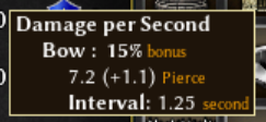
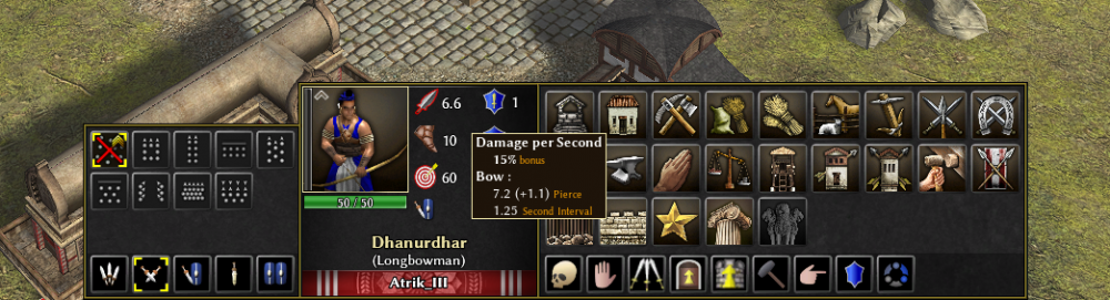
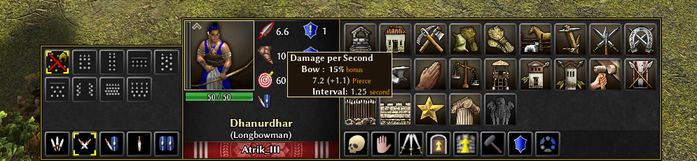
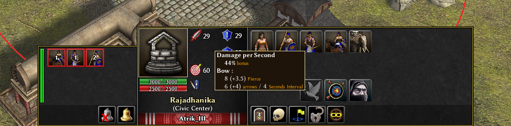
My point is the tooltip isn't actually describing the DPS — it's describing the unit's combat stats. 7.2 (+1.1) damage at 1.25 second intervals. At no point does it show the calculation based on the damage dealt in one second (the 6.6 shown the hovering element) BUT... ...I get your point here. Makes sense. Hack Damage Reduction seems a good choice Yeah it's pretty the same way as aoe2 shows it but using brackets. It's not that obvious but I agree with you: let's avoid cluttered ugliness Your hopes has been heard. @vanz sorry for flood your thread with off-topic discussion
-
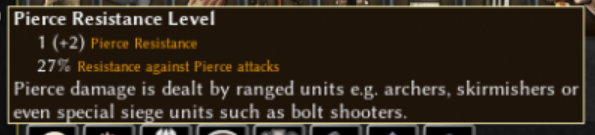
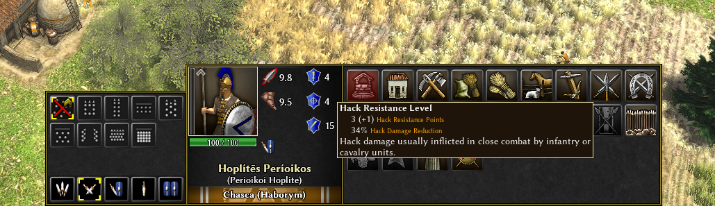
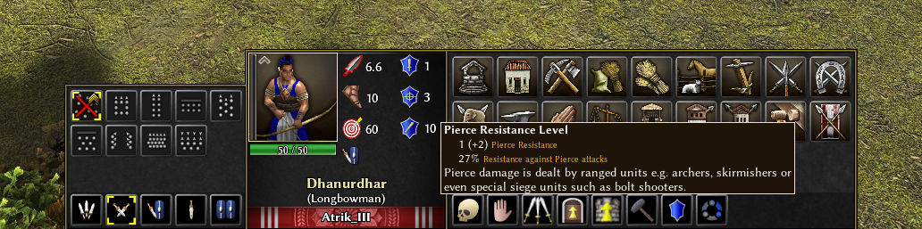
I don't understand why. That would be rather confusing, the tooltip should start by describing what is the element you are hovering, and in this case it's the DPS. Agree, but I was talking about trying to reduce the texts on the lines where stats are displayed, the small description below ofc aren't a diminishing the readability. I would prefer not call the damage reduction % be called "Bonus Resistance" to not be confused with a bonus like in dps, but indeed "Resistance to Pierce attack" is maybe not the best, so i named it "Hack Damage Reduction". It's rather obvious anyways that it is a reduction from incoming attacks. It might not be that obvious that the (+1) here is the bonus, however if i try to any variation of : 3 Base (+1 Bonus) Hack Resistance Points it becomes ugly... So I think I'll leave it like this and hope I'll pass the@guerringuerrin validation

-
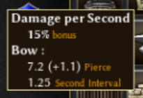
I'd still group the Bonus Damage with the weapon section and remove "per Second" but I guess there are some limitations for that? You could change "bonus" for "Bonus" to match text format But anyways, comparing both versions the new one looks so much cleaner now. Nice work! I guess in the case of Resistance I would do: Pierce Resistance Level 1 (+2) Pierce Resistance Points 27% Bonus Resistance or the other way Pierce Resistance Level 27% Bonus Resistance 1 (+2) Pierce Resistance Points which would match much more the Damage tooltip stats order. And adding "against pierce attacks" seems redundant as it's already specified in the tooltip's title Regarding amount of text, I think that as long as you keep a clear layout of each attribute's values (like in this case), adding descriptions at the end of the tooltip contributes to a more detailed understanding of the different combat stats.
-
There there, you were right, too much indents . I tried few things around your suggestions and that's what I think is best. Added some details for buildings too so that it's easier to differentiate base arrows and arrows from garrison too. Thoughts?
-

Limit the amount of trainable heroes in Alpha 9
Deicide4u replied to Deicide4u's topic in Game Modification
I don't think that building of the source is required. The only thing that needs to be done is to modify the hero unit templates and restrict the training limit in a JS file. I see there's BuildLimits.js file, but I need a similar one for units. -
Yeah I'm aware of that! Still feels off in the context of the tooltip. If you want to keep the indentation, I feel like only two indents would be better than three
-
This seems that it can look better, I'll try! You don't see the cursor, but, this is the header of the tooltip because you are currently hovering the Damage Per Second stat. Then, you get the breakdown so first indent. Then a second indent because it is a breakdown of the attack. So I think It's how it makes the more sens.
-
Haha Keep in mind that I'm barely familiar with 0 A.D.'s numbers. I've always found them very hard to read, and in general, I'm pretty lazy when it comes to numbers. If you don’t mind, I’ll get a bit picky and suggest the following changes. Damage Bow: 7.2 (+1.1) Pierce Bonus: 15% Interval: 1.25 seconds “Damage per Second” doesn’t really make sense in the context of the tooltip. I’d also remove the indentation or just use a single level. In the case of the damage tooltip, double indentation only adds confusion. I’d also try this alternative layout which I find better than the first : Bow Damage 7.2 (+1.1) Pierce 15% Bonus 1.25s Interval Or: Damage Bow 7.2 (+1.1) Pierce 15% Bonus 1.25s Interval I think these layouts improve readability and allow the player to quickly understand the structure of the tooltip. And the third one is my favourite
-
I don't know if/how I could do better without adding text (that would ultimately make the tooltip less readable overall...).
-
Yes all correct, however if you feel like double checking is that because it's not that intuitive?
-
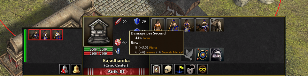
Let me describe it to see if I understood it correctly: The Bow of this archer has 7.2 of base Damage + 1.1 Damage from the first Ranged Attack damage (15%). I asume if you research the second Pierce damage, the % bonus will be higher It also has a base Pierce Resistance of 1 + 2 from two Pierce Resistance upgrades researched. EDIT: also the 6.6 we see in the sword next to the portrait is the real DPS of the Bow, as it has an interval of 1.25 second. That's a boonGUI legacy feature
-

Limit the amount of trainable heroes in Alpha 9
Gurken Khan replied to Deicide4u's topic in Game Modification
Knowing next to nothing about coding I'd guess as per usual: copy & paste. Find how it's done now, copy it to the old source and build. I'd imagine building that old source could be quite a pain, especially if you'd have to implement that whole function into the engine. -
Thanks @guerringuerrin. The previous iteration wasn't satisfactory because it didn't help that much to estimate upgrade levels. I think I much more prefer it now and I think it's easy to read. (on screenshots you don't see the cursors but each tooltip correspond to the stat you hover ofc)

-
Here is the market for the same:


-
Latest Topics
-
.thumb.jpg.b21ca1d0c15fb56b42c39b25a0a40815.jpg)

