Micket
Community Members-
Posts
180 -
Joined
-
Last visited
-
Days Won
20
Everything posted by Micket
-
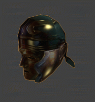
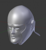
That isn't really ideal reference material. I try to google for other, but it's difficult to find anything suitable (and they all seem to be different). I'm done with this one (still needs diffuse texture, but normal map looks OK) helmet.zip
-
But Enrique already made a model there?
-
Lowpoly with normal map: (a few details to work out, can't finish it tonight)
-
But if the mesh doesn't align well, with the texture and ridges, you'd have to go for a crazy high polycount before displacement modifier would look alright, no? My old Intuous 2 tablet (12 years old now) isn't working well, so I'm stuck with a mouse right now (and being left handed, I can't draw worth @#$% with the mouse). I should buy one of the new small ones (and a new computer with plenty of RAM)
-
If you point me to good references I can give it a try. High poly version is done now. The edgeflow is horrible for highpoly (i should have started anew rather than building on the lowpoly). Next up, normal mapping and that stuff. helmet_wip1.zip
-
Sure is messy to do high poly modeling. So much struggling with the subdivision surfaces where ridges connect.
-
-
Well, i did it for fun. I figured the time period is off anyway (no?) It's 222 triangles as well, so, quite a bit on the high end there. And the texturing is just some slapped on projections from that reference you posted. I figured i'd try doing some better texturing, like a normal map.
-
Yeah that wonky geometry around the chest area is difficult to model in a way that looks good when animating (while still keeping it lowpoly).
-
This won't happen in game, but when you make these renders of the animation, there are some artefacts that appear due to quads flipping their triangulation depending on the deformation. If you apply the "Triangulate" modifier before the armature deformation modifier, and this will be removed (and be closed to what the game will render)
-
It really is unfortunate that this is going to be like.. 10 pixels big grey blob on screen!
-
I saw this crazy GDC 2015 video today on the art assets in UE4: Starts exactly at 15min Photo scanned, and semi.-automatic de-lighting/shadowing to obtain the raw diffuse color. Clever stuff.
-
Now, the short comments like this seem bizarre to me. Surely you must realize you are in no different position than anyone else here who contributes to the project... when they could be playing bf4... or watch netflix. The wording in several of your comments makes it sound like the rest of us were getting payed. I'm not saying you are not contributing anything of value, or that it seems like your posts take little effort (I'm sure they are not, though, many of the imgur images are just dead links, so it's hard to tell), I'm just saying.. we have all spent our spare time on this project. Now, about the thread; Most of us artists know how to make normal maps. It just takes more time to do so. I don't think that increasing the work load for the artists will be beneficial to the project. That's just me though (and sure, if there is some part that is super critical putting in extra work on that makes sense).
-
I'm sure that at the normal zoom level, these are not visible, but, i think the "elbow" joint should bend more. Also, the front paw should extend! (of course, the paw is like.. 3 pixels, but that's what struck out to me when i looked at the rendered animation in blender). Back legs look great.
-
Looks great, though, there should be quite a bit of tweaking left. I don't think the black areas are really the problem, but there are some regions where the reference image doesn't cover well, such as the back, and the legs. It looks great from the side, but in game, it'll be viewer from above most of the time. There is also quite a bit of highlight in the texture, which should preferably be painted over with a neutral grey body color (the region on his back is almost white).
-
Darkening the eye-region should help to make it stand out better Regarding the animation; Is that still shot representative of the animation? Because, I must say, it looks very stilted. Also, the "pace" walk seems like a very unusual way for a dog-like animal. Isn't galloping the usual way a hyena would move about?
-
With careful node merging, the UV map will remain useful (in Blender at least). You just have to be careful at the texture seams. Maybe a bit of tweaking is needed, but at the zoom-level where the LOD switches, there is no way to tell if the texture is a bit wonky. Just select an edges, and press "alt+m" and choose collapse. It you need more control, select 2 nodes, and press alt+m for merging at different positions.
-
The textures aren't the way they are today because everyone thinks they are the best thing ever, they are this way because noone has made a nicer texture yet. I can't speak for everyone else, but I'm certainly an amatuer. A lot of the textures come from photos and such. The highlights aren't painted, they just happened to be in the reference material, and gets copied over to the diffuse map. A matter of people not being to put in industry quality work (for free, on evenings and weekends). Also, you posted your first topic just a few days ago. People haven't ignored what you've said, there just haven't been time to reply. Honestly, I don't know what to say, because I already agree with all your critique. I'm not very good at texturing though, so I can't do much about that situation.
-
Yup. I wasn't expecting any of this to be easy, and (unfortunately) I am suggesting there is a lot of work to do (and re-do). I will advise against working in a vacuum; Upload the mesh screenshots as soon as that is finished. Or even better, upload it when you feel you have the basic shapes down. I believe we are quite good at giving out constructive critisicm in this forum (think of it as tough love). Tweaking the model based on feedback early and there would have been very little to do, and now, ouch. I can't help but to feel like a as$hole to suggest changing something, because I know it was a lot of work at this point. As for polycount, yes. I make my models of higher polycount than what the typical zoom-level in gameplay calls for, for several reasons: 1. It's a bit of future-proofing. Mid-poly today? Low poly tomorrow! 2. If there is ever any LOD support or anything like that, It's a lot easier to collapse nodes (I made a small test of collapsing some edges, and I got it down to 350 triangles: ) without noticeable loss of detail (at this zoom-level) 3. In the end, the difference in polycount (300 triangles or so) is probably less to that of a single palm-tree in the background. Unless there is a rhino stampede (which would be awesome), there is not really any impact on the game. 4. A bit of eye-candy doesn't hurt when you zoom in!
-
I think the contrast and saturation can be adjusted, to make it stand out a bit more. If the dark spots popped out a stronger, i think it would look better! I made a paintover of what I think would make it stand out and be easier to identify as a hyena
-
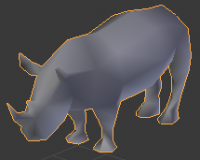
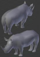
Hi Gussebb! I sure hope I don't come off as a too negative here, but I think there are some anatomical issues with the model. Some time ago, I made a model for a white rhino (but noone ever got around to texture or animate it), which lookes like this: The thread is here: http://wildfiregames.com/forum/index.php?showtopic=17411 While I do realize i sound like a pompous @#$%, I was very happy with how the model turned out. Perhaps you could switch out the model for your animation skeleton? (also, everyone should feel free to modify any of my meshes if they think I've done something badly!)
-
There are Gorilla http://www.wildfiregames.com/forum/index.php?showtopic=17408&hl= White rhino http://www.wildfiregames.com/forum/index.php?showtopic=17411&hl= Cobra http://www.wildfiregames.com/forum/index.php?showtopic=17415&hl= I'm not sure about the state for the rest of them, but I don't recall seeing any texture for these three. Have fun
-
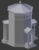
I started modeling this, so, here is a WIP. I might have to redo some fo the parts to get the polycount down, but I'm going to make it as I first intended, and I'll see how much detail I have to cut back. Right now, I'd estimate that it end up being around 2700 triangles + statue on top, so it's a bit heavy.
-
The Big Eyecandy Progress List
Micket replied to idanwin's topic in Eyecandy, custom projects and misc.
This thing looks really neat. Should I model it?

