Micket
Community Members-
Posts
180 -
Joined
-
Last visited
-
Days Won
20
Everything posted by Micket
-
Indeed. I have no intuition about the mandrill, and since I had to piece together sources from all kinds of places, it's definitely difficult to determine if I totally messed up on some part. I probably spend twice as long time looking for & at references then I spend modeling. You never have to apply the modifier. You should add the suffix _L and_R or .L .R respectively on both the bones and the vertex groups You can check the Fox, Oryx, or Tiger models i made, which I rigged this way.
-
Well, about the shape itself, i would simply rely on a lot of reference materials. I always put in a background image of a good profile picture, then try to figure out the 3d shape from the outlines. It might sound boring, or like cheating, but noone really knows what animals actually look like unless you go through a myriad of references, meassuring all the relative sizes. If I were to draw even a common animal unprepared, like a cat or a bird, I would completely mess up it's anatomy. Now, I don't know exactly what species you were aiming for, and from hunting references I've come to appreciate the wide range of anatomy of animals within the same species, but i'd say you overdid the changes to the skull. A quick comparison with some reference off google search Had this been a model of a human, we would all be able to tell if something is off, like a huge nose, tiny eyes, enormous chin.. but in most animals, our memory alone is insufficient. For animation, there is some more practical things to try and sort out (and they are not that easy). The biggest challenge i find are the legs relative movement to the body, and here, legs are merged into the body. For quadrapeds, the stomach kind of "tucks in" behind the thigh. The font legs also needs to have something cut in in-between the leg and torso (up into the "arm pit"), to allow some relative movement there. Still, with lowpoly, and furry animals, you kind of have to find a good middle ground. Also, are you working on this without a mirror modifier? that has to be a huge inconvenience.
-
I put most of my models on opengameart.org as CC0, so i don't know if they are used elsewhere. It's just a bit of future proofing from my side. Since I've made a halfdecent selection of animals now, with similar polycount, it could probably find some use in mobile games and whatnot.
-
Difficult to find good sources. Rarely any pure profile/front/top photos, and if there are, never in the same pose (different headtilt, sitting standing, etc.) and of different animals (when you start looking, you start seeing a large difference within each species). Also, the fur is a pain in the @#$%. Especially doing it in a way that will look decent for animation. Next, i'm thinking bison or leopard
-
I'm not at all happy with this one. Head is sort of OK, but the long fur and mane makes it really hard to tell how the underlying anatomy is constructed. mandrill_male.zip
-
I know, and agree with your points. However, just waiting until someone just worked on the texture to throw it out is definitely inefficient. There are also plenty of animals still left on the list, so unless the bear is an especially important there is no need for all of us to work on the same thing.
-
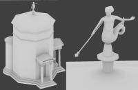
Well. the measurements came from some image that showed the dimensions (not really useful for texturing), the rest of the shape is very basic, save for the statue, which I partly made up since the only references where those tiny drawings in my previous post.
-
I could take a look at this, but, I would likely change it a lot.. as in completely change everything, if I do anything. Meaning all texturing needs to be redone as well. I would be upping the polycount significantly. I usually make the my models way more detailed than necessary for 0AD zoom level, but it's because I want to have the possibilities for them to be used in other games as well. But, to wait until someone does a model.. only to redo it, well, that just feels like a @#$% move. It certainly isn't a very effective way to get work done!
-
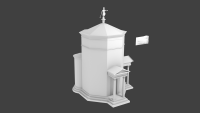
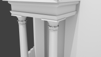
I finished this some time ago, but never got around to post it. I don't really know what to do with the figures around the top part. It's to much work, kinda tricky to model, and would bump up the polycount even more. I left it with flat surfaces. towerofwinds.zip
-
He was probably inspired by the roundness of his head
-
Weeeell.. I'm kinda busy playing shadows of mordor these days.
-
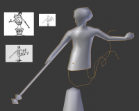
I figured i ought to try and finish this up, but man, the statue is tedious. I only have such low res references.. and the references are only drawings from the front. I can't tell what he's holding. I thought it was a staff first, but when i look at all 3 images, it seems more like.. a mace,? Anyone know what it should be. Also, the tails.. oh man.. those suck to model. I can't tell how they are supposed to go, where they split exactly and so on. Edit: forgot the image:
-
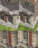
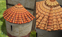
I don't know what to say about that. They are normal PNGs (unless I made some mistake just before uploading, but they all seem alright to me). I used them in the screenshot above. I made some improvements to the UV-mapping (and a very tiny amount of mesh tweaking) on the roman civil centre. rome_cc_2.blend and roman_cc.dae are both in google drive folder above. Left previous, right new * Adjusting UVs for tiling region * Layered rocks and avoiding black creases on outer corners (which doens't make much sense) * Continuous bricks around pillars
-
I had some issues with Gimp that deleted RGB for fully transparent alpha values (even though the PNGs with the option for transparent pixel values selected.) In the end, I got tired of trying to make it work, so i just changed the darkest alpha (0) to 1/256. No visible difference. Lets see if this works: https://drive.google.com/folderview?id=0Byux4vjcSM5UfmZvQTFSdjFRdXA3bVJWck80ZFFRRzAwVXVhUDhadVVGRGlReWozMGY0SEU&usp=sharing
-
Well, i did some tweaks last night, but never got around to post them. I have considered dropping the existing texture and just make a high poly version to bake from, but that also seemed like a lot of work. But then again, all the time i spent on this it would probably have been faster to just model it directly. (granted, it was a learning experience as well). So, seeing how you are already well into making an awesome high poly model to possible bake from, I can't help to feel that I've wasted time trying to cut corners (only to end up un-cutting all the corners step by step). I have diffuse, specular, and normal/displacement maps finished now. I'll upload them to some google drive or something
-
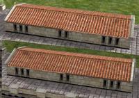
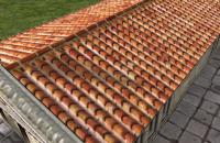
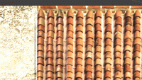
I think they still look nice even without shaders. In particular since many models mirror the texture on half the roof, which meant there were baked shadows going both ways. Now, the problem I tried to correct was that the normal mapping looked weird from one direction. But, even now when there is very little baked shading left, there is still a big difference from where the lighting applies. It's especially noticeable on roman house that mirrors the roof (ignoring the ugly part in the middle, it's quite different on each side of the building Light from above: Light from left: (the scenario is flipped when i light from the right) I did some tests with a flat diffuse color to verify that everything was working correctly on the normal map.. aaand well, there doesn't really seem to be anything *wrong* with the normal map My conclusion is the combination of: 1. Diffuse texture is not properly de-lit: (it's barely visible, but if you look for it, you can tell there are leftover shadows that I didn't get rid of completely) 2. The ambient light in this game is pretty high; Shaded areas barely get much darker. The difference between fully lit, and shaded areas in the normal map is in the same magnitude as the shadows left over in 1. I'm quite annoyed at how poorly this turned out :/
-
-
-
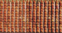
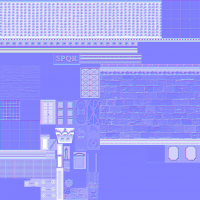
Using this diffuse map, parallax won't look good at the seams. It would have needed to have a bit of padding around the edges of each texture piece, but that would also waste texture space. A single tiling texture would have been best for this. Perhaps future OpenGL will remove the need to construct these texture-atlases (which would certainly be a blessing to us art-devs). Then again, parallax is kind of overkill for this game (you got to soom way in so even see it). Normal maps should be fine. So, since texture atlases are bound to stick around for quite some time, I would recommend that these texture include a bit of padding around each texture in the future. When scaling they smear together, and producing normal maps are a PITA, and parallax occlusion won't look good.. all due to the lack of padding (it would waste a bit of texture space, but it's worth that cost). I'm working on removing the baked shadows in the diffuse texture now, side by side comparison so far:
-
I got the other rome struct normmap as well, but it was to big to upload here.
-
Thanks. I was assuming they were located in the art source. I worked a bit with the rome_struct_norm.png, a made some detailed improvements. Since there are no distances between different sections, applying the normal map plugin in Gimp (and probably the same in photoshop) will create normal ridges around edges where one sub-texture end. I avoided this by doing a lot of manual copying. This workflow was pretty time consuming, and, unfortunately, if one wants to change something it's quite a bit of work. The blend files I've seen for the other textures would be a much more scalable/modular way of composing these packed diffuse/normal/height-maps.
-
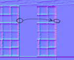
Actually guys. exactly which file is it: http://trac.wildfiregames.com/browser#art_source/trunk/art/textures/skins/structural/romans I can't find it. Should I even be looking here? Regarding the model: More quads are really not necessary. Just rotating the UV coords more or less solves that problem. There are actually 4 quads already, 2 of them are just very tiny (and unneccessary if you ask me). I fixed it (at least i think it looks great) in the example above, without adding any quads and just changing the UV. There are also a few other details on that UV-mapping I think could use some work. The triangles underneath the V-shapes are
-
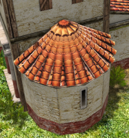
Enrique: But where is that existing heightmap? I tried browsing the SVN, and tried a bunch of files, but I didn't find it. I'm pretty sure the reason isn't ticket 3119. It's a twofold problem: 1. the rounded part have more geometry, V-shaped patterns, and the heightmap/normalmap is fitted for the flat surface. 2. The UV coordinates are not set correctly on that section (they are upsidedown, but that's not th actually the only problem) Fixing 2 should be enough to stop it from looking strange: see example here (with just the diffuse map)
-
I see Yes, most of the roman textures have this already. I can't find the file that Enrique baked from though (I would like to take a look), since there are way to many files to just go around blindly. (b.t.w the texture is up-side-down on this rounded part: Celts seems to have some. But the structures doesn't really fit well with a normal map. I guess I'm not sure what I should be modeling. Adding another animal probably won't really take the graphics to the next level.
-
So I was experimenting a bit. How about normal maps on buildings (as far as I can tell, it's not the case for the (most) models right now?) What do you guys think about adding a bit of normals?


