Micket
-
Posts
180 -
Joined
-
Last visited
-
Days Won
20
Everything posted by Micket
-
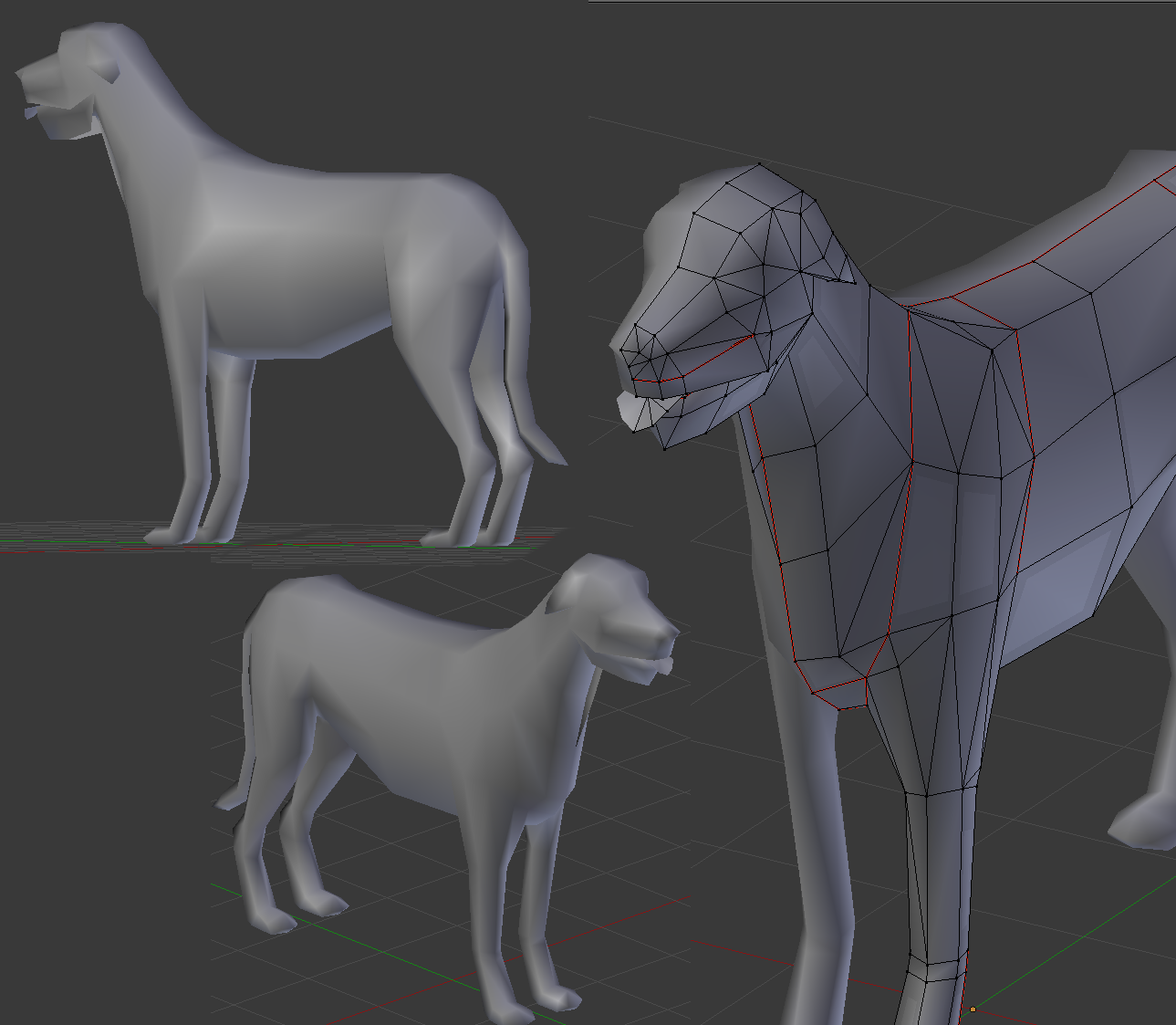
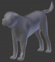
Much nicer. Do i spot a rough edge along his front legs as well. Or is it soppsed to be like that? Hard to tell from just one angle.
-
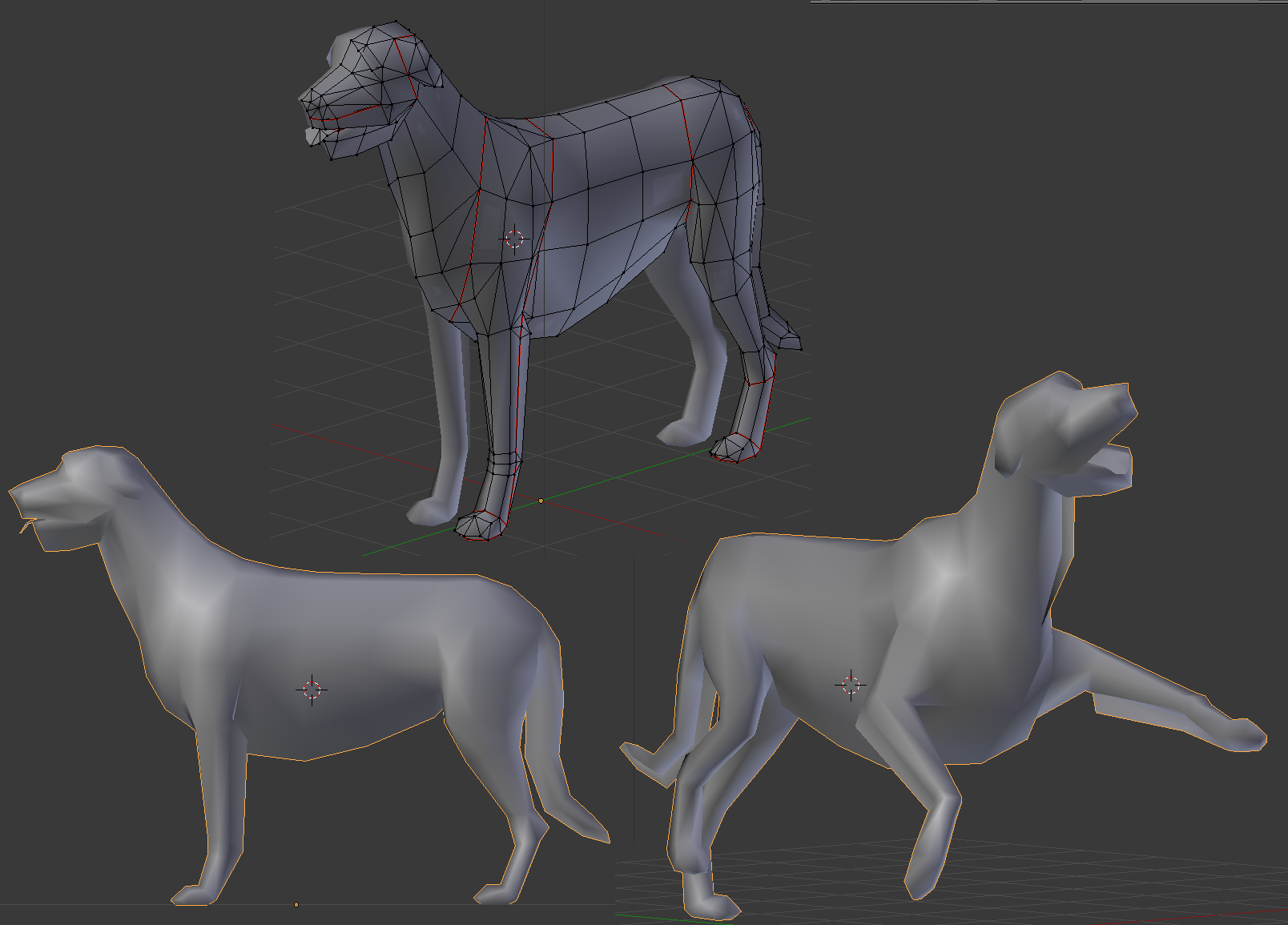
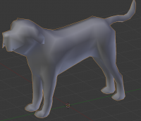
Still a bit of work left, but it's looking more and more like a Mastiff now Showing an older and a recent WIP.. since.. well.. someone might be interested to see the progress (wip2 is the current state)
-
Something like this http://commons.wikimedia.org/wiki/File:Irish_Wolfhound_Sam.jpg http://commons.wikimedia.org/wiki/File:Agripinne.jpg http://commons.wikimedia.org/wiki/File:Fergus_%282545552302%29.jpg ears folded sort of like this http://commons.wikimedia.org/wiki/File:Cecil_Aldin05.jpg
-
In ambient light AO would probably look good, but it would look worse under sharper lighting instead. You should however add some margins to the baking there, there are hints of black lines (partly due to the unecessary number of UV-splits). Was it unwrapped like this before? It would probably look nicer if one tried to minimize seams.
-
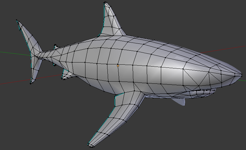
Since this dog tends to have long hair, I made some single planes for alpha channels. If any of them are problematic for whoever paints it, just go ahead and get rid of them wolfhound.zip

-
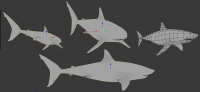
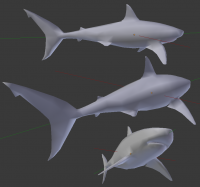
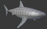
If we want to go for a whitetip or blacknose shark, I would rather just make another model that closer matches them (there are quite a few distinctive changes between them when you really get down and study the anatomy)
-
What type of shark is that? I thought the eyes would be pitch black (at least for the references i used for the geometry, great white sharks)
-
Here is a WIP I kind of went overboard with the areas for which i thought alpha maps would be cool.. head could use a bit more work I think the tounge really puts a cool twist though I'll rig it up so it can be animated separately!
-
===[COMMITTED]===Temple of Capitoline Jupiter (wonder)
Micket replied to Tobi95's topic in Completed Art Tasks
Quite similar to the etruscan temple i had a go at some time ago: http://www.wildfiregames.com/forum/index.php?showtopic=17756&page=2 Tobi95, you should fix up and texture that one as well now that you've done a good job on this one! -
@stanislav Thanks, but unless the photos are near vertical, I can't do much else than to eyeball the sizes, which is what I've tried up until now. @enrique If you get some profile reference shots (and, preferably top or front view), that would speed up the process. Photos at even a slight angle are difficult to work with. Edit: Wolfhounds was easy to find, thanks to all the dog owners who just looove to show them off at dog shows. Perfect. Mastiffs are quite varied however, so I need help there. I did some tweaking, and unwrapped it. I'm calling it done now. Technically, this is a female shark, since I didn't model the two dicks (yes! there is two!) greatwhiteshark.zip
-
Still needs some UV-mapping and stuff. It was a bit hard to find good references from above, so I'm not 100% sure about the overall shape.
-
Good to hear. Now, Strannik, get to work on the Rhino or something! I want to see it charge.
-
===[COMMITTED]=== Ptolemaic/Seleucid Helmet Props
Micket replied to Sighvatr's topic in Completed Art Tasks
The license is right there on the page, CC0 i.e Public domain. Same goes for all yughues stuff (plenty of textures). -
===[COMMITTED]=== Ptolemaic/Seleucid Helmet Props
Micket replied to Sighvatr's topic in Completed Art Tasks
http://opengameart.org/content/free-tilling-texture-pack-28 -
No it doesn't. This is a new model and noone has textured it.
-
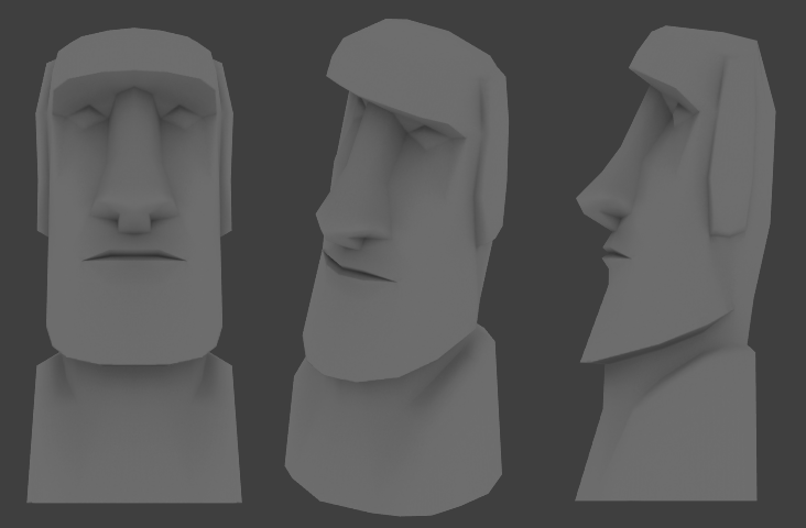
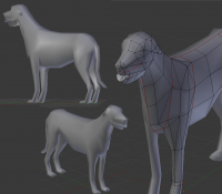
Looks great. Good job. The only critique i have is that you might want to widen the nose a bit, and bring the it down closer to the mouth to get that typical elongated look of the face more pronounced. Of course you'll need the neck/shoulder part as well.
-
Quads are better for perhaps highpoly modeling, since industry insist on using *only* Catmull-Clark subdivision algorithms for smoothing, which looks awful for triangles. (They might be slightly more convenient when cutting new edge loops as well, which is why I mostly use them whenever they appear naturally ) But lowpoly models this just doesn't apply. Everything is going to converted to triangles before rendering in the game anyway. So if you have a piece of surface that really is triangular, don't be afraid to insert it. Basically do whatever you want to get a nice edge flow since that makes it easier to do smooth things.
-
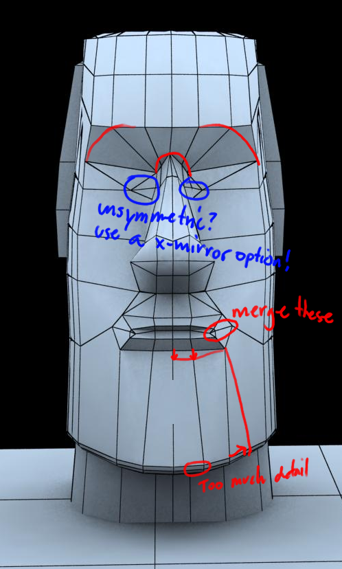
Well I really hope this hasn't been discouraging. My intents have only been to give constructive criticism, but I know I can come off as quite harsh. The only thing I can think to do is to try to give more tips. What I think is a common mistake is adding to much details, and then try to tweak things. To many control points and it becomes near impossible to work with it (unless you go for sculpting). I tweak a vertex, then check it from different angles to see that is gives the desired shape, then tweak it some more. Trying to make a somewhat smooth arc, like the chin, around 5 vertices is maximum, because otherwise its because to much work to readjust the surrounding vertices for every change and you end up with wobbly surfaces. It might even just be a subconcious thing, where one is avoiding making larger necessary changes because you're thinking about all the surrounding adjustments you'd have to do. I marked some things that I would have probably changed just for illustrative purposes It's a bit hard to say more since it's just a front view.

-
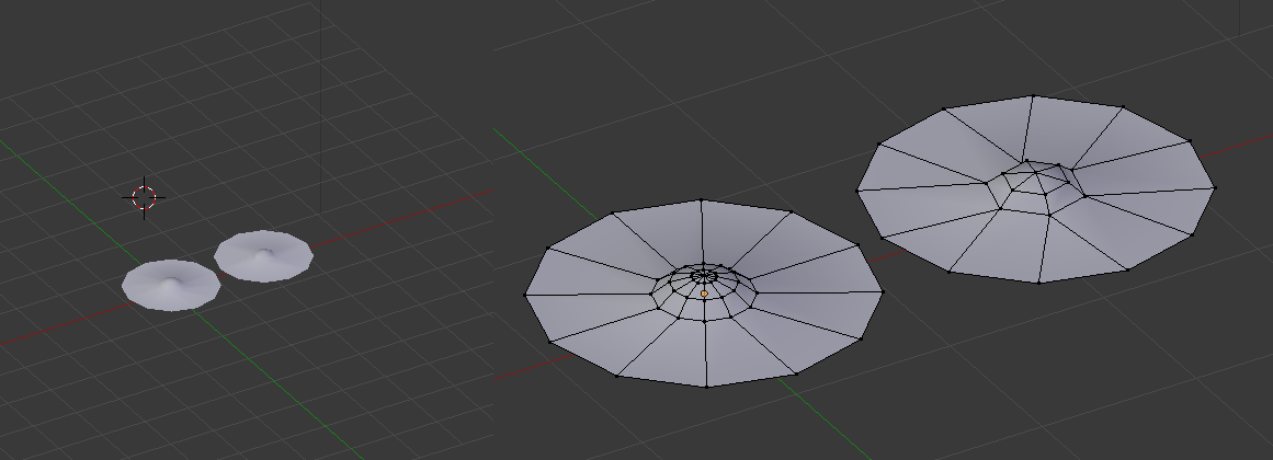
Actually, maybe your insistance on quads are limiting your options. The handles on the swords are a bit overdone, but round things (which are always tedious) can also be reduced, for example a typical case: Even at fairly close distance you can barely tell the objects apart, and the left one has 84 triangles while the right one only has 36.
-
I think you might be spending a bit to many polys considering how very small these will be in game. Also, you have plenty of ngons which you will need to work out (see corners of shields), or the will be converted to triangles automatically (and probably not as well as doing it manually). Quads are usually ok unless they are very distorted, but you have 10 corner polygons in some places.
-
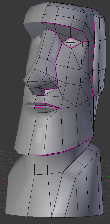
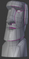
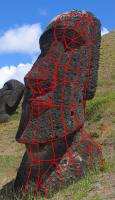
I can see more edge loops have been added, but the nose looks as sharp as before. The loops on the forehead also seems underutilized. I would actually recommend cutting down the polycount, and rework the basic shapes. The nose shouldn't really need more than 4 edges across the ridge. made some minor adjustments, so here is a new zip. maoi.zip
-
Well, actually, i hardly see any difference at all. Nose is to thick and short, several sharp regions that should be rounded (like the corner of the brow that should be more like a circle segment). Many edges seem wasted, and unevenly spread. I'm sorry if I come off as harsh, i don't wish to sound discouraging, and, well, there are many variations of the maoi statues. But some things, like in particular the rounded brow and the elongated nose isn't reflected in this model. I threw together my own model (surely we would want to keep multiple ones, since they have so much variations). I ended up at 408 triangles. maoi.zip

-
I think you should spend more polys making the chin and brow rounder. Shaping in the nose some more, adding in the slight shoulder parts I sketched a rough idea for what I think would be a nice amount of detail.
-
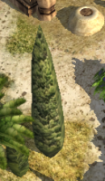
I got to say.. this tree sticks out like a sore thumb. It's just.. to dark? High contrasts. Also very flat. Especially compared to that beautiful palmtree right next to it.
-
Oooooh show a sample of the crocs normalmap please!