Enrique
WFG Retired-
Posts
2.338 -
Joined
-
Last visited
-
Days Won
96
Everything posted by Enrique
-
Nice work man! I like the direction a lot. Playercolor could be on the props, but if you find a way to make some parts would be good. Don't bother too much on nails and very little stuff, it's probably not going to be noticed. I agree with you in increasing the contrast a bit.
-
It looks out of context because of the ao maps. Keep in mind that cliffs are not smooth like in the game. Ideally, this waterfalls should be use together with future AOed cliff meshes which will not be so smooth and will give cliffs a better look. However, I still not sure how I'm going to approach cliffs yet.
-
I'm afraid that's not possible, since each variation for each biome uses it's own texture. If tiling/masking worked, that would be another thing.
-
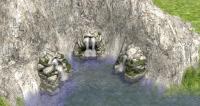
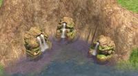
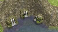
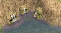
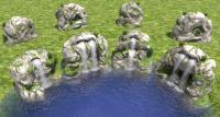
I remade the models. Now they have the back "open", because it's supposed to get "in" the cliffs. There's too much textures to get them all in-game, so let's choose by biomes, or just choose one waterfall variation per biome or something like that. First row from left to right: mediterranean, desert, tropic, and savanna:
-
This site is IMHO one of the best Blender3D training resources in the web right now: http://cgcookie.com/blender/ enjoy
-
Yes, I know what you mean. I used a texture that I thought it was from a cliff, but it doesn't. I can change the texture easily, but I might also try a different approach for the models. Maybe extending the back part far away to get "inside" the cliff would be better.
-
Thanks! The problem I found regarding cliffs is that as far as I know, they cannot have tiling textures like the terrain. This may make the textures look low res compared with the terrain, or need a bigger texture to be on par. I will definitely make some test to see how it goes though
-
Right now I set the actor to "float" so it will always stay just above the water level, so the end of the waterfall makes waves when hitting the water.But maybe it's better just to extend the waterfall without waves to be able to set the waterfall rock higher? I'm going to commit so people can comment or suggest a better way of making them.
-
-
Full, of course It can be filled with already in-game props, but you can choose to model new ones, it's your choice.
-
===[COMMITTED]=== Mauryan light & medium Warships
Enrique replied to Enrique's topic in Completed Art Tasks
No problem Nick . I took care of the 3 heroes. I think there's no more work left on the mauryans, maybe the cart for the trader, but the ox is not animated, so it won't make it to the alpha 13 release that will be sometime soonish. -
Dude they're 40x40, there's not much room for detail. In addition I think they look good, and distinguishable (maybe the background is a little bright for my taste, but it's ok)
-
Sure! Feel free to change the texture and post it here. Don't go too overboard with the contrast though, it's looking quite good atm ;-)
-
-
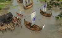
LoL. Mauryan warships and merchant ship will have even different wood texture. You'll have no problem to differentiate them. Just wait to see them in-game next to each other. Furthermore, they have different symbols on the sails. If someone has not clear which one is it, it's not paying attention lol
-
I think they're three images, but I have zero knowledge about how the menu background works/needs... I'm sure someone here will point you in the right direction
-
That last one looks awesome LordGood! Tbh, I think we're not going to be able to find enough artists to have all the unit icons hand-painted. It was decided to use ingame screenshots for unit portraits also for consistency reasons instead of having different styles for each faction/artist. I don't want your talent to be wasted on portraits that maybe don't make it into the game. But would you like to make some main menu backgrounds? it would be awesome to have more than one picked randomly. There you can make it with all the detail you want
-
Looking awesome! Please add it into a zip file in .obj format with the texture in .png and I'll take care of the rest to get it in-game You can post the zip with the file and the texture here, you'll find a button to attach files when you click "More Reply Options" next to the "Post" button
-
After following the discussion thread I changed my mind. It will be better than percentage armour for even upgrades between all units.
-
It's already commited. Check it out
-
From Pureon post of Icon showcase:
-
Art-style is great for illustrations but not for game buttons.Try to scale them down to the ingame buttons resolution. They're going to be impossible to distinguish.
-
Fixed


