Enrique
WFG Retired-
Posts
2.338 -
Joined
-
Last visited
-
Days Won
96
Everything posted by Enrique
-
-
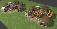
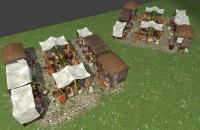
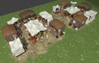
Nope, walls and special building and wonder are not done. And this market still not finished yet.
-
I discussed this with Pureon some time ago, the problem adding patterns/playercolor to the white sheets is that the texture is used in some buildings and could lead to some ugly stretching. Perhaps I'll try with an extra small texture for the patterns/playercolor (though I used some flowers details with playercolor not currently shown in the screenshots) we'll see
-
-
I have to agree here, thanks to everyone that helped to make the Mauryan civ to come into 0 A.D.'s world with historical accuracy Also agree to the special thanks to lilstewie, he made a fabulous work researching and finding awesome sources
-
Just to let you know, market is already WIP. Expect layout proposals to choose soon
-
Why quote 7 images to say that?
-
[RESOLVED] Cannot alter match setup options in Alpha 12 Loucetios
Enrique replied to sumghai's topic in Help & Feedback
Hello sumghai! welcome to the forums. You are not able to change the match options because you are not allowed to do so on a "Scenario" match mode. If you want to customize that options, you should change the match type to "random" and you'll have access to them. Scenarios are meant to have a defined set of conditions to play them. That's why you're not allowed to change them. The same happens in multiplayer. Have fun! -
===[COMMITTED]=== Mauryan light & medium Warships
Enrique replied to Enrique's topic in Completed Art Tasks
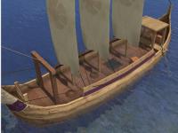
Nice start Ndragu. I don't know if it's the camera angle but the ship looks too wide now. I imagine the warships being narrower and the merchant ship about the wide of your last picture. Another thing is that I think the deck should be a little lower, it looks too close to the edge of the ship now. Keep it up! -
===[COMMITTED]=== Mauryan War Elephant (and hero elephant)
Enrique replied to Mythos_Ruler's topic in Completed Art Tasks
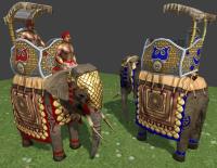
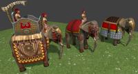
lol I considered the other two elephant units as finished . Anyway, I just changed the scales color and lightened the howdah, it was looking too dark compared with the rest of the textures. Can we consider it ready for production now? -
===[COMMITTED]=== Mauryan light & medium Warships
Enrique replied to Enrique's topic in Completed Art Tasks
I'm not sure what you guys mean. If you are referring to shadow artifacts (like sawing shadows) that's probably lack of polygons, and can be caused due to sun's position. If you refer to the black line along the sails from top to bottom, that could be 1. the shadow of the rope going from the top of the mast, 2.- The black pixels outside the margin of the sail textures "bleed" inside the UV islands and shows the black line (I think it's both) This second case is more visible when zoomed out. I'll take a look at it when scaling the three sail boat up. -
-
===[COMMITTED]=== Mauryan War Elephant (and hero elephant)
Enrique replied to Mythos_Ruler's topic in Completed Art Tasks
Here they are: Still not happy with the hero elephant yet. I'll make him another head armor with scales, and probably I'll touch the howdah textures to fit better with the rest of the elephant. The other two I think they're almost ready -
===[COMMITTED]=== Mauryan light & medium Warships
Enrique replied to Enrique's topic in Completed Art Tasks
Nice, keep it going I like those horns, nice idea, we should add them to the three sail version also -
Voice-Actor Application - Miles B. Huff (Sweyn78)
Enrique replied to Sweyn78's topic in Applications and Contributions
Pureon is kindly suggesting that first we need language experts to verify and translate the phrases needed for each civ and review them. There's no point on specifying technical matters if we don't even have the translations yet. If you, or someone, wants to help on this field, please share the list with potential contributors/native speakers who can help to translate them and record them if possible. -
===[COMMITTED]=== Mauryan light & medium Warships
Enrique replied to Enrique's topic in Completed Art Tasks
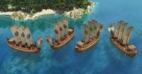
Yes, a smaller version, this time with just two main sails. But I'm going to scale up the three sail version you did. I'll let you know once I scale it up to use it as scale reference -
===[COMMITTED]=== Mauryan light & medium Warships
Enrique replied to Enrique's topic in Completed Art Tasks
@Ndragu, don't worry about the bugs, you're here to learn (I still make off-centered mistakes quite often lol) Probably the parented props to an empty wasn't a problem, I just mentioned because I don't usually see that. The best way to check how is imported into the game is trying by yourself. Luckily here are two tutorials for you to test adding props ingame. (just try with little test-assets to see which problems you can find) You can ask any doubts/problems here if you encounter any. The tuts made by our team member Pureon: http://trac.wildfire...DImplementation (just skip the blender edition part, the rest is the same) http://www.wildfireg...42 Definitely looking better with playercolor on the sails. Nice work! @Lion.Kanzen I don't think adding symbol variations on the sails will help to identify which faction owns the ship, but that's my personal opinion. @lilstewie The fish boat sail don't look so triangular, I kind of like it deformed by the blowing wind. I would leave it as it is now. -
===[COMMITTED]=== Mauryan War Elephant (and hero elephant)
Enrique replied to Mythos_Ruler's topic in Completed Art Tasks
No, as lilstewie suggest, it was said just to have howdah for the emperor. Please check the types of elephants here: http://www.wildfiregames.com/forum/index.php?showtopic=16700&st=40#entry261071 -
===[COMMITTED]=== Mauryan light & medium Warships
Enrique replied to Enrique's topic in Completed Art Tasks
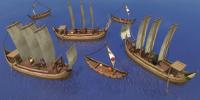
Ok, I put it in-game and here are some mistakes to learn from them -Origin point was under the waterplane (below origin coords). Looks like the deck is full of water: -The props were parented to "box012" and "Mesh" empties (there should be parented to the actual mesh named "untitled") maybe it's caused by the exporter, I don't really know. -The ship was not centered at origin coords (0,0,0) so the ship turned from a wrong pivot point. -It was facing the wrong direction (just rotating the whole ship 90º before exporting fixes this) I fixed this issues and here's the final result: I added the fishing ships to compare scale. The model looks great, but maybe the whole ship needs to be scaled up, but I don't know how big the actual ships were. And we're going to need playercolor on the sails definitely, what do you think? -
===[COMMITTED]=== Mauryan light & medium Warships
Enrique replied to Enrique's topic in Completed Art Tasks
Sure thing! And give me a list with the prop names to add to the .xml actor and I'll show you how they're added to the model in the game -
===[COMMITTED]=== Mauryan light & medium Warships
Enrique replied to Enrique's topic in Completed Art Tasks
Probably, that's why he's adding them on the interior. (Although vikings weren't the only ones who did that) @Ndragu: Looking good. Last request, could you make the orangish decorations in the hull of the boat with partial transparency to make them playercolored? -
===[COMMITTED]=== Mauryan War Elephant (and hero elephant)
Enrique replied to Mythos_Ruler's topic in Completed Art Tasks
This elephant is not a normal unit, is the hero elephant carrying Chandragupta. It's the emperor's elephant, so I guessed it would be quite decorated. -
I'm pretty sure it's already square, it gives the illusion of triangular shaped because of the screenshot angle.
-
===[COMMITTED]=== Mauryan War Elephant (and hero elephant)
Enrique replied to Mythos_Ruler's topic in Completed Art Tasks
This is what I thought at first. But after researching an endless amount of references, I realized that howdahs are not so small at all. I finally came out with this design so it has room for sitting comfortable and to get up and fight. If you have interesting references or sources please share

