Spahbod
WFG Retired-
Posts
594 -
Joined
-
Last visited
-
Days Won
2
Everything posted by Spahbod
-
Previewing a map in the game setup screen.
Spahbod replied to Spahbod's topic in Game Development & Technical Discussion
So we can sketch a 400x300 into a 512x512 and then the gui engine will sketch it back to 400x300. But I should say that almost none of the gui images are power of 2. -
Previewing a map in the game setup screen.
Spahbod replied to Spahbod's topic in Game Development & Technical Discussion
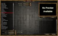
The preview should be something like 400x300 (Or more specifically, 398x298) or the game will sketch it to that size. gamesetup.zip This one is a little tricky. Should go to "art/textures/ui/icons/session/mappreview/" mappreview.zip -
You wrote a script to import height maps? That one would be very useful by itself.
-
You cheated! I wanted to make that one! Just joking. Nice map. I think the forest floors can be improved to be matched better with the terrain and the ocean floor can be some wet sand instead of the "thing" it is now. And it is better to write a little more description about the map. Overall nice work.
-
Previewing a map in the game setup screen.
Spahbod replied to Spahbod's topic in Game Development & Technical Discussion
They are already distinguished. The dropdown appears when you click on the "select map" button. -
Previewing a map in the game setup screen.
Spahbod replied to Spahbod's topic in Game Development & Technical Discussion
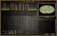
I have no objections then. When shall I commit the new ui? Note: The engine sketches the preview image if it doesn't fit the whole thing. That means that it is not necessary to have a preview exactly at the same size. I sketched the player assignment area. How do you think? -
Well, eagles, hawks and vultures are also found in deserts. And I think we should add wildasses too.
-
Previewing a map in the game setup screen.
Spahbod replied to Spahbod's topic in Game Development & Technical Discussion
Well, after a discussion in IRC with Pureon, we found out that it is better to have a 1pt border instead of the current one. How do others think? Discussion from IRC: -
Random Map Script: Sahel Watering Holes
Spahbod replied to wraitii's topic in Scenario Design/Map making
placeTerrainBaseOnHeight is for the whole map. But do we have any other "low" terrain here to be concerned about? -
Random Map Script: Sahel Watering Holes
Spahbod replied to wraitii's topic in Scenario Design/Map making
@wraitii: My update was committed a day after you made this topic. That's why I say you were faster than me. The problem with that line should be solved using placeTerrainBasedOnHeight() function. I had used it in many occasions with good result. Try archipelago for example. -
Previewing a map in the game setup screen.
Spahbod replied to Spahbod's topic in Game Development & Technical Discussion
The current size is 371x270. I really like the idea of atlas making the preview. But I can't do it. There is no problem at all to be solved! What is the problem with chat being there? This is the code. You should paste it in public\gui\gamesetup\ gamesetup.zip You should put these in this address: "art/textures/ui/session/icons/mappreview/" mappreview.zip The preview itself would be pink because I didn't upload the images. Only codes. Any more suggestions? -
Random Map Script: Sahel Watering Holes
Spahbod replied to wraitii's topic in Scenario Design/Map making
Bah. I should have looked at the forums. Your improvements are much better than mine and I bet you did it in less time. I may do that after the current gui work. -
Previewing a map in the game setup screen.
Spahbod replied to Spahbod's topic in Game Development & Technical Discussion
The problem with that space is that it is filled with chat box in multiplayer mode. So I should decrease the width of chat box in order to put more options there (that is not a problem because we don't have many options yet). Edit: Lol. I am a WFG Random Map Scripter that does GUI stuff and has also done some little 3d modelling but has just made 2 random maps in the upcoming release. -
Previewing a map in the game setup screen.
Spahbod replied to Spahbod's topic in Game Development & Technical Discussion
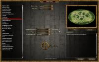
Does anyone else think that we should remove the logo? I put it there to fill that empty space. Any suggestion for that? In scenario selection, those "options" would become texts and show the map's options. So we need them in map selection screen. The same would happen if we add more filters (because they are not changeable "options" anymore). So this is not an issue at all. What if I am the host and a client wanted to tell me that he won't play this particular map? The host should see the chat box during the map selection process. Done. That was what I was trying to do at first. But the player assignment color badges and some other things where on the top of that "pop up" for unknown reasons. I agree with all your points. -
We had one developer working on it some time. But I don't know what happened to it.
-
Previewing a map in the game setup screen.
Spahbod replied to Spahbod's topic in Game Development & Technical Discussion
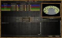
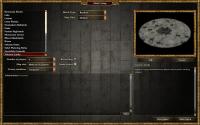
No. I never meant this. That was for old times when the river was horizontal. Fixed it. Thanks. How about these? Single Player: Multiplayer -
Previewing a map in the game setup screen.
Spahbod replied to Spahbod's topic in Game Development & Technical Discussion
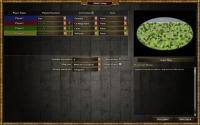
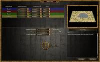
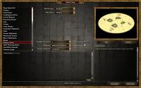
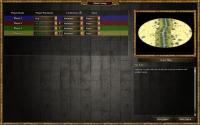
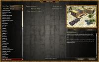
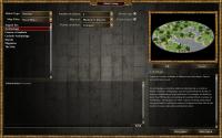
1. It doesn't. The two first pictures are from single player matches and the last one from multiplayer. 2. I agree with you on that it doesn't belong there. But otherwise the page would look empty. 3. How about bringing the options panel to the center of the screen? Similar to the way it is right now in the game? -
Previewing a map in the game setup screen.
Spahbod replied to Spahbod's topic in Game Development & Technical Discussion
The code is commented and ready to be committed now. Rearrangement is still possible. We need to decide on this. What should we do? -
Previewing a map in the game setup screen.
Spahbod replied to Spahbod's topic in Game Development & Technical Discussion
Technically, all of them are from the same concept and are direct screenshots from the game. -
Previewing a map in the game setup screen.
Spahbod replied to Spahbod's topic in Game Development & Technical Discussion
My latest experiments: We will certainly add more options to the game but I am thinking of adding a decorative image to the canter of that blank space. -
Previewing a map in the game setup screen.
Spahbod replied to Spahbod's topic in Game Development & Technical Discussion
Hopefully they'll understand which map is selected by the host because I coded it (although I couldn't test it). But now after a little thinking, I agree that we should place the game options somewhere it that it could always be seen. Edit: The game's main menu music is so good that I can't properly work on GUI because I want to hear it to the end every time I am testing something. Omri really deserves a big thumbs up. -
Previewing a map in the game setup screen.
Spahbod replied to Spahbod's topic in Game Development & Technical Discussion
Well, I did some experiments and found out that it is much better to separate the map selection and the player assignment. Here is the result: There are a lot of empty areas in single player mode that can be filled with the player's selected faction info, emblem and other such stuff. I think we should separate the two as it would be hard and confusing to have everything in one place. -
I tried to work with blender but it was very hard for me because I am used to working with 3D Max. Still there are many things that can be done by 3D Max like modelling static stuff. So if you want to make a structure, I recommend you 3dmax.
-
Found two problems. I can't sign out. It goes to an error page. Also in the main forum page there is a "Moderator CP" that is fully accessible!

