Atrik
-
Posts
804 -
Joined
-
Days Won
43
Everything posted by Atrik
-
Sheeps are in "passive" stance, while gazelles and all fleeing fauna have "skittish" stance.
-
Should be in for next release where (mostly useful for corrals) gathering from animals continue if other animals of the same stance are nearby. https://gitea.wildfiregames.com/0ad/0ad/pulls/9083
-
You post so many ideas that I'm getting the reflex to skip your posts, just so you know you might want to be more concise. What you are describing here will be implemented next release : https://gitea.wildfiregames.com/0ad/0ad/pulls/8525
-
@Vrayer, congratulation on making your first mod! I have to warn you however that changes like theses will cause oos if you play with players that wouldn't have the mod. For the mod you posted, you should keep the compatibility check enabled in the mod.json to avoid problems. If you really want to create a compatible mod that does this without compatibility issues (that will not oos), you would need a different approach where the UnitAI behavior stay unmodified but triggers re-issuing a command, for other clients to serialize the same behavior as you want. That's tiny slightly more complicated to do but very feasible.
-
@Vrayer If you want to could add a poll to this thread (maybe also change the title) and if people think units should continue to hunt other animals it could be done for next release. It could also be possible to do it depending on animal "stance" for example units would keep hunting any other non-aggressive animals or any animals basically in the same stance that your initial order was.
-
To do this, you would just need to remove this line: https://gitea.wildfiregames.com/0ad/0ad/src/commit/9598c6c2e1f4cc58f92d4fd6a54fda39ad195bf9/binaries/data/mods/public/simulation/components/UnitAI.js#L2755 But beware this line was obviously here for a reason. For example, if you are slaughtering a bunch of sheeps but an elephant comes by, then your units will attack this elephant.
-
Closing Old Issues
Atrik replied to ShadowOfHassen's topic in Game Development & Technical Discussion
https://gitea.wildfiregames.com/0ad/0ad/issues?labels=-24 Here you go -
Exactly. For a game overlay, they are the worse thing possible.
-
If you are referring the @Thalatta's last mock, then the dead space would always be less then current ModernGUI layout (10 slots vs current 12) but it's a bit closer to screen center which might look worse as said above. Your other points I acknowledged them in the last comment, so agreed but you always have to make compromises, goal is to make the best ones. We're back to first exchange : too much clutter, too much space used. The second option is just slightly better enough to make it interesting.
-
I think I'll consider this proposed layout, I see a some benefits. One of them might be an option to hide it as some players like myself already know each unit command hotkey. I also like that you get 10 slots for unit commands which is the exact number to not have any overflow for single-type selection even including new capture button (the 10th is "back to work") but doesn't have much dead space. The overflow in multi-type selection (worker + building) will overflow but that's somewhat fine, not worth adding space for this. About the construction panel layout, it's not worth pursuing your attempt to order building, in my opinion. Due to the fact that the list of construction is very variable : across civs, mods easily add some, and in a multi-type selection (if any of the selection is a trainer, a researcher or can be upgraded) then you cannot keep the ordering. Also on your mock the order isn't even done by any entity classes that would make it possible.
-
I like the gain in clarity and the attempt to normalize panel's heights. There are a couple reasons why I still couldn't go for this. Lateral space is already scarce in ModernGUI if you don't have a big screen Although your suggestion takes as much total space as what's implemented in the mod, it adds the clutter a bit more to the center of the screen. For users that use hotkeys for unit action anyways, or at least for myself, this is not desirable (maybe it's just something you could get used too idk) Contrary to what you say, the placement is logical. All possible actions are on the right side, all attribute-like options on the left (formation stance..) Currently the single selection detail panel wouldn't be able to shrink down height without losing something. You are basically saying the wording "turret point" is confusing but you aren't suggesting anything.
-
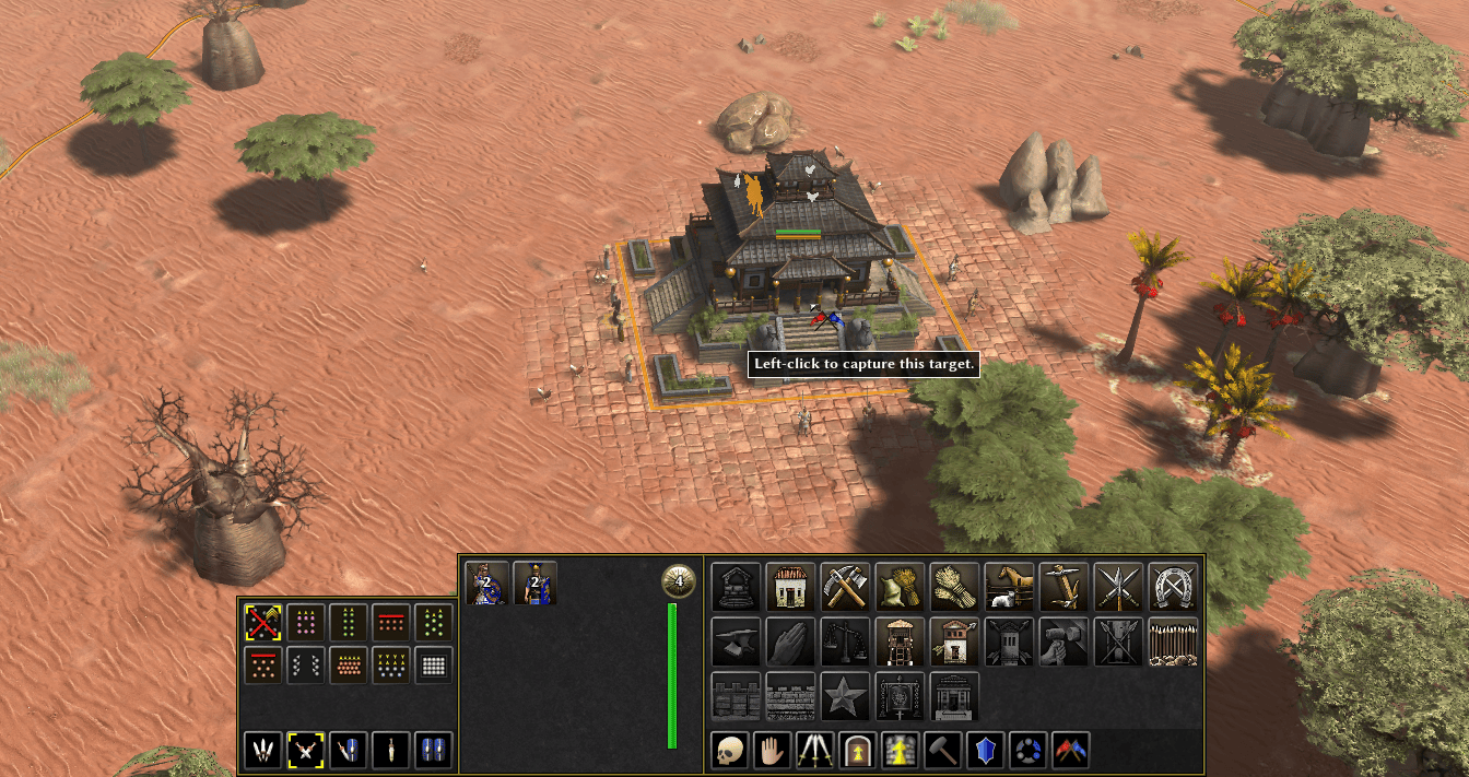
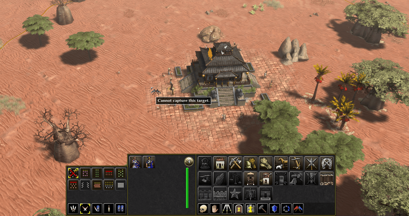
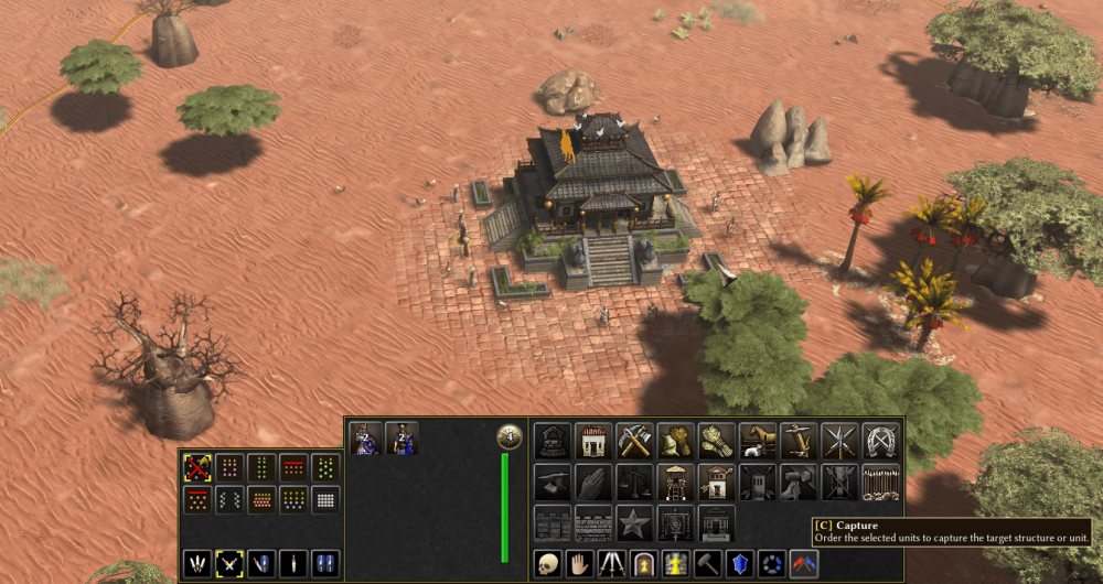
Have to say you are right. Hardly a bug. But it's confusing game-play choice (in fact, just a left-over from old wall towers being able to shoot). I have a pending patch were I replace garrison for turret points on wall towers.

-
The absence of a bug is generally less noticeable then when it's here
-
Vanilla UI doesn't have space to display all unit action button, so it doesn't show it. You can use the hotkey as an alternative. I can also recommend using ModernGUI as others and myself contributed to fixing bugs and limitations of the game UI. There are at least 100+ bug fixs like this in the mod. You can also choose to wait a few decades for them to be addressed in vanilla (no sarcasm, just a extrapolation of the time to get one item merged), staff and contributors do whatever they can to make it happen but the process is slow by nature.
-
@SadRdz see: Just tested the option by @ffm and it actually works after restarting the game/session.
-
Implementing forces in Unit Motion
Atrik replied to Atrik's topic in Game Development & Technical Discussion
Yes it does, but in the videos, this opposite force is just not applied as it should, so the effect is less then its supposed to be. -
Implementing forces in Unit Motion
Atrik replied to Atrik's topic in Game Development & Technical Discussion
So for the explanation again, we could now plug any force that could contribute to unit motion and we just sum up the vectors. So it's almost free there, when calculating unit motion. Maybe excepted we still have to check for collisions. The rest of what makes the unit motion looks realistic is inertia, which is also just a ""force"" vector that carry unit velocity over the game turns. Calculating the forces themselves is generally making some dot products and sometimes maybe some trigonometry (kept as minimum for angle of impact etc) so also possible to be kept very cheap. For the current demo of the boat we use 1 trig function which seems reasonable. -
So much quality content about this topic
-
Implementing forces in Unit Motion
Atrik replied to Atrik's topic in Game Development & Technical Discussion
It does in the video, but there are reasons why it end up just slightly slowing down the attacker. Now taking a step back from what I did empirically and reading the comments, I might just rethink some aspects that would address some defects like this one. Would be very nice, yes more realistic movements and collisions would make a boarding mechanic interesting. -
Implementing forces in Unit Motion
Atrik replied to Atrik's topic in Game Development & Technical Discussion
We use one trigonometric function to determine the hit angle and deduct the amount transferred as angular velocity and add the force to right direction. It's a really nice suggestion that I like, I don't know how animating "choppy oceanic water", it would require to implement a terrain-dependent bonus or effects, then adding the force would be easy now. However i like it, not sure about what would be the timeline to even have the features enabling this. -
Implementing forces in Unit Motion
Atrik replied to Atrik's topic in Game Development & Technical Discussion
Noted but for the videos, the unit template parameters are for the "demo". The balancing of it all will be a task on it's own , my focus at the moment is to put the features out there as most of them would be optional (so disabled/absent from unit motion). It could be possible with not too much work on the code side, now that a lot of the structure is already there. But it also require a proper animation, else would look too weird. So that's for another time.. You can note that the boat receiving the blow in the video almost seems animated here but really it's just "hacked" with some rolling motion. -
These are videos from a current work in progress to implement different forces into unit motions, like inertia, knockbacks and charge attacks! The values would be very customizable in unit templates for mods too! Screencast+from+2026-06-04+23-57-24.webm Screencast+from+2026-06-18+18-01-22.webm Screencast+from+2026-06-18+17-53-13.webm
- 18 replies
-
- 12
-

-

-
Actually not bad!


-
But how does that look in 64px?
-
I need some advice... worst game of my life
Atrik replied to AmericanDream7's topic in Help & Feedback
@AmericanDream7, @Akentas, sorry you guys had to face this. Indeed you should not hesitate to mute and ban from your games, players that seemingly just want to harm. In most cases they, themselves believe you did something wrong and their answer is to be toxic, which is obviously them not being reasonable. For my take on this, I certainly don't want to push toward having more policing, but we should work toward having more efficient tools to blacklist-whitlist players. (See this opened ticked)