Leaderboard

Popular Content
Showing content with the highest reputation on 2026-06-30 in Posts
-
Version 0.28.9 now on mod.io2 points
-
I debated even posting these other ones, lest I just spark endless rounds of talks of "customization." All of the relevant information shown in the 2nd version and more would be shown in the 1st version with very detailed tooltips. I'm not sure every aspect of the game should be customizable. Sometimes we have to actually design something and stand by it.2 points
-
Items like this for Civ Bonuses and Team Bonus. Stencil format. onHover tooltips give Description/History: Then for technologies and structures, we get icons like these, which have onHover tooltips giving costs, etc., as in-game or in structtree, plus Description/History: (technologies) (Structures)2 points
-
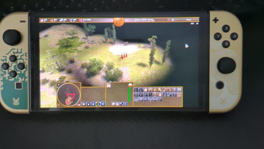
Full crossplay support between Switch and PC -. Connecting to lobby also works
 1 point
 -
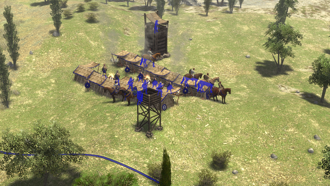
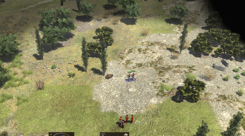
This is my scouting mod, it is not complete yet, but if anybody want's to test it, that would be great! If you find any errors or have suggestions, please post them It is also on Github (which is updated more frequently, and has more bugs): https://github.com/Jeff-web-sketch/Scouting More info at the github page (see wiki: https://github.com/Jeff-web-sketch/Scouting/wiki) Thanks to everybody who helped! Changelog has moved to github: https://github.com/Jeff-web-sketch/Scouting?tab=readme-ov-file#readme Scouting-1.7.pyromodScouting-1.7.zip Scouting-1.6.pyromodScouting-1.6.zip
 1 point
 -
I'm not really fond of "customizations" either, lots of code for little value. Having a single toggle for two UIs, the current "CRT" optimized one and a new one focusing on modern format 1080p and 16:9 supporting also 21:9 and whatever insanely wide monitors exist. The "LED" version would scale well on modern resolutions, be it 720p, 1080p, 1440p or even 2160p. It could also incorporate many of the suggested changes, I can't say I absolutely love the mock ups but they are much much better than what we currently have. Once the "LED" one is polished we can consider dropping the "CRT" one at some point.1 point
-
Edited the Athenian mockup with some DE-accurate information: I threw in some vertical scrollbars for 3 of the information panels and a horizontal scrollbar under the Hero portraits at the bottom.1 point
-
Exactly. All we need at first is to make a generic layout (so every civ's Civilization Overview will look nicer right away), and then a civ-specific layout: perhaps for either the Achaemenids and/or the Athenians. If can make that work, then it should be a lot smoother making the rest of the civs follow suit with their own themes. All of the features will be in-place and all we need to do is plug-n-play.1 point
-
Yes, looks great. I also think that all the civilization-specific ornamentation adds a lot of personality. I can imagine a base template with more generic decorations that act as placeholders until they're replaced with civilization-specific ones. I think that could help the visual development of each civ overview.1 point
-
I think the 'generic' theme could be based on this Athenian example. Just remove all of the Athenian-specific things, like the owls, anchors, and ocean waves. That way, when a modder adds a new civ or the base game adds a new civ, the new layout will still work without necessitating a whole new theme right away. The theme for the new civ can be created later and will be helped with the fact that there will be a dozen examples of how it's done. I really like how the bonuses are represented by stencils, while the 'entities' such as technologies and buildings are represented by simplified, aesthetically pleasing round icons.1 point
-
I've submitted 3 PRs and 4 Issues.1 point
-
Yeah, either remove the names entirely, or something like a name plate that overlaps the emblem could look really nice too:1 point
-
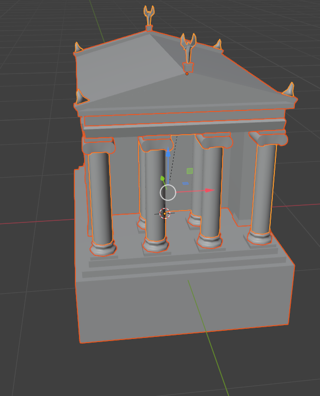
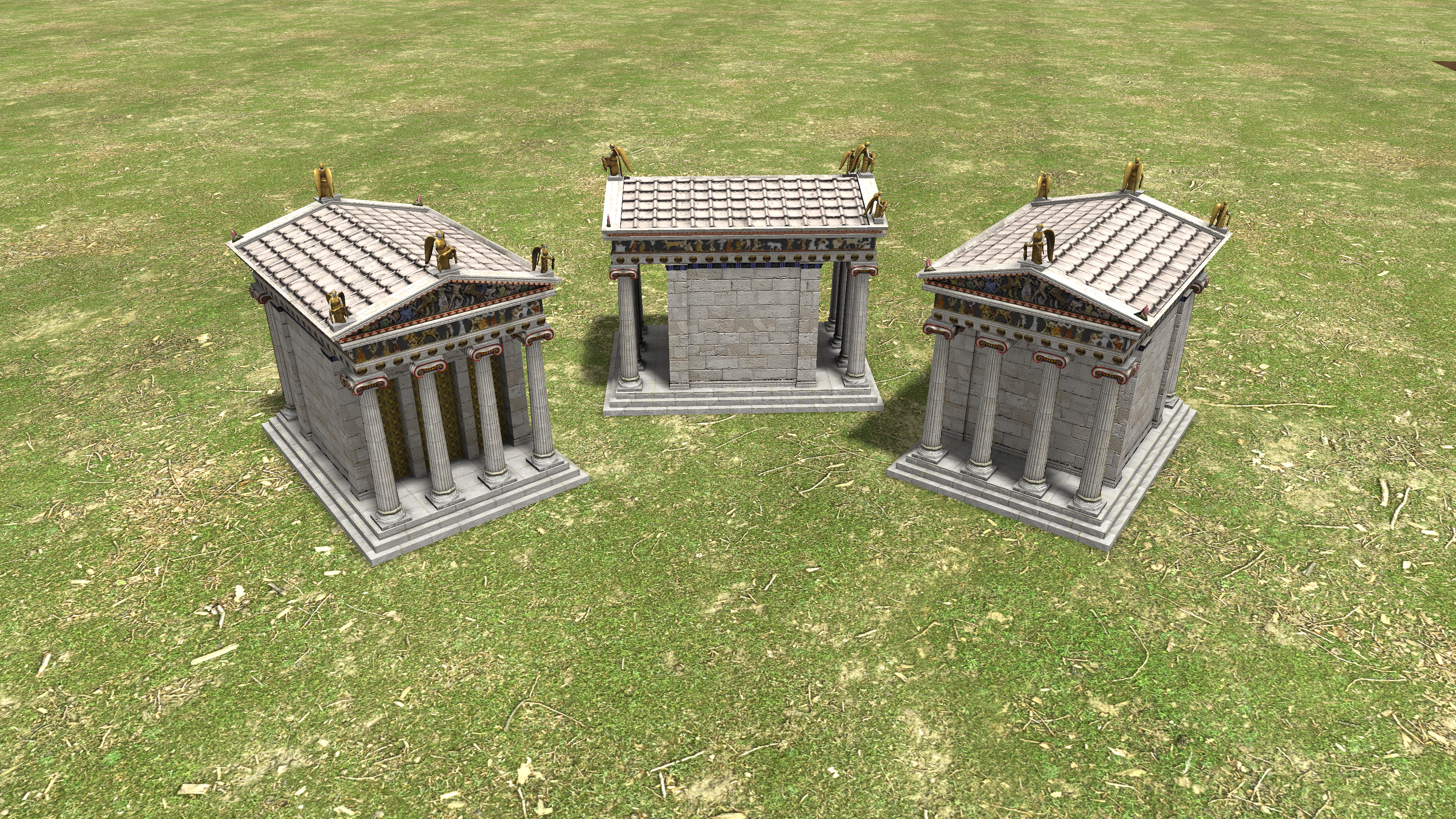
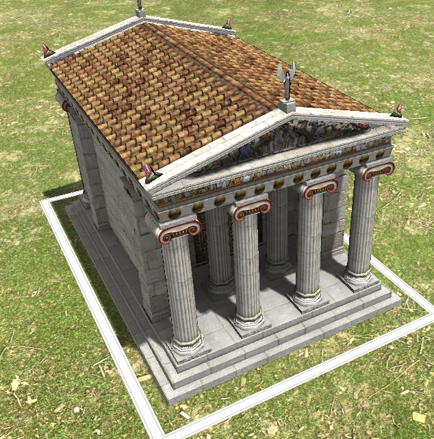
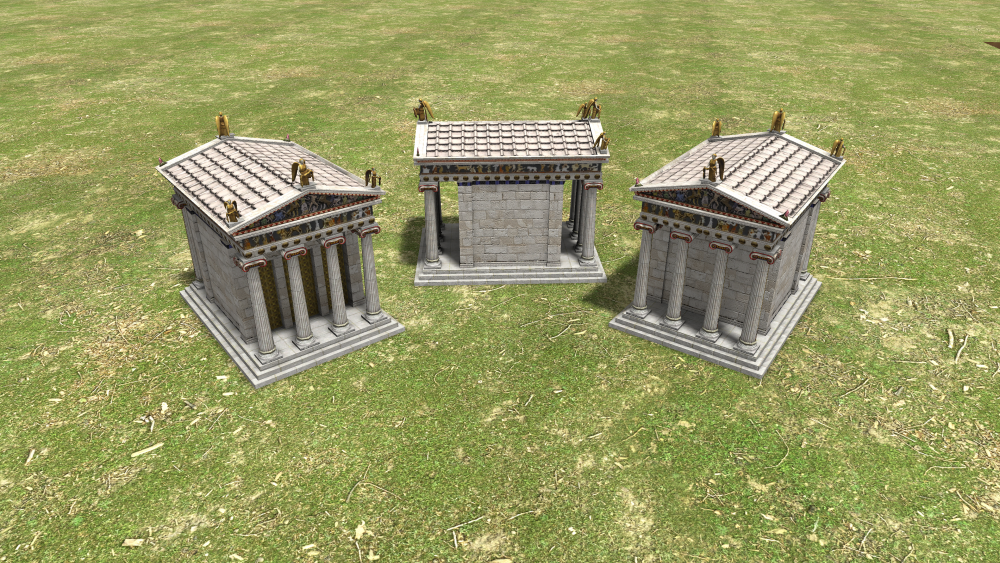
https://www.anasynthesis.co.uk/index.php/nike/the-temple-of-athena-nike I'm thinking it would be possible to use the current Athenian temple models as a basis for the Temple of Athena Nike. Athena Nike would be narrower and the columns would be skinnier. It would also have nicer sculptures at the top. I think the structure would be overall about 80-90% the size of the buildable temple and would have the white rooftiles of the Parthenon instead of the brown tiles of the standard temple. It would also have the bronze gates inside of the columns in front of the door.
 1 point
 -
1 point
-
@wowgetoffyourcellphone Scaled, changed proportions, the columns and the gate. I also added some more deco around the top and closed some supposedly "hidden" downward faces, because I could imagine a cutscene walking up the acropolis with the new camera path possibilities. The Nike sculptures are those from Athena Parthenos. temple_athena_nike.zip
 1 point
 -
Lo estuve probando y no veo ningúna diferencia?? Qué me falta?
 0 points