Mythos_Ruler
WFG Retired-
Posts
14.941 -
Joined
-
Last visited
-
Days Won
59
Everything posted by Mythos_Ruler
-
Removing Or Adjusting Support For Square Maps
Mythos_Ruler replied to k776's topic in Game Development & Technical Discussion
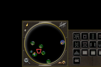
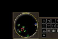
Try these out for size. I committed the texture for the idle button (bottom right) to the game. There is a lot of wasted space in the texture because the button is slightly larger than 64 pixels on a side so I had to go up to a 128x128 texture. So, if I fiddle with the shape of the buttons a bit I may be able to fit it into a 64x64 texture. -
Age Of Empires Online
Mythos_Ruler replied to tinoesroho's topic in Introductions & Off-Topic Discussion
Okay, so the Home City is where you play from and you use it to store items and create new items. It's also used to send you on quests, which are new scenarios you can win and receive new items (like new technologies and things like that). You can choose to refuse quests and do other things though. And the game is open-ended, with no specific "single player campaign." This isn't bad, IMHO, because the campaigns in AOE have always been pretty craptastic. As you go along you Level up your home city and get new buildings and things, which in turn allow you to upgrade your units and things like that. You also collect items and resources on your various quests that you can use to build new things in your Home City or upgrade your troops. It's all very cool and RPG-ish, without losing the great AOE RTS feel. As you expand your Home City you can change things and place buildings wherever you want, unlike the Home Cities in AOE3. Basically the HC concept has been completely revamped and made 10x better. You no longer have "cards" and "decks" but items you collect and acclaim you achieve through questing (agreeing to play assigned scenarios, essentially). I only achieved Level 2 so far, but I'll let you know how it goes. One of the things I like is that the game essentially cuts to the chase and refers to you as a god. This is how most RTS games are played -- the player is a god-like being making every single decision for every entity in the game. A lot of RTS games pretend that you are a general or something, but RTS mechanics aren't like that at all. AOEO finally acknowledges that fact and acts accordingly, referring to the player as Zeus or whatnot. Pretty neat. The Hotkeys are nothing like 0 A.D. I'm afraid, but it does have a hotkey editor. I quickly changed the camera movements to a 0 A.D.-like setup, so now it's all better. A few other details: There is an integrated marketplace in the game. Since the core gameplay is free, you can go to this market to purchase gameplay enhancements. I am not sure what will be available in the marketplace, but I assume additional factions, units, cosmetic improvements, things of that nature. As someone who would like to get into the game dev business, such a thing is pretty awesome (especially how seamlessly they've integrated this). But as a gamer I'm dubious about it. Why should someone who can pay more money than me get a leg-up over me? But it remains to be seen whether this will actually negatively affect gameplay in such a way. Other thoughts so far: - The game will also have an Online Manual accessible from the in-game Menu. This is something we plan to do with 0 A.D. - Graphics are nice to look at. I look forward to seeing more advanced units and heroes and such. I am not so sure about the design of the buildings and things. Not very historical in that respect at all. - The music is pretty good. It sounds a lot different than other AOE installments and oddly more "authentic." - There is an ever-present chat room in the bottom left corner. It keeps the game feeling "social" and helps if you want to ask a question, but hopefully it doesn't fill up with XBOX Live-style chat with people swearing at each other all the time and using racial slurs. Time will tell. - The UI art is good, but I don't like how everything is so spread out. The UI is disconcerting in this way. http://www.ageofempiresonline.com/faq/ -
How would you have done the HC concept? How should the HC affect gameplay?
-
That would work too. I'll see what I can do.
-
Age Of Empires Online
Mythos_Ruler replied to tinoesroho's topic in Introductions & Off-Topic Discussion
I signed up for the Beta two months ago and just yesterday received my confirmation E-mail. -
Iberians For Alpha V
Mythos_Ruler replied to Mythos_Ruler's topic in Game Development & Technical Discussion
It'd still be cool to have it. I can commit it to the Art SVN. -
Age Of Empires Online
Mythos_Ruler replied to tinoesroho's topic in Introductions & Off-Topic Discussion
I'm installing the BETA now. I'll let you guys know how it is. Apparently it is Build #5164. (4/13/2011) -
Removing Or Adjusting Support For Square Maps
Mythos_Ruler replied to k776's topic in Game Development & Technical Discussion
-
New Patrician
Mythos_Ruler replied to ArchaicWarrior's topic in Introductions & Off-Topic Discussion
Salve, citizen! First Spear Centurion Lucius Vorenus recommends you install the Alpha IV release, sub-titled "Daedalus." http://www.moddb.com/games/0-ad/downloads/0-ad-alpha-4-daedalus -
Removing Or Adjusting Support For Square Maps
Mythos_Ruler replied to k776's topic in Game Development & Technical Discussion
I'll see what I can do. Looks like I failed to upload the GUI .PSD file to the Art SVN before my hard drive went kaput. I'll just make do. -
Iberians For Alpha V
Mythos_Ruler replied to Mythos_Ruler's topic in Game Development & Technical Discussion
It's a decent placeholder. I think I will make a new one now based on the references we have. EDIT: I like your texture a lot. Do you have the working PSD? EDIT 2: I committed a new Healer texture. It's closer to the concepts, but I still don't like it. The female body mesh is too low-poly. In fact we really need an all new mesh for this, since the Priestess is supposed to have a huge flowing gown. -
Removing Or Adjusting Support For Square Maps
Mythos_Ruler replied to k776's topic in Game Development & Technical Discussion
Philip's notion sounds like the perfect compromise, actually. So, for the buttons, we apparently have 4 spaces for 4 buttons. Either that or if we get support for overlapping buttons we could prolly fit two in the upper two corners and one in the bottom two corners for the possibility of 6 buttons. Let's just assume 4 buttons for now. The question is then, which 4 buttons are the most important? Probably: Minimap Zoom Toggle Idle Workers (should cycle through these in this order: Female Citizens, Fishing Boats, Traders, Merchant Ships, Citizen Soldiers [infantry], Citizen Soldiers [Cavalry], then back to Females). Score Toggle Minimap Flare Idle Workers could possibly go to the 'Population' icon in the ribbon. Click that and it cycles through the workers. Doing this we could then put 'Friend and Foe' or something else around the minimap in its place. -
We could conceivably do something similar with a few trees here and there, but leaves falling to the ground. AOE3 did this. We just have to be careful not to overload the game world with particles.
-
Iberians For Alpha V
Mythos_Ruler replied to Mythos_Ruler's topic in Game Development & Technical Discussion
It's backward. -
Iberians For Alpha V
Mythos_Ruler replied to Mythos_Ruler's topic in Game Development & Technical Discussion
Definitely the female dress mesh. I wish we had a better "dress" mesh for her, but it is what it is. -
As promised I have added sparkles to metal mines. Update SVN and check them out.
-
Graphics Features
Mythos_Ruler replied to Ykkrosh's topic in Game Development & Technical Discussion
This is visible on the terrain in Battle for Middle Earth II as well. It's a nice bit of realism that would help temper our new super bright sun rendering. Perhaps each skybox can come with a corresponding cloudiness factor. It's subtly visible in this video (I recommend watching in HD so you can see the cloud shadows better). Of course ours can be more stark or more subtle as needed. We don't have to mimic this exactly. -
Iberians For Alpha V
Mythos_Ruler replied to Mythos_Ruler's topic in Game Development & Technical Discussion
Well, the current Female texture is serviceable. It's basically a mod of the Celt female texture. But the Priestess really needs some work. Right now "she" is the male priest's body with no head. -
I think that would be more likely than having trees and walls block Vision.
-
Atlas Scenario Editor
Mythos_Ruler replied to historic_bruno's topic in Game Development & Technical Discussion
It'll need an auto-build, right? Looks awesome and I can't wait to play around with the new tools. -
Iberians For Alpha V
Mythos_Ruler replied to Mythos_Ruler's topic in Game Development & Technical Discussion
Checked out the Slinger projectile. It could probably stand to be a little bigger. I can't even see it when in flight. -
Iberians For Alpha V
Mythos_Ruler replied to Mythos_Ruler's topic in Game Development & Technical Discussion
That'll be awesome. -
Iberians For Alpha V
Mythos_Ruler replied to Mythos_Ruler's topic in Game Development & Technical Discussion
As far as the Priestess body, I just meant it needs to have the dressy female body mesh+new texture. I fixed player color on the fishing boat. The actor just didn't specify color. -
Considering the game is only in the mid-Alpha stage, I think your criticisms are unwarranted. Shader support was recently added to the renderer, and graphical features like Bloom, distance fog, etc. will most likely be implemented in the future. You must first realize that the goal of the project is not just to push out a game, but to experience game development from the ground-up. Most fans realize this and enjoy receiving snapshots of the game's development in the form of semi-regular Alpha releases. Our simulation system is uniquely extensible and easily moddable by even novice modders and aspiring developers. So, you see that the goal is not to push out a game with all the latest bells and whistles. Our goals are broader than that. And besides, I don't see how HDR, ragdoll physics, and the like improved an RTS much at all, Age of Empires 3 being the prime example. With all that in mind, if you have any specific suggestions on how to make the game less lifeless, then please let us know. We are continually improving the game and the development of the game is as much a community project as anything.
-
Not sure. The easiest thing would be to just keep the Carth javelinist as-is, and just tweak it so that it's slightly different than the Iberian version. Unless someone comes up with something better of course.


