-
Posts
2.300 -
Joined
-
Days Won
23
Everything posted by Nescio
-
Of course, I never said it would be easy to implement; it's something for the long-term wish list, like multi-core support or splitting the public mod.
-
Exactly: What you need is pango, which would also allow different writing directions and properly scaling text sizes.
-
Thanks for the link. I read the article from beginning to end, yet could find nothing in support of your claim. In fact, it states: However, our data exhibited no difference in legibility between typefaces that differ only in the presence or absence of serifs. and: In Experiments 2 and 3, the presence or absence of serifs made no difference in reading speed, for all participants, both normally sighted and those with low vision. Only in Experiment 1, which used an acuity criterion of legibility, was a statistical effect of serif size observed. The size of the observed effect was extremely small, however. which is in agreement with what I wrote earlier:
-
It is. Find me a reliable study in support. Comic Sans has a poor reputation and is taken less seriously. I dislike it myself too; when I wrote “quite decent” I wasn't commenting on its beauty, I was talking about its readability; at least all its letters are distinct, contrary to geometric fonts (where b, d, p, q are all the same).
-
That's actually a popular myth that is repeated so often that people have started believing it. If anything, it's the other way around: serifs improve readability, which is why books and other print media use them. The reasons why sans-serif fonts are recommended for displays are two-fold and mainly historical. Displays used to have only a handful of pixels and there was simply no space for serifs (try putting text in an image with only 6 pixels vertically). Nowadays computer (and phone) screens tend to have such high resolutions this is no longer relevant. Secondly, sans-serif fonts first appeared only in the late 19th C, around the same time Modernism emerged (not a coincidence), and have always carried “modern” connotations. In the early 20th C Bauhaus was very influential on many fields and let to the Futura typeface; decades later Helvetica and Univers became successful on the same principles. Using a sans-serif font to push back at what is considered old is still prevalent in the 21st C. Google used a serif font (Catull) in its logo until 2015, when as part of a larger corporate reorganization (which created the parent company Alphabet) it was deemed necessary to reinvent itself and create a new identity. The “serif vs sans-serif” is rather a false dichotomy; what matters is that a good font is chosen, not whether or not it has serifs. And there are many bad fonts, both serif and sans-serif. As for sans-serifs, Arial is a rather poor typeface; Comic Sans quite decent; Frutiger is simply great, it was designed for airports, and has since been adopted for railway stations and road signs, due to its readability at long distances. Linux Biolinum is not a bad font, but I like Linux Libertine better. If I believed it would be less readable I wouldn't have taken the trouble to make a mod for it.
-

Custom Hotkeys - is there a list of available keys?
Nescio replied to 2fftr's topic in Help & Feedback
See binaries/data/config/default.cfg and keys.txt. -

Translating Specific Names
Nescio replied to Akira Kurosawa's topic in Game Development & Technical Discussion
What is the file name? It's actually a bit more subtle. Though the exact pronunciation is uncertain, it is known that Old Persian ç evolved from Proto-Iranian *θr and eventually became Middle Persian s. It must have been a distinct sound, otherwise the Persians wouldn't have developed separate cuneiform signs for it. Nonetheless, for the purposes of the game, transliterating ç as “сс” /ss/ is fine, provided it's done consistently. You need people who know what they're doing. It's a lot of extra work for little benefit, so yes, uneconomical, thus understandable why commercial titles typically won't try. -
-
Some people like serifs. 0 A.D. uses the sans-serif font Linux Biolinum. I prefer Linux Libertine. Therefore I had a look at the source/tools/fontbuilder2/fontbuilder.py, generated new font images, and bundled them in a mod: linux-libertine.zip With the mod 0 A.D. uses Linux Libertine (Display and Bold) as the default font in game, and FreeSerif as the fallback font, which also happens to have a greater Unicode coverage (over 10,000 glyphs) than the default fallback font FreeSans (over 6000 glyphs). It should work with both the development version (A24) and the stable (A23), as well as earlier versions (A22 etc.), but if experiencing trouble when switching, delete the 0ad cache (see https://trac.wildfiregames.com/wiki/GameDataPaths ) and relaunch the game. [EDIT]: @Itms, maybe something to upload to mod.io?
-

Translating Specific Names
Nescio replied to Akira Kurosawa's topic in Game Development & Technical Discussion
“Translating specific names” or something like that? Language is fascinating. -

Translating Specific Names
Nescio replied to Akira Kurosawa's topic in Game Development & Technical Discussion
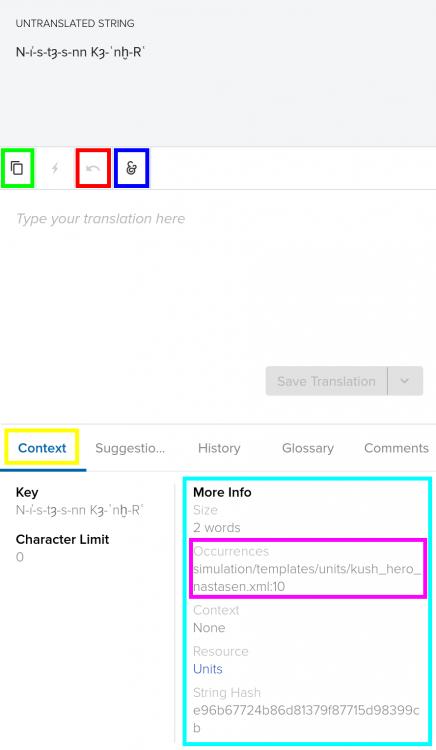
Good questions! I assume you're asking because you're translating strings on transifex? If you're having trouble with something, it helps if you inform us about file it is, which you can find under Context (yellow) / More Info (cyan) / Occurrences (magenta). For specific names, if you're translating to a language that uses the Latin alphabet, you can usually just click on Copy the source string (green) or press Ctrl+G. If you make a mistake, click on Revert the translation (red). Under Add special character (blue) you can find e.g. the ellipsis (…), itemization bullet (•), en-dash (–), or non-breaking space (NBSP). Alt+Enter will save your changes. If you're translating to a language that uses a different script (e.g. Cyrillic), then you probably want to transcribe the specific names. You can find some information on the relevant wiki page (work in progress). Consistency matters. Are you familiar with IPA? I don't know how Briton and Gaulish specific names are pronounced. @Genava55? Iberians use Basque: https://en.wikipedia.org/wiki/Basque_language#Phonology Mauryas use Sanskrit: https://en.wikipedia.org/wiki/Sanskrit#Phonology Persians use Old Persian. The X was probably pronounced /kʰ/ (as Ancient Greek χ) or /x/ (as Modern Greek χ). The š is indeed /ʃ/ (as in English ship). The ç is uncertain; it may have been a palatal fricative /ç/ (as in German nicht, not German auch, which is velar /x/) or perhaps affricative /t͡ʃ/ (as in English church). The ā is a long a /aː/, which is the same sound as short a /a/, but twice as long. Yes and no: the apostrophe (actually a keraia) indicates the Greek letter should not be read as a letter but as a number; B' means 2; see https://en.wikipedia.org/wiki/Greek_numerals#Table @Stan` or @feneur, could you split off @Zeldt's question and my answer into a separate translation thread? -
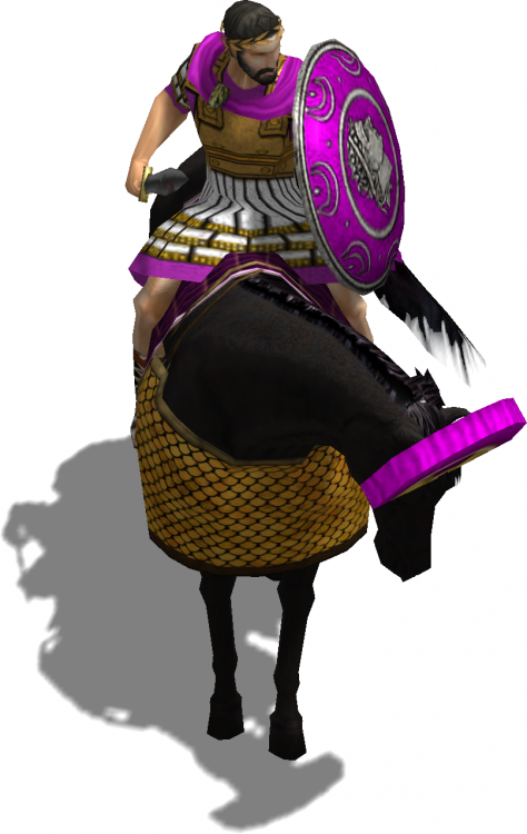
And I screenshot their actors: Perhaps someone could properly crop and resize them so these five heroes have at least some icon of their own?
-
Artistic licence, I suppose. I posted a few images at https://wildfiregames.com/forum/index.php?/topic/22779-0abc-mod/page/13/&tab=comments#comment-382501 some months ago, but if you need more, let me know.
-

Specific Name Review: Units
Nescio replied to Doktoreus's topic in Game Development & Technical Discussion
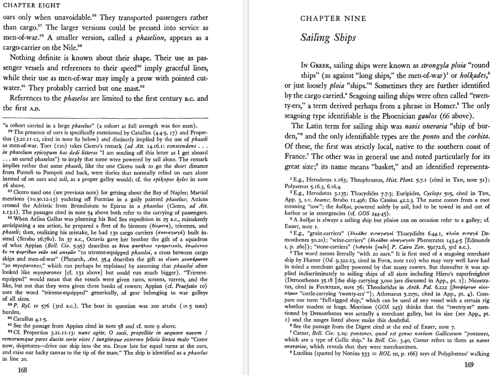
Why? The current name, πλοῖον φορτηγικόν ploion phortēgikon does mean “ship of burden, merchantman”; you can find it in your LSJ; πλοῖον στρογγύλον ploion strongylon is an equally good equivalent. Another fine name would be ὁλκάς holkas “ship which is towed : hence, trading vessel, merchantman”. Both ναῦς naus and πλοῖον ploion mean “ship”, however, the word naus is rare outside literary texts (Homer, Thucydides) and when both terms appear alongside each other and no adjectives are used, naus indicates a proper warship, ploion a merchantship or transport. (Again, see LSJ.) So I'm curious how you came up with “naus emporia” and why you think it would be better? For the Ptolemaic merchant ship, which has a different actor, a slender vessel, I would recommend the term φασήλιον phasēlion, a common Nile vessel. Here are also two pages from L. Casson Ships and Seamanship in the Ancient World (Princeton 1971) in support: -
That looks promising! I'm not not too sure about the ends, though, thrusting spears could have points to stick them in the ground, but javelins not really. Could you make the lines thicker, so it'll still look good when small? Also, the heads appear to be transparent.
-

Specific Name Review: Units
Nescio replied to Doktoreus's topic in Game Development & Technical Discussion
That's fine, there is no rush, I was just checking what has been done so far. Commits I remember: 22620 : Roman specific names 22719 : Persian specific names 23338 : healer names 23421 : Greek hero names -

The Kingdom of Kush: A proper introduction [Illustrated]
Nescio replied to Sundiata's topic in General Discussion
Go ahead, catafalques are a separate case (also for other civs).- 1.042 replies
-
- civ profile
- history
- (and 5 more)
-

Specific Name Review: Units
Nescio replied to Doktoreus's topic in Game Development & Technical Discussion
Did this happen? If so, when? -

The Kingdom of Kush: A proper introduction [Illustrated]
Nescio replied to Sundiata's topic in General Discussion
Also, kush_catafalque.xml has <SpecificName>Shanakdakheto</SpecificName>; do you happen to know the original transliteration?- 1.042 replies
-
- civ profile
- history
- (and 5 more)
-

The Kingdom of Kush: A proper introduction [Illustrated]
Nescio replied to Sundiata's topic in General Discussion
D2624 (Hopefully this one will have less trouble getting reviewed.)- 1.042 replies
-
- 1
-

-
- civ profile
- history
- (and 5 more)
-

The Kingdom of Kush: A proper introduction [Illustrated]
Nescio replied to Sundiata's topic in General Discussion
- 1.042 replies
-
- civ profile
- history
- (and 5 more)
-

The Kingdom of Kush: A proper introduction [Illustrated]
Nescio replied to Sundiata's topic in General Discussion
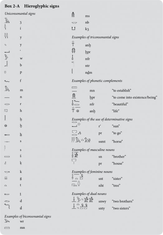
Kushites wrote in Egyptian hieroglyphs, right? Found it: https://en.wikipedia.org/wiki/Yogh#In_Egyptology- 1.042 replies
-
- 1
-

-
- civ profile
- history
- (and 5 more)
-

The Kingdom of Kush: A proper introduction [Illustrated]
Nescio replied to Sundiata's topic in General Discussion
It seems most Kushites structures and units use transliterations that don't insert vowels, so it would be inconsistent to do something else for the heroes, don't you think? I'm assuming the raised commas represent the voiced pharyngeal fricative /ʕ/ and glottal stop /ʔ/ and should thus be written as ʿ (ayin/ayn) and ʾ (aleph/hamza), not with single quotation marks ‘ and ’. However, is that a ʒ (ezh), a 3 (three), or something else?- 1.042 replies
-
- civ profile
- history
- (and 5 more)
-

The Kingdom of Kush: A proper introduction [Illustrated]
Nescio replied to Sundiata's topic in General Discussion
That makes sense. Nonetheless, we should still aim to get the other three consistent. I also had a look at the Kushite champions: Noble Cavalry: <SpecificName>Htr Ms’ n mh-ib</SpecificName> Meroitic War Elephant: <SpecificName>Abore ‘h3</SpecificName> Noble Archer: <SpecificName>Hry pdty</SpecificName> Napatan Temple Guard: <SpecificName>rs ‘Imn</SpecificName> Meroitic Temple Guard: <SpecificName>rs ‘Iprmk</SpecificName> So shouldn't Arakamani have “Irk-k-Imn Hnm-ib-R” and Harsiotef have “Hr-sʒ-it.f sʒ-mri-Imn” (plus proper diacritics) as their respective specific name? And Nastasen?- 1.042 replies
-
- civ profile
- history
- (and 5 more)
-

The Kingdom of Kush: A proper introduction [Illustrated]
Nescio replied to Sundiata's topic in General Discussion
However, Amanirenas has <SpecificName>Amnirense qore li kdwe li</SpecificName> and Arakamani has <SpecificName>‘Irk.‘Imn</SpecificName>.- 1.042 replies
-
- civ profile
- history
- (and 5 more)


