-
Posts
2.755 -
Joined
-
Last visited
-
Days Won
47
Everything posted by historic_bruno
-

===[COMMITTED]=== Updating the Greek Structures
historic_bruno replied to Gen.Kenobi's topic in Completed Art Tasks
I think that's what http://www.wildfiregames.com/forum/index.php?showtopic=16198 is for, though I'm sure it's all subject to change. It's a good point though, we may have a use for multiple markets, for the different Hellenic factions. Something for the art team to decide -

Wall Gates - how should they work
historic_bruno replied to luziferius's topic in General Discussion
I like that aspect of it too. Gates shouldn't be magic, there should be a risk involved in opening them, which is in the middle of a battle, you risk letting the enemy in. There's no way you could close and lock a gate in practice with enemies already inside, you need to drive them back first. -

Wall Gates - how should they work
historic_bruno replied to luziferius's topic in General Discussion
Even if units are passing through the gate, so it crushes them? I suggested not making the gate close immediately as it created the possibility of a unit becoming trapped on an impassable tile. Maybe better would be to test the area immediately within the gate for unit obstructions, instead of the much larger opening range. -

Building placement, damage and garrison
historic_bruno replied to System Error Message's topic in Help & Feedback
Have you tried Alpha 10? It has a new wall placement system which is very easy to use. Prior to that, they had to be placed individually. All you do is drag and drop, placing walls in a straight line connecting two or more points. It seems quite easy to use. We might add an optional snapping "grid" system for other buildings, for people who like a highly organized city I don't think that will happen without a physics system which we certainly don't plan. That said, we will gradually add more eye candy for damage and destruction effects. It's low priority compared to completing gameplay features. Can you give a more specific example, perhaps a screenshot of a difficult path for walls? Gates are now in SVN, so you'll definitely see those in Alpha 11 It looks like each infantry or ranged unit adds an arrow to the total count fired, which occurs over a two second period. I think whatever it does is not really correct and needs tweaking. Suggestions are welcome Yeah, naval combat really needs improvement, we plan to work on that for Part 1. -
It's not impossible to display both, but I think the external IP is more useful, you need that to play with people on different networks. We can have a button for LAN play that shows the private IP for the few users who would find that useful. Actually the hope is most people won't even need to know their IP once we implement a multiplayer lobby (http://trac.wildfiregames.com/ticket/1504).
-
I think we should animate the rotary mill special building. Sure, references for any of the above It's one thing to assert that Celts had more sophisticated architecture, do you have any reference images or literature? For my part I can't disagree that our Celtic buildings look quite primitive, far more so than other civs, but all the game's art is an approximation emphasizing the most well-known aspects of a civilization over a period of time, not necessarily cherry-picking from the wealthiest classes. Nor should it be assumed that every building is accurate scale for a large city. How would that be a change? If anything those buildings look even more primitive than ours, perhaps more detailed in some ways, but I wouldn't say they move us in the more "refined" direction that AbdelMuhamar is suggesting.
-

Terrain erosion
historic_bruno replied to myconid's topic in Game Development & Technical Discussion
I don't see how we could borrow them since it's not open source We could get some ideas, implementing them is the challenging part. If we implement fancy terrain modeling techniques, why not do so in JavaScript and make them part of the random map generator? Unless it turns out to be a very slow process, but slow processes are annoying, we should make them fast. I've seen some decent terrain generators even in old 90s games. The random maps could certainly benefit from more realistic terrains, no less than Atlas. -
Looks good to me and IMO it solves a problem we've noticed for some time: new players have apparently been overlooking the "Match type" dropdown and the filter as well. Now it should be obvious there are some options. This layout also solves the problem of the UI looking empty on wide screens A few minor cosmetic bugs on the multiplayer client window (dropdown should be hidden, text should be visible): I'm sure they can be fixed easily and I'd also say commit it
-
It would be handy to have a Blender script for automating the multiple UV set creation and AO baking. My thinking is even if AO support is added to the engine today, requiring artists to import every DAE, add a second UV set, export a new DAE and bake the AO texture, allowing for human error at every step, will be so time-consuming and boring that it will be put off due to higher priorities and interests. Several minutes is probably too long to generate a high quality AO texture on the fly and we have to consider slower computers (mine can handle about 8 threads at a time) I don't see that we need a lower quality GPU approximation, though it might be nice to see how it looks in practice for a comparison. I was wondering if we couldn't do the actual raytracing algorithm on the GPU since they are highly parallel by nature.
-
I was thinking about this. Currently our texture manager can do realtime texture conversion from png to dds, and that's integrated with the cache system. So if a texture is referenced that isn't present in the cache already but we have a source file, there's no error, it simply uses a temporary "default" texture and marks the desired texture as needing conversion in a separate thread. This is what's happening when you clear the cache and see all grey textures the first time they load. When we build the release package, we run the archive builder which does all the caching at once and stores the converted files in a zip archive, so users don't have to wait for the textures to convert. We could do something very similar with per-model AO. Each time a model is loaded (with a material that wants AO), some manager would search for the cached AO map texture, if present it uses that, if not there is a need to a.) load the AO map from png, or b.) generate a new one. If an artist did create an AO map by hand or in Blender, there would be a suitably named png found. Otherwise instead of an error (there's no source file), the manager would mark the AO texture for generation in a separate thread (the process doesn't sound hard, basically look at every face of the model and send out random rays, counting how many collide with the model -- it could be done very quickly on GPU, but maybe it's best to have a CPU path as well for the archive building?), caches the results, and the cached texture is loaded and used for rendering. While the AO map was being generated, the model would still be visible, only without AO. Most users would never see this because they would be pre-generated in the archive builder process. I think this is flexible and mirrors how our textures already work. I would like the process to be easy as possible for artists, in fact, I would like to make it so that even non-artists and people who have no idea what AO is can still create/import models for the game that look great. It would be nice if we could even generate multiple non-overlapping UV sets at loading, for models with only one -- but that's more of a wish for maximum flexibility than a requirement
-

Terrain erosion
historic_bruno replied to myconid's topic in Game Development & Technical Discussion
Dropped in what way? We don't make square maps anymore, so you won't encounter them very often, but as long as there's no difficulty supporting both I don't see why we wouldn't. Actually importing heightmaps is a good reason to allow square maps, for those who want high accuracy to a real-world map. The circular maps might cut off important features as in the above example. -

Build environment and deployment on the Mac
historic_bruno replied to Yves's topic in Game Development & Technical Discussion
Has anyone got Mountain Lion yet? I'm curious if the 0 A.D. bundle will work on it -
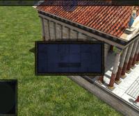
Hopefully there is something that can be done, because it also obscures selection rings and territory boundaries. Not that it's any worse in theory than other grass we use, but it could cover large areas of the map, so it makes the little problem into a monster problem Maybe we need a way to draw overlays on top/in front of certain types of rendered things. Obviously you wouldn't want them on top of structures or units, but they should be on top of e.g. grass including alpha textured grass models. Actually from now on, you're fine creating a ticket for art tasks. But creating a topic in the Art Development forum is good for discussion too This topic pretty much explains what's going on with the art department: http://www.wildfiregames.com/forum/index.php?showtopic=16198 I tested your "merged" branch, please forgive me if I report something you already know, this topic has become difficult to follow in its entirety. Seems to be a bug with decals, a few of them are black either when zooming in or at all times: AO or something breaks the UI, because I can only reproduce this after viewing the new Temple of Mars: Other than some bugs, everything you've done seems to work with ARB on my system, great job on that
-

Terrain erosion
historic_bruno replied to myconid's topic in Game Development & Technical Discussion
By the way, we do support rectangular (non-circular) maps, so if you really want to copy an exact heightmap, it should be possible There's a value in the scenario XML for this ("CircularMap"). -
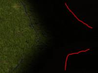
I can still faintly see the terrain after un-revealing the map, it seems it's not restored to fully black. You may need to adjust your monitor and zoom in to see it: Confirmed Right, on both GLSL and ARB I see the alpha channel as black, which could be partially responsible for the ugliness. It may be specific to my GPU/drivers: But yeah I figured it was experimental, that's why I mentioned it last
-
Yeah, once we have in-game diplomacy, I would expect one or both of these features to be implemented. I know we've at least discussed the "building in allied territory" concept before. We can flush out the concept of diplomacy and make something far more interesting than a simple ally/enemy stsnce (like AoE/AoK).
-
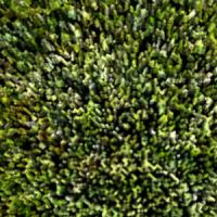
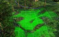
Thanks for making that updated, merged branch! I tested it on the following system: system_info.txt I like most of the effects and they seem to work as expected. I think the AO/normal/parallax/specular mapping will make the most impact and since it's also the longest tested and doesn't seem to have many problems, how long do you think it will be before it's ready to commit? Personally given how active development is in this thread (fixing bugs, adding new features, etc.), I feel it can be added to SVN fairly soon. It would be stupid to risk losing the momentum. The smooth LOS is also really nice Good job adding the heightmap import to Atlas, do you happen to have an image for testing it? Or what are the guidelines for it? I think if we add this, we also need some kind of global erode/smooth function, to tweak the overall result Or maybe we can show the selected heightmap image in a dialog and let the user preview, possibly modify it. Here's what I noticed that seemed buggy. With unchanged default.cfg (non-GLSL path): Might be a known problem: the terrain doesn't seem to be blending at all. I can see all the square tile boundaries between textures, and when I change zoom the boundary tiles shift somewhat. This might just be an oversight or unfinished work, but I want to mention it anyway Related: the grass material doesn't look good, I can't see the grass blades but it looks like the normal default grass terrain with black speckles all over. Should the two textures differ for grass material vs. standard texture, and can they be selected individually for different render paths? Now enabling preferglsl, gentangents, and smoothlos: Terrain overlays are no longer visible on default terrain because of the grass blades. This effects some debug overlays, but more importantly the Atlas terrain brushes. There are apparently some z-ordering problems even on other terrains, as you can see in this screenshot, showing an Atlas brush: The only effect I saw and wasn't sold on was the grass material. I guess there's some LOD stuff going on, because I'm noticing a kind of band at a distance from the camera, at certain angles it's more noticeable and while moving the camera it's very ugly. It gets very blurry and distorted in front of the band, also the terrain appears darker in the distance. It's difficult to show what I mean in a screenshot, you really need to see it in motion. Could the LOD algorithm be tweaked? Even without the LOD issues it currently looks worse than hand placed alpha textured grass Would a more detailed/higher res grass texture help? What's the advantage of this new grass, possibility of animation?
-

Can't build r10803 on Fedora 17
historic_bruno replied to lewowpard's topic in Game Development & Technical Discussion
Indeed, Loki1950 is correct, it has nothing to do with drivers but a change with Fedora 17 and GCC 4.7. There is an open issue with patches awaiting review on the NVTT Google Code site, ironically it references 0 A.D. Would you be willing to apply the nvidia-texture-tools-2.0.8-gcc4.7.patch patch and test if it works? Edit: oops ignore the above, it's already been added to our SVN trunk as of r11379. If you want you could probably just get the corrected file from there. -

Terrain texture blending
historic_bruno replied to zoot's topic in Game Development & Technical Discussion
Not sure how helpful that link is, since the info is outdated (it's mostly right on theory I guess). Would Misc Hacks > Wireframe be enough? -

Terrain texture blending
historic_bruno replied to zoot's topic in Game Development & Technical Discussion
There's a ticket and few comments about it: http://trac.wildfire...et/45#comment:5 - If Philip says it can be improved, I'm inclined to believe him, since he implemented it That said, I don't see anyone lining up to create a new set of interlocking blend textures let alone modify the existing ones, and it's not exactly an intuitive process So I'd be happy if we find a better alternative. Anyone care to play around with the blend textures? binaries/data/mods/public/art/textures/terrain/alphamaps/standard/ -
It's just that all the fiddling to make client and host subtly different layouts doesn't make sense, they both need to see the exact same information, the only difference is the host can change what he sees. I believe that's the motivation behind the current layout. Buttons/dropdowns for the host become labels for the client. It makes even less sense to duplicate 90% of the "normal" host setup window for a new map selection window (now we're copying player assignments and all game options into it, but we still need to display this same info for the other cases). The sticking point seems to be the host needing to see a complete list of maps, the client only needs to see the selected one. The solution requires some thinking "outside the box". Like: * instead of showing a big (incomplete) list of maps that takes up loads of space, we could use a dropdown which serves the same purpose. We have too many maps to show on screen anyway, in a single control. * If all dropdown/options were in a single column like your latest mockup, it would be clearer and more usable. Our current design has them all spread out so I agree that's not particularly usable. * Instead of showing a full size map preview that takes up so much space, we could either: make a smaller iconified version, clicking it opens up a full size preview and description dialog (possibly combine this with tooltip description). Or we could make the map preview smaller at 1024x768 and scale it up as space allows. But with a combination of the first two points, this might not be necessary. * If showing everything on screen at once is deemed too ugly, we can hide parts of the UI with a button, for instance click "Options >>" and the game options panel shows up. These would be local settings, not controlled by host. I like this idea less because we don't yet have persistent settings across sessions.


