Search the Community
Showing results for tags 'new'.
-
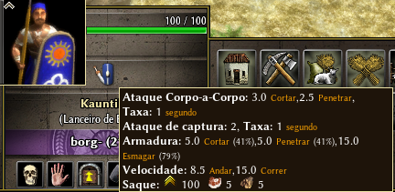
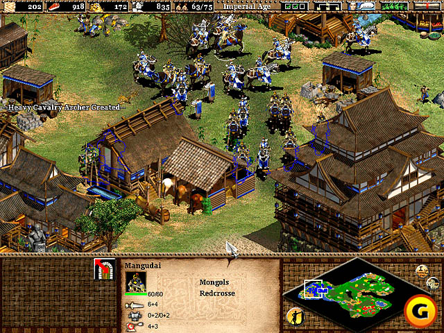
Hi guys!!! I come here to discuss a change in the interface of the units / constructions. It's something that has bothered me a lot, for several reasons. You need to leave your mouse over icon for some time, until important information is shown, and even then they are confusing, have poor allocation, letters are small and not have icons. It sounds like something unimportant but it is not, in some other rts games, when you evolve your drives, the drive model also changes, so you know that drive is upgraded, and you take care of it. At 0 A.D this does not happen, so you can not tell if the drives are upgraded, you need to click them, leave the mouse on the icon for some time, and then you can see a lot of confusing information. What I would like to see is something like this: It's something simple and clean, just with a few icons, showing, atack/armors/atackrang. Of course a few more things can be added, and also, the other information does not have to be taken, they can stay where they are. This way it is much easier to see and you do not waste time looking for the information you need. I have seen some players complaining about losing fights and only then did they see that the enemy units were much stronger. And I dare you to say, that some players do not know that this information exists, because they have never tried to leave the mouse over the icon. Age of empires 2 is just one of the good examples we have, it does not have to be identical. What do you guys think? He gave his opinions and suggestions. Tnx
-
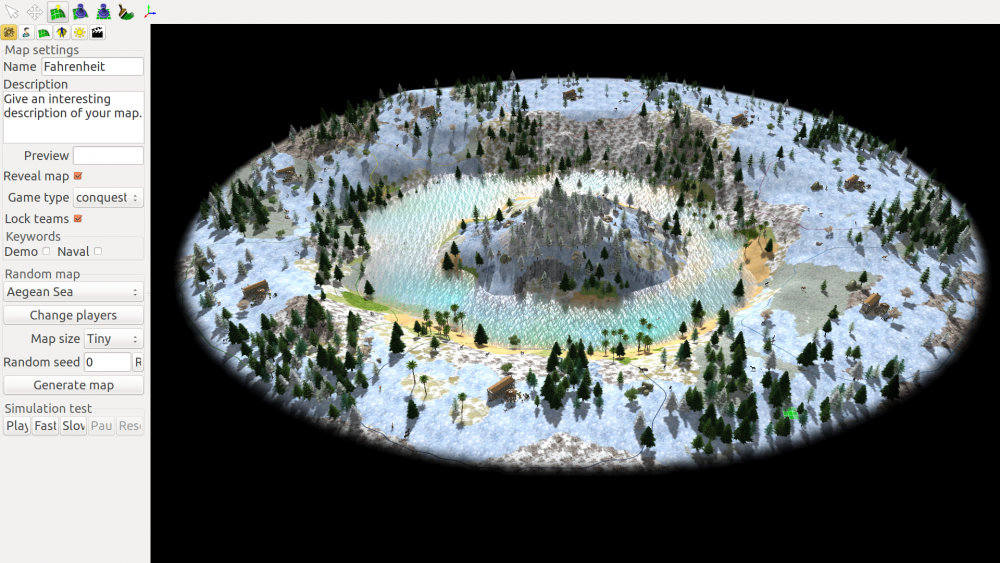
I have designed an op map imo 1.How can I place units Where can I find the xml file and can i share it here, to play it in lobby with you?
- 13 replies
-
- 5
-

-
- skirmish
- fahrenheit
-
(and 3 more)
Tagged with:
-
What do you think about introduction of the new resourse? Each person will need 30 units of textiles.
-
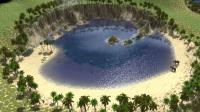
Please find the XML file for my map that I created. Its called the cove. a LARGE map for 2 players. both sides have resources, but since the volcano erupted back in 0ad, it made a lush and fertile land. first one there to gain control, reaps all the rewards, but you must fight off your enemy! as they will be after the loot too. Check it out, give us some feed back on what you think, I have plenty more coming soon. - The Canyon - Desert sands - The divide Thanks guys. J The Cove.zip

(1).thumb.gif.b5909d3df98a8ec15dc452423f219bc5.gif)
