
wraitii
-
Posts
3.457 -
Joined
-
Last visited
-
Days Won
77
Everything posted by wraitii
-
 The problem with qBot and Jubot, right now, is that they use the same strategy throughout the whole game (with minor adjustments for the early game). I'm implementing Marilyn right now to change its behavior as time goes by, which should allow for a better control of the late game. Attack and defense also need to be improved a whole lot, of course. However, for now, I'm trying to get the economic system to be resilient and efficient. I've got the "efficient" part done, now I must teach it to react if it's attacked or something. And some other economic stuffs here and there. Then I'll focus on other stuff.
 -
Perhaps the two buildings could be fused into one only, so has not to be too redundant? I think having the support elephant only for the late game would make it rarely appear during gameplay (often enough, the player doesn't bother too much about economy at that point). Perhaps it could be trained in the village phase, but you'd need to unlock a technology from a dropsite.
-
That seems like the easiest solution for now.
-
Previewing a map in the game setup screen.
wraitii replied to Spahbod's topic in Game Development & Technical Discussion
Yeah, the most simple solution in the end would probably be to have two screens. That would also allow to show some small informations about civilizations (I'm thinking AoE II did that). -
New GUI: Design & Features Discussion
wraitii replied to Mythos_Ruler's topic in Game Development & Technical Discussion
Both these ideas seem fine. I feel like the portrait moving would be more natural in that case (highlighting is also the universal sign of "your mouse if over this thing" in some cases). -
Previewing a map in the game setup screen.
wraitii replied to Spahbod's topic in Game Development & Technical Discussion
If you're using the left side completely, it might even be worth to remove the "land map-naval map-demo map" box, and to list each of them on the left in categories, this way: -- Land Maps -- Acropolis Oasis Whatever -- Naval Maps -- Archipelago Islands Whatever --Demo Maps-- … I think it would be an easy-ish way to improve the interface. -
Allright so I'm getting fairly good results in the early phase of the game (beginning ressource collecting) for now. I still have a ton of things to keep doing, but it's usually on par with latest qBot or better. I'll have to compare with myself. Oen thing I'm trying to do, for example, is having the flow of houses keep with the flow of citizens, and having Marilyn build the best citizen soldiers (for most civ, that will be the fastest unit costing wood/food. See for example the difference between the peltast and the foot companion for the macedonians).
-
Previewing a map in the game setup screen.
wraitii replied to Spahbod's topic in Game Development & Technical Discussion
From a purely formal point of view, I'd like this a bit more zoomed in, but from afar. It's to show the general map, not every single details. Reminds me of AoM previews, again. I like the normal style, minimaps are really ugly out of context. -
Previewing a map in the game setup screen.
wraitii replied to Spahbod's topic in Game Development & Technical Discussion
I think in a rearranged title screen it could, along with the preview, fit in the middle of the screen. Using my Ugly Photoshop Powers©, I'd say something like this: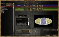
-
Previewing a map in the game setup screen.
wraitii replied to Spahbod's topic in Game Development & Technical Discussion
Will the random map seen be the one finally available? I'd rather not. It loses some of the fun of "random" maps. In this case, perhaps a "picture not necessarily exact" warning of some kind might be interesting. Good addition overall, though you should probably place it somewhere else. But that whole screen should be redone anyway. -
Post-processing effects test (SSAO/HDR/Bloom)
wraitii replied to myconid's topic in Game Development & Technical Discussion
All the texture mapping and the lighting effects are hard to discern from far away, but certainly improve the graphical feel of the game. Same with moving trees. This kind of improvement is not necessarily flashy (bar HDR - this is a funny joke -), but it makes a game go from "good looking" to "great looking", even at long distances -
Yeah, whatever myconid is adding right now should have an option in the settings as some of it can be fairly GPU/CPU-intensive on low end machines. I suppose it can't be too complicated to code, but I have no idea what the underlying architecture is. That being said, I really appreciate trees that slowly rock under the wind (and had personaly implemented small bits of pollen going itsy bitsy in the wind at some point in Alpha 9 for coolness), and it's great it's been done .
-
Yeah, the gathering rate would probably be higher (though that's not even sure, because usually dropsites are fairly close to the gatherers anyway), but not enough to absolutely break the game. Anyway, balancing can be done in a ton of other ways. And as Mythos said, in AoM there were two instances of "mobile dropsites", the Norse Ox Cart and the Atlanteans. BTW, to Pureon/artists: I've looked at the demo, looks good!
-
New GUI: Design & Features Discussion
wraitii replied to Mythos_Ruler's topic in Game Development & Technical Discussion
Judging from the stillshot for the video, that's kind of what I'm thinking about too. Reminds me more of RTW than AoM (I think I very rarely opened that screen in AoM). If we implement that, it should be "semi-obvious" that you can do it or appear on a tooltip or something, otherwise some players may miss it. -
I'm not too sure about the shuffling elephant? It's only interesting if it has a massive carrying capability, an unrealistically massive I mean. It also feels a bit too complicated for my taste.
-
BTW, since this has been added to SVN at some point... Is there anything from the previous remarks that still needs changing?
-
Looks like I've lost some of the last progression I had done... Not too bad, since I was stuck in a bad place. I'll recode in the simplest way I can a way to have females gathering food and the other wood. Now on the other hand, I'll try to make it even more "self-aware" because while the architecture is in place, it's not really used... And increasingly prepared to technologies. Using my newly found knowledge of the game, which I acquired by playing it.
-
I must say, as a player, I like that. It's a really different and civ-specific gameplay element (which perhaps the game kind of lacks right now, compared to some), and it would allow to balance on other things if needed. It's not really an "impossible" to imagine abstraction, plenty of games did it (I'm thinking AOM with the Atlanteans for example).
-
It's probably the better way, but we have to wait for Philip to have finished the new pathfinder for that. The summed area table is a neat idea, though.
-
New GUI: Design & Features Discussion
wraitii replied to Mythos_Ruler's topic in Game Development & Technical Discussion
If you're going to keep the button to show "attack" stats, I'd prefer it the way it currently is (though without the lag for the tooltip to appear, that's fairly annoying). Perhaps showing attack rates and some other useful stuffs could be added. I support the idea of having a centralized way of knowing every info about a unit. Reminds me of RTW, too. It's fairly neat. (BTW: what prevents from having the counters written dynamically? Lack of time? Was it decided so?) -
Post-processing effects test (SSAO/HDR/Bloom)
wraitii replied to myconid's topic in Game Development & Technical Discussion
If you're interested in working with 0 A.D. after the whole renderer updates have been cleared up, this might be relevant to your interests. -
New GUI: Design & Features Discussion
wraitii replied to Mythos_Ruler's topic in Game Development & Technical Discussion
Yeah, "balance" wasn't exactly the right word for what I tried to say... And looking back, it may unbalance the UI too much (most buildings have nothing in the left square next to the minimap allready). You've probably thought about this more than me anyway, so I guess you're right . Another suggestion: for multiple Units UI: perhaps the hitpoints and stamina bars could be refined. In this case, I'm showing the average health of the first quartile (bottom greenest bar), the whole(middle green bar), and the fourth quartile(yellow bar). I'm not completely sure it's not "more useless info", but I guess it could have its use. -
New GUI: Design & Features Discussion
wraitii replied to Mythos_Ruler's topic in Game Development & Technical Discussion
Reading from previous post, the problem was that too many informations had to be shown and that the decision was to cut it all-together. This setup should be able to show even charge bonuses, if dealt with properly. Alternatively, those could be displayed only when the unit is actually charging (in a different color perhaps). Since it's "static", as HistoricBruno said, it's merely a useful reminder for players. -
New GUI: Design & Features Discussion
wraitii replied to Mythos_Ruler's topic in Game Development & Technical Discussion
For the record, I think it would be nice to have a more "crammed" GUI option for players who absolutely want to see unit stats, something like this: . (I 'm showing the stamina bar for the record, and the A/D mean Attack/Defense, and should, if implemented, be replaced by two small icons.) -
New GUI: Design & Features Discussion
wraitii replied to Mythos_Ruler's topic in Game Development & Technical Discussion
If I may chip in: the player color behind the production queue is okay to me: it balances the color of the "You" banner. I wouldn't completely center the logo, but its center could be a bit higher. The parenthesis around the generic name seem unnecessary for me. It makes it harder to read (for some reason, my inner voice reads that in a quieter voice, which is annoying. But that may be just me.) and there's already a difference: the lack of bolding. About the GUI, taken from SVN: I've red-ed two irks: I feel like the "bar" is unnecessary and looks weird. The other icons are placed in a different order (but perhaps that's already been fixed). BTW: if you're showing unit stats by hovering over the icon... There probably should be no latency.

