wraitii
-
Posts
3.457 -
Joined
-
Last visited
-
Days Won
77
Everything posted by wraitii
-

Post-processing effects test (SSAO/HDR/Bloom)
wraitii replied to myconid's topic in Game Development & Technical Discussion
Allright, it looks like I've managed to do it by passing to to ColorPointer (apparently unused by instancingModelRenderer or ModelRenderer). I'll see if I can do something with that. -
Post-processing effects test (SSAO/HDR/Bloom)
wraitii replied to myconid's topic in Game Development & Technical Discussion
@Myconid: Yeah, that was part of the plan I had... Only I'm not completely understanding the "pointer" argument, and I'm not sure I can pass that as a texture coord. I'll ook into it, I can perhaps pass it as a secondary color. @Zoot: I'll see that when I get it working. I wonder if converting the water shader to ARB would fix #966/#1380. -
Post-processing effects test (SSAO/HDR/Bloom)
wraitii replied to myconid's topic in Game Development & Technical Discussion
Actually, it looks like you're using glVertexAttribPointerARB() to pass the tangents to the shader, and as it happens, I do not believe this function does anything to the ARB shader... I'll take a look at the code and see if I can use an alternative for the ARB shaders.It's not as complicated as I initially thought. Edit: Nope, complicated indeed. I've understood how to pass a new uniform, but the tangents are stored in a weird pointer thingy that uses the GLSL only "VertexAttribPointer" function... It probably can be replaced by some variation of "glVertexAttrib4fv" but I have no idea which exactly. -
Post-processing effects test (SSAO/HDR/Bloom)
wraitii replied to myconid's topic in Game Development & Technical Discussion
Looks like it's a bit of a mess... And IIRC you calculate tangents on the fly, which may require GLSL in the first place. -
Post-processing effects test (SSAO/HDR/Bloom)
wraitii replied to myconid's topic in Game Development & Technical Discussion
Doesn't seem to change anything. You seem to give the GLSL shaders a "a_tangent" matrix/vector used in normal mapping... Any idea how I can get the ARB shaders to use it? -
Post-processing effects test (SSAO/HDR/Bloom)
wraitii replied to myconid's topic in Game Development & Technical Discussion
Played around with the shaders... Setting a_normal as the output color. It flickers. -
Post-processing effects test (SSAO/HDR/Bloom)
wraitii replied to myconid's topic in Game Development & Technical Discussion
That's what I'm saying. It is indeed fairly weird that a_normal is messed up... I'm using a Geforce GT 120, with 256 Mo of vRam. My macBookAir, running 10.7 (on a Intel HD 3000) doesn't seem to have this problem. Can't tell if it comes from outdated shaders, or the GPU itself. Edit: Okay, got the specular to work on ARB. Moving on. -
Post-processing effects test (SSAO/HDR/Bloom)
wraitii replied to myconid's topic in Game Development & Technical Discussion
I looked around a bit. The blinking problem actually comes from the "a_normal" parameter being completely messed up when using glsl on my computer. Even the regular alpha does it. No idea why. I'll try to see if I can port your glsl shaders to arb, which seems to work. -
Post-processing effects test (SSAO/HDR/Bloom)
wraitii replied to myconid's topic in Game Development & Technical Discussion
Tried your TerrainSwapping branch… Got a weird "blinking texture" problem. Most surfaces blink to white and then normal very rapidly. It looks like it has a link with some sort of alpha problems, because for examples foundations are surrounded by a black square, and texture blending for terrain fails. The trees do wave, and I'm not sure what else should change. It also doesn't happen on everything. I've used the version from your github, changing the premake to SVN version because it crashed. I'm on Mac OS 10.6.8, using an iMac.
-
Random Map Script: Corsica vs Sardinia
wraitii replied to wraitii's topic in Scenario Design/Map making
I can try. If your request is mainly to allow civil centers placements, I can perhaps instead add a few glades here and there? Edit: here is an updated version... I'm not sure exactly what it changed, but it feels like there's a bit more space. I've also tried to prevent stuff from spawning on impassable terrain. -
@Pureon: was it on the latest SVN version? I've forgot to say it, but I discovered a bug with the water setting level during the creation of this map, which Spahbod fixed very recently. I should give a try at making the mountains less perfectly straight. @Mythos: I could consider that for larger map, but I feel like for small maps it would crowd everything too much. Will try.
-
in the random map folders, there's a folder called rmgen. It goes in there.
-
Very cool map, but two small issues: The sun is too bright, I recommend lowering the settings or every texture will be completely burned. The players starting area sometimes create a very circular shape. It looks extremely artificial.
-
Random Map Script: Corsica vs Sardinia
wraitii replied to wraitii's topic in Scenario Design/Map making
Small-ish update since I was making maps... I slightly improved the beach design, fixed a few bugs. Made the water slightly more murky. Download link in the original post's attachment. -
Pyrenean Sierra random map based on the indication by Mythos (in Map and Biome guide). I did not completely follow the indications: there are two passes, and in some cases a path could be allowed around the mountains and in some others not (because it's really hard to control ). I've included three different light settings: a sunny one, a cumulus one, and a stormy one, which look very different... I'm not too sure about the later, though. I think it'd look cooler with myconid's improvements, but I couldn't really try. (screenshots are a "Very large, sunny" map, and a "small, stormy" one). Note: this requires the latest SVN version as of July the 2nd. pyrenean_sierra.zip
-
It's very possible, and in fact very easy: just search for log ("creating path through"); And change the line if (mapSize > 150) { to anything that's false, such as (1==0). Boom.
-
Allright, so following your advice I changed the lighting... Tell me how you feel about it. I've also touched up a few things: made the water more murky, added small variations in the ground texture (patches here and there), added more flora to the passage through the oasis, and fixed a bug with chicken spawning (theoretically). The download link is attached to the first post.
-
Previewing a map in the game setup screen.
wraitii replied to Spahbod's topic in Game Development & Technical Discussion
I'm following Mythos on this one, and Pureon, it looks better to me too. -
Previewing a map in the game setup screen.
wraitii replied to Spahbod's topic in Game Development & Technical Discussion
I think the 1pt border would fit the best. -
Random Map Script: Sahel Watering Holes
wraitii replied to wraitii's topic in Scenario Design/Map making
Yeah, I solved it using a custom function, but it might be redundant (seemed like PlaceTerrainBaseOnHeight was for the whole map, not just the zone concerned here). -
Random Map Script: Sahel Watering Holes
wraitii replied to wraitii's topic in Scenario Design/Map making
@Pureon: of course. But sometimes, it's simply too unpractical. On the biggest size, Sahel Watering Holes has absurdly large watering holes. The scenario itself is a very small map. @Spahbod: Didn't notice the update you did, sorry . Still took the better part of my morning. I had trouble figuring out how to paint correctly, because using the clump placer with a layered painter resulted in a "line" either at the end of the PathPlacer or around the clumps. BTW, I'm going to give a go at "Pyrenean Sierra". I just need to figure a nice way of making mountains. -
Can do... In what way?
-
Looks like Blender rendering... I can give it a shot if you send me the .blend.
-
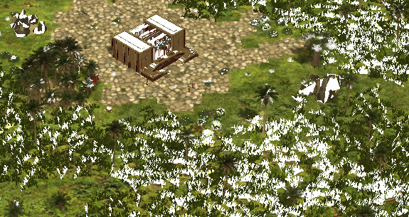
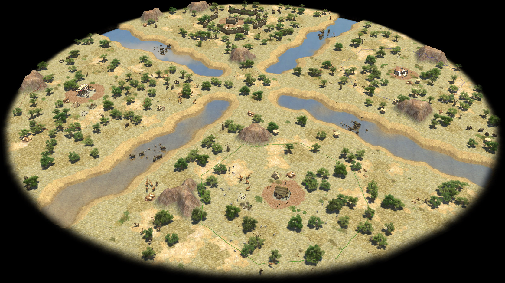
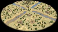
Spahbod recently added the Sahel Watering Holes random map. I've tried it and felt it could be improved a bit, so I'm offering a slightly updated version to make it look more like the scenario. Namely: the rivers are a little less straight, there are animals in the rivers, and generally more, the banks use slightly different textures, more grass patches, no fishes (to change?), and there are gazelles in the center and changes to the sun settings (using the scenario's). I'm using a new type of painter, so I've linked "painter.js". It's still not perfect, but I think it's a step in the right direction. Note: this map works much better when it's small. Which makes me think we should allow random maps to be limited to a certain "range" of size: some can perfectly be stretched, it's harder for others (eg Corsica vs Sardinia suffers on "Tiny", while this one gets really ugly when "huge"). Map and Library file.zip
-
Yeah, that's the most logical way. Perhaps the elephant stable could have technologies to improve the gathering rate of workers (simulating better trained elephants or something). It'd be neat for the indians not to have dropsites if they have a mobile dropsite already, methinks.