

Potter
-
Posts
70 -
Joined
-
Last visited
Everything posted by Potter
-
Neat idea! And, if we can follow with an analysis of who did what wrong moves, it might also be a good learning session. I really really like this idea ;-)
-
Nice videos, Brynn! +1 looking forward to your teaser video.
-
Very nice report! It would give everyone, who is not following the forums regularly, a good snapshot of progress and what to expect in the next alpha ;-)
-

Featured contributor: Jeroen, aka vts, aka vtsj
Potter replied to feneur's topic in Announcements / News
Great selection! Congrats vts! May your interest in 0 AD continue on and on ;-) -
Previewing a map in the game setup screen.
Potter replied to Spahbod's topic in Game Development & Technical Discussion
showing the list in a dropdown might not be handy as scrolling a long list in a dropdown is often awkward. a scrolling list is more usable... -
real interesting! So, in that case, does that mean that doing animations in future will be more easier
-
@myconid You really really rock!!! I have thought that the previous 0 AD already looked wonderful. But you have proved me wrong by making it more and more stunning. I am glad that you are doing this ;-)
-
Previewing a map in the game setup screen.
Potter replied to Spahbod's topic in Game Development & Technical Discussion
i like it. It is in the right direction! Now that we have some extra space... Are we going to start distinguishing between the different types of maps: like scenarios, random maps, etc - maybe with a dropdown above the map preview? -
Post-processing effects test (SSAO/HDR/Bloom)
Potter replied to myconid's topic in Game Development & Technical Discussion
+1. I really really like the new look of cliffs !!! -
WOW! Looks amazing what a simple effect can do for the game ambience...
-
New GUI: Design & Features Discussion
Potter replied to Mythos_Ruler's topic in Game Development & Technical Discussion
Agree! It looks weird... -
New GUI: Design & Features Discussion
Potter replied to Mythos_Ruler's topic in Game Development & Technical Discussion
I like the placement of the unit portrait, the reduced stances, experience bar shown under the unit portrait and the way carried goods is shown! But, i feel that the player name is shown more prominent than the unit name. It should be the reverse. And, i dont see the armour/attack stats. Where would that information be shown? -
New GUI: Design & Features Discussion
Potter replied to Mythos_Ruler's topic in Game Development & Technical Discussion
The unit panel is getting too crowded now! What about moving the "Action buttons" to the right area (construction panel), maybe with a different heading implying they are different from the construction icons. That would really give breathing space for the central unit panel -
New GUI: Design & Features Discussion
Potter replied to Mythos_Ruler's topic in Game Development & Technical Discussion
What about this updated mockup? I have moved the "carrying resource" icon under the portrait. And, we can also switch the locations of generic name and specific name, if we need more space for specific name...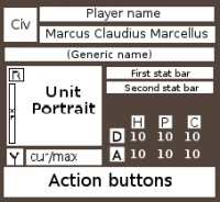
-
New Sound Manager svn patch
Potter replied to stwf's topic in Game Development & Technical Discussion
From the message "path uses both slash and backslash", Looks like somewhere there is a mismatch with path separators (which is slash for mac, linux and backslash for windows ) -
Just to make things clear, I am not against including Indian temples ingame. As said earlier, destruction of temples is historically accurate and can remain in the game. What I suggested was to not include recognisable Major GOD STATUES within the temples... Temples can still have statues of minor gods and other sculptures. Please, lets not get distracted with this! Lets continue discussing abt the awesome Mauryan Indian civ...
-
+1. I fully agree. And, considering that small gods like Indra, Agni were worshiped more during the Mauryan period (the religious sects of saivism and vaishnavism were just becoming popular during Mauryan period), this viewpoint will be more historically accurate than using statues of major gods like Vishnu, Shiva, or Shakti..
-
I don't support this idea! We must remember that Vedic/Hindu religion is a living one (Still being followed in India) and hence must steer clear of hurting sentiments. AOE 3 made the mistake of including religious buildings, which lead to hurting sentiments of the several players... A generic temple would not hurt much! but, one that includes statues of recognisable gods is sure to stir something, which we may need to avoid.Players usually dont like their gods razed to ground by enemy armies!!! So, if we need an altar, please make one without having recognisable god statues.
-
buildings videos
-
video links for army and europa babarorum videos for units http://www.youtube.c...re=results_main
-
New GUI: Design & Features Discussion
Potter replied to Mythos_Ruler's topic in Game Development & Technical Discussion
Hmmm, yes. Going to a separate screen can sometimes be distracting depending on the situation - when i am in the midst of a war. Good catch! How do we get a compromise between both the cases ... One idea! The tech tree can be split based on the buildings. And, in each building, there will be an tech icon that when clicked will show a small popup (not a modal dialog) showing the tech tree corresponding to the building. This will enable us by proving extra space for showing relationship, while not distracting from the game action... I actually meant a single screen with different tabs for diplomacy, chat, tech tree, etc. Usually, having a full screen for things will have extra space than a dialog, that we can put to good use... But, considering our case, where the central game screen is of paramount importance and the user should not be distracted from the action, i agree that having a separate screen can be a distraction to game play. So, having them as a dialog also makes sense here -
New GUI: Design & Features Discussion
Potter replied to Mythos_Ruler's topic in Game Development & Technical Discussion
But, considering that integration comes with distraction (the user has to go and select the building to research tech) and confusion (it would not be clear about how advanced the tech tree is), i think it would be better to go with a separate tech tree screen. And, in each building, there can be link button, which launches the tech tree screen with the current building focused... Such a screen can be used for various other things like diplomacy functions, etc -
New GUI: Design & Features Discussion
Potter replied to Mythos_Ruler's topic in Game Development & Technical Discussion
I agree that the menu button looks out of context! But, merging it with the emblem will more chaotic, as it would not be discoverable and tries to combine two things (user-oriented actions) and emblem (civ specific actions) which are not related!!! But, I agree that the emblem can be put to more use, but it must be civ-specific! Maybe, when clicked, it will show the statistics on the current workers, units, like below: Workers on Wood: 12 Workers on Stone: 0 Workers on Food: 34 Workers on Metal: 0 Workers Idle: 20 Elite units: 4 Infantry : 24 Archers: 30 Units Idle : 7 -
New GUI: Design & Features Discussion
Potter replied to Mythos_Ruler's topic in Game Development & Technical Discussion
I assume that you mean to say Top Left - Selection module showing selected entities Bottom Left - Tabbed modules based on selected objects Bottim Right - minimap Is that right? I was searching for something in the bottom middle, when you said middle And, why not show a tabbed module attached to the right-side minimap, instead of the small icons shown. I feel they are too small to click and if we want to add more icons, it becomes problematic! Anyway, I think this new UI is in the right direction and just rocks!!! Keep it going, team I really like this idea of a global research display panel. Current game design where i have to shuffle thro diff buildings to research is a little annoying I have another idea, keeping the new tabbed UI. Why not display the full queue in the space for "Selection Module" (aka Top Left). This will show all working queues of all the buildings at a glance, instead of the user going building by building. -
Instead of restricting player colors like that, why not give an option to the scenario designer so that he can restrict the players from changing colors, but if he doesnt mind, the players are free to change their colors?
