Search the Community
Showing results for tags 'interface'.
-
.thumb.png.ce58cea22940c255f5b0a735d5abee36.png)
==[Task]== Tiny icons set (simple)
Lion.Kanzen posted a topic in Eyecandy, custom projects and misc.
based in Wraiitis mod for the GUI I will make some icons and here a work in icons for patches. if you have a request let me know.- 79 replies
-
- lion.kanzen
- gui
-
(and 3 more)
Tagged with:
-
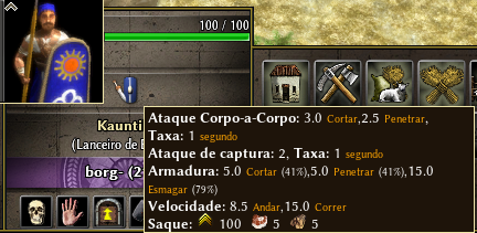
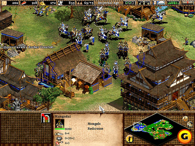
Hi guys!!! I come here to discuss a change in the interface of the units / constructions. It's something that has bothered me a lot, for several reasons. You need to leave your mouse over icon for some time, until important information is shown, and even then they are confusing, have poor allocation, letters are small and not have icons. It sounds like something unimportant but it is not, in some other rts games, when you evolve your drives, the drive model also changes, so you know that drive is upgraded, and you take care of it. At 0 A.D this does not happen, so you can not tell if the drives are upgraded, you need to click them, leave the mouse on the icon for some time, and then you can see a lot of confusing information. What I would like to see is something like this: It's something simple and clean, just with a few icons, showing, atack/armors/atackrang. Of course a few more things can be added, and also, the other information does not have to be taken, they can stay where they are. This way it is much easier to see and you do not waste time looking for the information you need. I have seen some players complaining about losing fights and only then did they see that the enemy units were much stronger. And I dare you to say, that some players do not know that this information exists, because they have never tried to leave the mouse over the icon. Age of empires 2 is just one of the good examples we have, it does not have to be identical. What do you guys think? He gave his opinions and suggestions. Tnx





(1).thumb.gif.b5909d3df98a8ec15dc452423f219bc5.gif)
