

idanwin
-
Posts
762 -
Joined
-
Last visited
-
Days Won
13
Posts posted by idanwin
-
-
That would be nice. I would definitely put some in our CS department!
-
It's definitely something to look into. I don't think there's any games out there that do something similar. Since we have the generic names anyway it's not really a problem if people can't read the name. It would be nice to see the pronunciation in the tooltips or something similar though.
If there aren't any free fonts out there we could try making one. Even if it's just a crude one to start with. Since this is open source someone will come along and improve it eventually.
-
 1
1
-
-
Idanwin, based upon a character from the Dutch book "Brief voor de Koning" (en "Geheimen van het Wilde Woud")
I live in Flanders (flemish part of Belgium), studied in Wallonia (french part of Belgium) and currently study in the UK.
GMT 0/+1
Idanwin a.k.a. Ilya and Eris
P.S. We have two Hamlett's :-D
-
1
-
-
You could read the changelogs ;-)
-
Actually I have this issue too.
Does work:
alt-enter to enter windowed mode
Does not work:
alt-tab to change windows
ctrl-alt-arrows to change workspace
left-top corner for window spread
alt-enter to enter fullscreen again (this worked long ago though, not sure when this stopped working)
Ubuntu 13.10 64bit
-
Shall we make the knot-binding the idle animation?
Have fun animating that ;-)
-
2
-
-
Hi and welcome to the forums,
I'm a computer science student who plays music and lives in Belgium as well xD
There's a chance we've already met AFK
What instrument do you play? Me the violin.
It's nice to see new people around!
Ilya
-
We should really make a tutorial campaign/scenario once triggers are implemented.
-
Anyway, my initial post already had a git diff file, does that count as a patch?
-
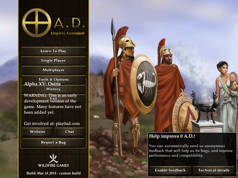
Mmmmh, Is 0.a.d playable on netbooks ? If not shouldn't be considered, but if it is there will be an issue with 1024x600 resolutions.
The (current) menu already gets warped at 600p height.
The 0 A.D. main menu at 800x600:

You need about 690p height to display it correctly.
-
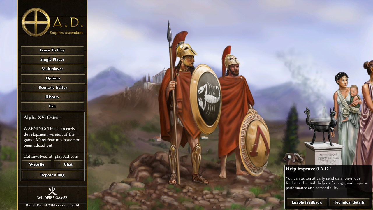
I suggest the games main menu item "Tools & Options" be split into two separate menu items "Options" and "Map Editor".
My arguments for:
-Makes the editor more visible to newer users
-Decreases clicks for people who want to use the editor (and don't use -editor)
-Decreases clicks for people who want to use options from main menu
-A lot like most other games
My argument against:
-Overlap on small screens
Counter-argument:
Works on screens =>720p in height (tested), smaller screens (e.g. 800x600) cannot display the current menu either
This is what it would look like on a 1280x720:

-
I would love to see walls crumble, AoK did a very good job on that part :-)
-
Me likez torrentz. I also thought that might be a good option, but wasn't too sure about it since that would require some people to keep an old version of the repo on their harddrive that they can't update (since that would break the torrent)
So ... yeah.
Having an svn version that when downloaded can be updated with git to the latest git version would be perfect.
-
I love that selection screen, it would be a shame not to have it in the game. Keeping the drop-down menu available is very important though.
The problem I see with having a button next to the drop down menu is that it may not be obvious to new players that there is more information of civs to be found there. Maybe we should add a first time overlay that explains which button does what on the first launch of a fresh install (with a skip button, oc)
Really looking forward to using that marvellous piece of menu design :-D
-
Did anyone watch the steam dev days videos?
There's some really interesting talks about OpenGL, might be interesting for our programmers...
-
I bet most of those users are just inactive, maybe - if you do a purge - send them an email that they need to reconfirm their account within x months.
-
RTS doesn't necessarily require battles ;-)
It would be gorgeous to have seasons like that in 0AD!
-
I was thinking something along these lines:

(I'm not very good at this)
I think a design like this fits their icon set better.
-
1
-
-
I always use SVN. That's why the error miraculously disappeared.
EDIT: read my post again. Why did you think I used A15? I explicitly stated svn before ...
-
The part of the map that gets cropped off because it is outside the skybox, i.e. the skybox gets rendered in front of it.
-
That would be awesome! It should have several options: Thick Forest, Normal Forest and Sparse Forest.
EDIT: And add forest textures to the ground as well
-
Google has a 'search by image' function nowadays, so if you're ever wondering where a picture came from: Google is your friend (beware, his big brother may be watching though)
-
1
-
-
Had to trawl through Flickr's source code to find the original.

That one always works :-)
-
Hadn't checked in on this in a really long time, glad to hear your still working on it. As someone said before, this community may be nice people, but you never know who the people are who register and only post a few things.
Sabaton: War of the Weeping Lands
in Introductions & Off-Topic Discussion
Posted
The main problem I have with them is that they don't have anything to show.