Search the Community
Showing results for tags 'portrait'.
-
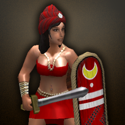
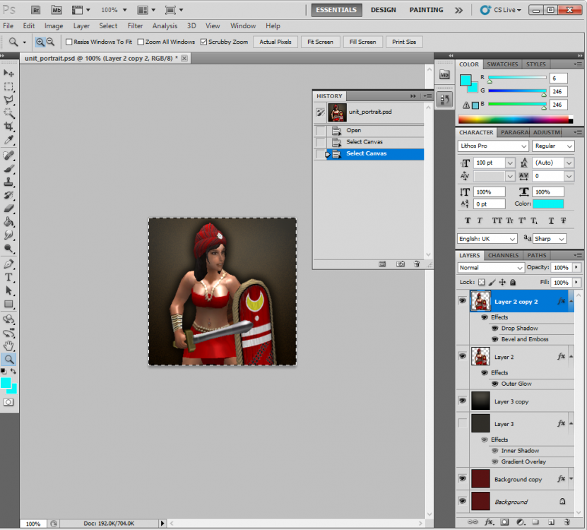
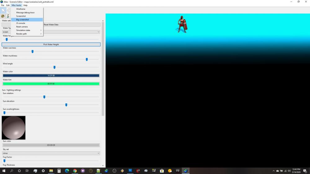
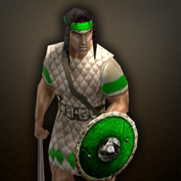
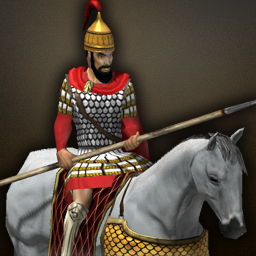
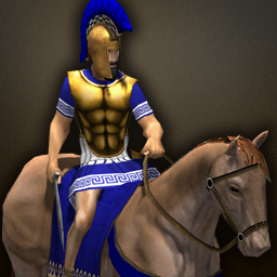
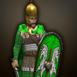
1. Here is the standard background I use: 2. Taking a screenshot of the unit in Atlas with the "Big Screenshot" option, it looks like this (note, I use a custom scenario map with a bright ground texture for ease of cutting in Photoshop) 3. A. I cut the unit out of the background, B. copy the unit into a 2nd layer (this is important), C. resize it to 256x256, D. then add the background texture at the top of this tutorial. E. From there I adjust the Layer Styles (effects) of each of the unit layers to give the final product. This is what the file looks like for me: 4. These are the layer settings I use. First, to get that nice brownish background glow (THIS IS WHAT IS MISSING FROM MANY OF THE NEWER PORTRAITS IN THE GAME): 5. Here, I create the drop shadow effect: 6. Sometimes I add a subtle Bevel and Emboss to help the unit stand out a bit from the background. THIS IS SUBTLE, and usually used on a unit with dark edges, like dark hair or a dark horse. Sometimes I don't even use it. As an example, I used this effect to make the Balearic Slinger's head stand out a bit more, otherwise it would have blended into the drop shadow. 5. Here is the final product: Further Examples: unit_portrait.psd

