Yves
WFG Retired-
Posts
1.135 -
Joined
-
Last visited
-
Days Won
25
Everything posted by Yves
-
sync error (2 players and 1 AI) with logs
Yves replied to raymond's topic in Game Development & Technical Discussion
Unfortunately Alpha 10 used slightly different revisions on the different platforms. That can cause OOS-Errors. I suggest you wait a few hours/days until alpha 11 is released and try again. -
After removing everything related to the new shader effects from local.cfg it didn't crash at loading when we played the next game. However it crashed later. At the moment it looks like a faulty ram module caused some instability and maybe was also the reason for some of the crashes. We've removed the module, reinstalled windows and played one game on a random map against three aegis-bots without crashing. Now we could try enabling the shader effects again and see if it still crashes.
-
My brother got this. It started somewhere in the middle of a game and then continued spamming. Later it crashed, but I don't know if it's related. ERROR: OpenAL error: Invalid Name; called from CSoundBase::SetLocation (line 168) ERROR: OpenAL error: Invalid Name; called from CSoundBase::SetRollOff (line 89) ERROR: OpenAL error: Invalid Name; called from CSoundBase::SetPitch (line 112) ERROR: OpenAL error: Invalid Name; called from CSoundBase::SetCone (line 102) ERROR: OpenAL error: Invalid Name; called from CSoundBase::SetCone (line 104) ERROR: OpenAL error: Invalid Name; called from CSoundBase::SetCone (line 106) ERROR: OpenAL error: Invalid Name; called from CSoundBase::SetGain (line 83) crashlog.txt crashlog.dmp
-
I have some crashes when loading maps too. PC1 - Windows - Prebuilt binary --> Crashes most of the time PC2 - Ubuntu - Manually compiled --> Works PC 2 is my development client for both Windows and Linux (Dualboot). If I can reproduce the problem there, I can debug it. Otherwise I'll have to find out what's the problem on PC1.
-
I get this: ERROR: Failed to find matching prop point called "dust" in model "art/meshes/structural/celt_outpost.dae" for actor "scout_tower" I've tried clearing the cache, but it didn't help. I also got this error, but only before clearing the cache, so I'm not sure if it's still there: ERROR: Failed to find matching prop point called "dust" in model "art/meshes/structural/celt_house_b.dae" for actor "house" Btw. how can I import a .dae file in blender? I've found that there should be a collada import option but there isn't any. Do I have to download a plugin somewhere?
-
I've seen an arrow flying very high and "growing" to a size of about 4 centimetres at a staff multiplayer match.
-
I think the last one looks best. Does anyone know where the hoplite is available in higher resolution? EDIT: Found it - http://www.wildfiregames.com/forum/index.php?showtopic=15477entry232155 however the source file (psd or whatever) would be even better.
-
Post-processing effects test (SSAO/HDR/Bloom)
Yves replied to myconid's topic in Game Development & Technical Discussion
Well done myconid, I've tested again with the fixed renderpath and can't spot any issues now! -
I just wanted to mention here that some people are saying that the music quality isn't as good as in alpha 10 anymore. Maybe it's the same that fabio mentioned about "missing some sounds". I compared with alpha 10 and can't hear a difference, but my speakers aren't very good ones. Check the discussion about that topic in the irc-logs(starts about 21:37) http://irclogs.wildfiregames.com/2012-08-31-QuakeNet-%230ad-dev.log
-
Post-processing effects test (SSAO/HDR/Bloom)
Yves replied to myconid's topic in Game Development & Technical Discussion
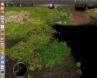
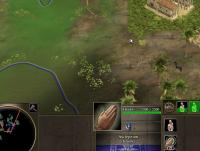
The minimap is now broken when using renderpath = fixed. The general question is if we still want to support this. I've tested it quickly on punjab3 and apart from the minimap it still seems to work. EDIT: Another issue with the fixed renderpath is that rivers are red sometimes. Punjab is not in egypt so it's not one of the plagues from the bible. EDIT: With the help of priests the water is now green. You can see on the second screenshots where the color seems to come from... -
Post-processing effects test (SSAO/HDR/Bloom)
Yves replied to myconid's topic in Game Development & Technical Discussion
Sorry for the confusion. It's fixed for me. -
0 A.D. is still in alpha stage and my opinion is that it's too early for that. Players who expect a polished and stable game won't stay long because of lag, bugs, missing features, balancing issues etc... They probably even won't try 0 A.D. again later because of their bad experience. Don't get me wrong. There's nothing wrong about getting more players and 0 A.D. is already quite fun to play... but It's very important that players know what it is: an early development version.
-
Post-processing effects test (SSAO/HDR/Bloom)
Yves replied to myconid's topic in Game Development & Technical Discussion
It's the first time I notice it... The minimap looks good when I move into unexplored terrain (check the screenshots). EDIT: Wait... I thought I was using a more current revision. I'm going to test it with the most current one again. Sorry! EDIT2: Yes, it seems to be fixed. I remembered having updated my working copy yesterday but it was the other one on my VM. -
Mythos_Ruler's Playlist
Yves replied to Mythos_Ruler's topic in Introductions & Off-Topic Discussion
-
Ça va en englais? https://help.ubuntu....sitories/Ubuntu The corresponding checkbox must be enabled: https://help.ubuntu....ntuSoftware.png If you're trying to install 0ad you can either use the version from universe or the ppa. http://trac.wildfire...aseLinux#Ubuntu
-
Oui, tu pourrais poser la question en français. Je pense que mon français est assez bon pour comprendre.
-
You'll have to use the current svn version or wait for alpha 11 which should be released in the next weeks. It's a known problem and should be fixed with the new sound manager.
-
That was criticizing on a high level. There are multiple details that aren't optimal when using the ingame controls for camera movement. One thing is also that the camera's altitude sometimes doesn't change smoothly enough. A separate camera control for ingame video-sequences (or how's that called?) and for videos like yours will be needed. Maybe I can do something about that in the next weeks... if there's no solution available yet. Indeed, that's the part I also like about that shot. I didn't mean you have to change it. I just mentioned an aspect I don't like about it and maybe you have an idea how that aspect can be improved.
-
I like the video, but I noticed three things that could be imroved in my opinion. 1. The music starts at a peak in terms of intensity. I mean if you listen to that track, I guess the part you start with is somewhere in the second half. It would be better if the music's tension increased in the video or at least started with a simpler and slower part. I hope you know what I mean, it's difficult to explain. 2. I think the camera movement could be improved, but that's probably a technical problem at the moment. 3. In my opinion you have shown some parts of maps which are visually below average or you focused too much on them. An example is "the rivers of Gaul". It's too much zoomed in and both the textures and the transition between water and land don't look quite good.
-
Multiplayer: Different version between Linux and Windows
Yves replied to Alex24's topic in Help & Feedback
Apparently something went wrong with this release and we shold double check if the revisions are the same for the next release. That's probably the reason why I got "Out of Sync" errors when playing on Linux with someone on Windows. http://trac.wildfiregames.com/log/?action=stop_on_copy&mode=stop_on_copy&rev=11863&stop_rev=&limit=6 If someone builds a roman siege wall outside of his terretory it will disappear after some time in the Simulation on Windows because of the "bleeding" effect while it stays there on linux... . -
Previewing a map in the game setup screen.
Yves replied to Spahbod's topic in Game Development & Technical Discussion
I'm sure it can be solved somehow, but what I mean't is that it's not yet solved in the concepts and I don't know yet how to solve it exactly. Yes, that's a possible use case but it can also be done if the chat is only on the main screen. You will never be able to solve it the best way for all possible use cases. However I'm unsure if the chat should be kept there or not. That's my I mentioned both possibilities (remove it or move it to the middle). -
Previewing a map in the game setup screen.
Yves replied to Spahbod's topic in Game Development & Technical Discussion
I think the main screen looks quite good now. It's a lot better with the buttons in the middle. Though I'd remove the 0ad logo. A problem could be that we have too much space at bigger resolutions, but I think it's better to have too much space than an overcrowded UI. The description textbox is already bigger than it's needed for most maps, but that doesn't hurt. Maybe an artist has a brilliant idea how to fill the space but it's not urgent in my opinion . I'm still not quite happy with the map selection screen. I think the controls (Number of players, map size, victory condition, reveal map, teams locked) shouldn't just be duplicated there. However they naturally have a little different meaning for random maps and for scenarios. That's why I thought about making two separate map selection screens for random maps and scenarios. When 0ad is release the number of available scenario maps could quickly increase and a filter functionality for "victory condition" "map size" etc.. could become useful. Such a filter doesn't make sense for random map because that would be options instead. Using the same controls as filter and as options would be confusing. If we take this approach we could change the controls on the match setup screen to text which gives more flexibility for design. Another thing is the chat on the map selection screen. I'd either place it in the middle or remove it. If we remove it we get more space for things like filters and we could change the map selection screen more to a dialog like when you click on "History" in the main menu. This would solve the problem of having too much space there and it would also give more orientation to the player about where he currently is in the menu. -
Previewing a map in the game setup screen.
Yves replied to Spahbod's topic in Game Development & Technical Discussion
I think this still needs some more work on the concept. 1. The main window lacks the chat. 2. Some of the settings are on both screens and the purpose of both screens doesn't seem to be clearly defined. I think some of them (like "teams locked") don't belong to the map selection screen. 3. There are some things that don't look very good (like the chat window on the map selection screen or the settings on the main screen). I mean just visually... they might be right there for the functional aspect. -
Previewing a map in the game setup screen.
Yves replied to Spahbod's topic in Game Development & Technical Discussion
Well, actually the map SELECTION could really be separated. I mean the other players joining the game don't care about all the GUI-Controls used for selecting the map because only the host can select a map. But I still think that the other settings like "fixed teams" and "reveal map" should be visible in the main match setup window and also which map got selected by the host. That's information the other players care about and they should immediately notice if the host changes such settings without having to go through submenus. -
Previewing a map in the game setup screen.
Yves replied to Spahbod's topic in Game Development & Technical Discussion
Actually the other layout mockups are at 1024x768 and I don't think they look "disrupted". But I like your layouts and would even say they are a bit better. I'd probably prefer alternative 1 because I think only few people read the descriptions. Even if they do, they won't do it every time they setup a match. Agreed. The question is if there will ever be selectable starting positions on the map preview. I think that's something that enhances the possibilities of multiplayer matches a lot. In this case it's probably also a bit inconvenient to have the preview on the bottom right because it would not just be a preview but also a control. I would try to avoid that even if it might look a little bit crowded on the screen. I think the most important purpose of the match setup screen is to show all important information at one place.


