-
Posts
721 -
Joined
-
Last visited
-
Days Won
12
Posts posted by Ludo38
-
-
Thumb up, Enrique, superb models.
-
Very nice !
-
Made a different material for the weeds, now they look better when the camera is turned where the shadows are showing. Before and after pics:
That looks perfect Enrique, thanks! I'm glad the game's farms are having these improvements.
-
Cool topic !
-
Glad to hear from you Tomas !
I like this sketch and indeed it promises much! Please keep motivation high on this image, I'm sure it will be a great one. It's definitely a sight that would mean a lot in the game's menu. Do your best !

-
Staging screenshots is way too fun
its on uneven ground
OMG this screenshot is sooooo fresh

Thanks for it Lordgood ! The building is perfect and I really like the cypress that way, unless someone finds a way to have a more detailed one with the same polygons amount !
I love the look of these farm fields. Having them in 3D instead of flat texture is a real improvement.
Is there some current work done on more variety in the agricultural fields 3D models ?
-
Wraitii, congratulations, that is very nice. I'll look forward to the evolution of this beautiful minimod !
-
Good work Tomas ! I like it, especially the mood of this wood with the hill in the background!
-
 1
1
-
-
Windows and Mac only? i'll not spend a cent on them.
Ah, I understand you. darn, I don't understand why so few games have a native support on Linux. Is it complicated to make ? Is it such a worry that they almost never include it in their plans ?..
-
Hi Ivan ! Welcome to Wildfire Games. Your work is a delight. Thanks for joining us !
-
Waow, congratulations Enrique, this is excellent, feeling very real and complete (the ears and the tail moving are good detail for that).
-
I suggest to remove the tower (probably not necessary at all, especially if we consider the Lighthouse available i this civ) and to enlarge the building to have it much more in the scale of the rest of the structure. This building doesn't seem able to host what would come from such a large platform.
-
Great work as always Enrique
 I'm glad the Lighthouse is coming true !
 -
Hi Duke !
 Welcome aboard !
Good work so far ! I like how bulky you imagined the platform. It could be a good way to distinguish it from the dock of the other civs. I'd definitely suggest to keep this idea, it looks epic.
On the other hand, I don't go for the building up there, because it's (to me) too much in the spirit of a temple, which is not necessary here. Could you test a simpler and more utilitarian building ? The figures paintings on the wall are also out of place here, I think. I recommend you to check the other docks from the game. I especially like the one from Mauryans, which is also the latest that was modelled.
-
 2
2
-
-
Welcome on 0 A.D. Gordon ! You've got some really cool images. I'm quite fond of the pyramid building set picture. It's really epic.
Thanks for offering your service.

-
Hi Tomas,
I agree with Lordgood on this anatomical detail (the right leg) that I pointed out earlier.
Thanks for your patient work.

-
Excellent work Micket !
-
Hi everybody.
I just want to say I am very busy these days and haven't yet completed the White Horse. I might be able to commit it during november. Thanks for your patience.
-
Cool task, keep it up Micket. Thank you.
-
Looks superb! I love the composition! The only thing I'm concerned about is its...roughness? If you can make things a little sharper, it will look great!
Agree with that !
Lordgood, thanks for this work.
-
Good work on this second one !
I like the scene, the colors, the idea of this stand alone Celt frightening the Romans !

There are 2 things I think should be corrected :
-his right leg doesn't really connect rightly to his body, it's starting too far from the other leg.
-the raised arm with the sword lacks dynamic and strenght. The sword feels light and not so dangerous... Maybe reshaping it a little bit, and giving some more tension into the arm, really about to hit, would increase the power of the guy's move.
-
Whenever you need some public domain or free to use material, think Wikimedia Commons, it's probably the best source for these licences.
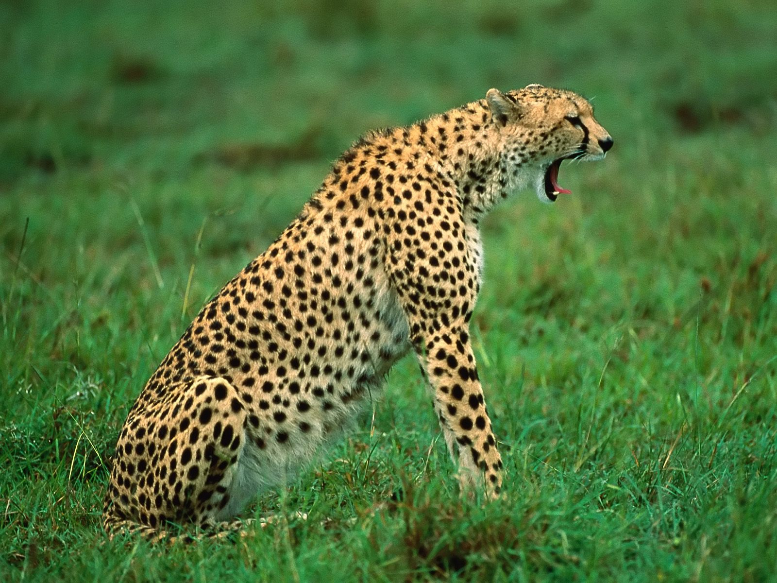
Here is the section for cheetahs :
http://commons.wikimedia.org/wiki/Category:Acinonyx_jubatus
And here is a good side view that is public domain.
Cool that you work with Gimp. darn, I'm now impressed by how many people are using it. It's an always growing community, it's so cool...
-
Hello,
I thought that I would just try your idea ludo and reply when I was done with it. However, it seems that it might be a bit longer. Just want to say that I really think your idea is worth a try, and I'm working on it. But it might be some weeks until I can show anything though...
The reason being that (except for that I need to put it aside to get a fresh perspective on it) currently, the lightning has kind of two separate function: both to lighten the texture correctly and to lighten the shape (bevels) correctly. I The problem is that when I increase the bevel it's just a bright, one-colored bevel, and when I try to adjust the lightning to fix this, the texture looks worse. It's a tough situation... :-/
I always try to wait with replying until I got something to show, but sometimes I'm just to optimistic with the time, and I end up not replying at all in a very long time...
No worries dude, take the time it needs.

You're working on Blender, right ?
-
Very good work Zentaoaki !
The general shape and texture are excellent.
Three improvements that I suggest :
-the eyes are sort of non-existent, for now it's more like a dark hole. Can you try them another way ?
-the shape of the head can be improved, it looks too flat and messy at the top. On this photo we have a good idea of the head's shape :

-The texture around the neck is blurry and less colored/contrasted than the rest. Judging by this photo, the neck looks like the rest of the fur :


===[TASK]=== WONDER: Britons: Stonehenge and White Horse
in Official tasks
Posted
Hi everybody,
As some might have noticed, I haven't given signs of life for months, and I left my White Horse incomplete...
Today I come back to apologize, and I attach here the .blend file + the model's texture (png), in order to leave it to you for completion, because I really have no more time available for 0AD, sadly...
The model is basically complete, but it needs a recut of the land shape following the area circled by stones, and the other thing is to add various grasses and a few bushes on this hill This last touch is one that I awkwardly tried but didn't managed to achieve at all.
Thanks a lot for receiving the model and fixing these last bits. If it turns out included into the game, it will be a great pleasure for me.
Again, really sorry for having left it on "stand-by" for so long.
Best luck to you all and to 0 A.D.
I'll keep following the game's developement, but indeed, I feel I won't have anymore free time to give to its making.
Mes meilleurs vœux pour la suite de l'aventure 0 A.D. !
WhiteHorse-Blend+texture.zip