Leaderboard


Popular Content
Showing content with the highest reputation on 2021-12-18 in all areas
-
https://store.steampowered.com/app/1448030/Press_Any_Button/ Free until 19.12.2021 at 7:00 PM1 point
-
Git pull the latest code from master branch. Build it on MacBook Pro. I can cheat by "jame jam" but cannot cheat by "iwanttopwnthem 50". The output is : ERROR: JavaScript error: simulation/components/Trainer.js line 229 Script value conversion check failed: v.isNumber() (got type undefined) Trainer.prototype.Item.prototype.Spawn@simulation/components/Trainer.js:229:31 Trainer.prototype.Item.prototype.Finish@simulation/components/Trainer.js:205:7 Cheat@simulation/helpers/Cheat.js:82:10 cheat@simulation/helpers/Commands.js:72:8 ProcessCommand@simulation/helpers/Commands.js:53:23 ERROR: Failed to call ProcessCommand() global script function Please fix this.1 point
-
I asked on their IRC whether they support SVN, which they confirmed as doing already. No hint about dropping support. https://wm-bot.wmcloud.org/browser/index.php?start=12%2F08%2F2021&end=12%2F15%2F2021&display=%23phorge1 point
-
It's not if you consider the only problem with git to be disk space. Whether it's on the server or on the client. It's a good comparison to show it doesn't really matter. Agreed.1 point
-
For the second link, I suppose you refer to: It seems that epriestly (the old maintainer of phab) is just posting some suggestions on what one could do. It doesn't seem to contain any evidence that svn is/will actually be dropped. Not sure what the official line is (I heard some conflicting info from @Freagarach on irc). Would be good to figure out. This is an unfair comparison. A git repo contains far less than a phabricator instance: think of all discussions, attachments of whatever kind, non-committed patches etc. The fair comparison would be to compare the size of vcs's (git, svn etc.) with size of development tools like phabricator. If anyone has some data on either of these, please add them to the thread. Not the only person asking: https://secure.phabricator.com/D8775?id=20822. Also may I add https://www.tuleap.org/integration/tuleap-gitlab-integration-why-and-how-to-use-it and https://docs.gitlab.com/ee/integration/github.html. Feel free to list similar pages for other solutions.1 point
-
https://www.epicgames.com/store/en-US/p/neon-abyss Free until 18.12.2021 at 5:00 PM1 point
-
https://www.epicgames.com/store/en-US/p/shenmue-3 Free until 17.12.2021 at 5:00 PM1 point
-
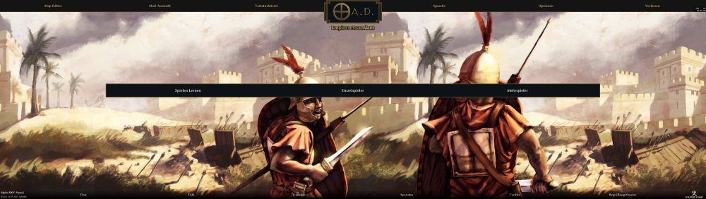
I totally agree with you. Having the menu not in the center is very uncomfortable when using a widescreen.1 point
-
As @Freagarach hinted, that's less a concern of my mod and more of the main game I only use what is already there. And yes, I think I will bring back some transparency to the main/ center menu, but I don't like the idea of moving the buttons to the side again. For one, the are the most important buttons and positioning them roughly dead center means they are the first thing you notice when looking at the screen, which highlights their importance (contrary to the buttons positioned at the edges of the screen). Also, moving them to one side would destroy the symmetry I personally find aesthetically pleasing. But yes, the reason that I made a new background is 1) that I wanted to look at something different and 2) that the old backgrounds didn't work that well with the new menu design :p Maybe I can move some stuff around in the old backgrounds to make it look better tho.1 point
-
Thanks. Good point, I only tested English for now. Will try to include that in the next iteration.1 point
-
Thanks, I will try and report back.1 point
-
https://code.wildfiregames.com/D23121 point
-
Single-player vs Multiplayer, me thinks either both should use a hyphen or neither, tho I admit I'm not that great in English. Also I agree with Freagarach that the center bar is not ideal. For your background it works somewhat but most existing ones will have important elements cut out. They are fine pieces of art and deserve better Maybe an approach like the bottom bar could work with a corresponding font or maybe just move those 3 buttons to roughly where they were in the original design. Guess they won't be any less prominent there than if they are dead center.1 point
-
Thank you. Looks nice Small fix missing translations for non-English interface in shiny: --- /dev/null +++ globalscripts/rename.js +function rename(maingamevalue, newvalue) +{ + const translate_mgv = translate(maingamevalue); + const translate_nv = translate(newvalue); + if (translate_mgv != maingamevalue && translate_nv == newvalue) + return translate_mgv; + return translate_nv; +} --- gui/pregame/ProjectInformationItems.js.orig +++ gui/pregame/ProjectInformationItems.js - "caption": translate("Translate the Game"), + "caption": rename("Translate the Game", "Translate"), --- gui/pregame/TopMenuItems.js.orig +++ gui/pregame/TopMenuItems.js - "caption": translate("Map Editor"), + "caption": rename("Scenario Editor", "Map Editor"), --- gui/pregame/CenterMenuItems.js.orig +++ gui/pregame/CenterMenuItems.js - "caption": translate("Join Private Game"), + "caption": rename("Join Game", "Join Private Game"), - "caption": translate("Host Private Game"), + "caption": rename("Host Game", "Host Private Game"),1 point
-
@maroderYou could use this version of the logo.
 1 point
 -
Thanks! yeah It took a while I am working on new images, but it's a slow process. I would like to include more e.g. the ones from DE, but the licensing of the DE ones is a bit unclear to me.1 point
-
Yeah, I agree, but the opaqueness makes it also harder to read on the very bright old backgrounds... Its a trade-off for sure. But thanks for the feedback, I will keep it in mind for the next version. The idea in the back of my head is to make the color exchangeable by the user though an graphics option (but maybe that would be over the top)1 point
-
Very nice work, @maroder! I must say that I liked the opaque play buttons (LTP, SP, MP) more than the solid ones now. It just cuts through the background too much now, IMHO. But maybe other feel differently.1 point
-
Love the refined, modernized look on version 3.1. What about having multiple background images (say a dozen or so maybe?) (especially @wowgetoffyourcellphone works) that are cycled so each time the game is run one would get a different one?1 point
-
It works, thank you.
 1 point
 -
Nice! Looks very clean.1 point
-
Yeah, this is the best draft at the moment and according to the 80/20 rule the last tweaks to make it look perfect will take me way to much time. (And I'm out of ideas) So if someone has a different nice design idea I would really like to see it, otherwise I will probably only try some smaller adjustments like @Radiotraining mentioned for the next version.1 point
-
ahahahaha he will go absolutely insane with all the feedbacks! Is not your fault, Alre.. but he already made quite a few proposals also for that shape and, at the end it's been settled with that box with those decorations.. I also think is not bad. My only comment was to make it more subtle, so reducing some 20% the dimensions and maybe the border can be a little bit thinner. I think that with those small adjustements it will fit smoothly with the rest! :)1 point
-
Yeah if you have an idea how it may look better feel free to make a draft. I made so many different versions and wasn't satisfied with any of them, so I'm open to new ideas It's ornamental for now, but the question is rather should something happen? And if yes what?1 point
-
If you click on the logo, something happens, or is it ornamental?1 point
-
getting better and better! maybe a bit out of style? respect to the logo iself I mean.1 point
-
update to 3.1 based on feedback from @wowgetoffyourcellphone @Stan` @Radiotraining [Logo background is probably still subject to further change]
 1 point
 -
yeah, I abandoned the minimal approach for this version. Still not happy with it, but I didn't find anything better. So if anyone wants to give me new ideas (preferably with a draft) I would be very interested to see that1 point
-
Uhmm a bit better thanks for trying that out! Okay, if you want a real feedback : the shape is okay, but it's still a bit too big and cumbersome in my opinion. Before it had the advantage to look more sleek and minimal with the rest. Now it really gets all the attention! i'd say that a good compromise could be a mix of both : making it look more subtle as before (smaller proportions) but i also think this rectangular shape fits better! try also with a simple rectangular without those wings. It shouldn't be "noticed", a simple shape could work just fine. It may be worth to try and see, maybe with wings can be still better though! ehehe sorry for being annoying you asked for it!! ahaha i'm kidding: do what you can. The rest is still amazing!1 point
-
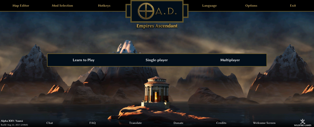
@OptimusShepard Thanks again for the report. v3.0 is out now, which should work on widescreens (hopefully) @Radiotraining @Lion.Kanzen As you can see I switched to a rectangular logo background and gave it a bit more space. I hope that looks better now
 1 point


.thumb.png.f3f47d08fd1bf1063ea4b371390681b4.png)

.thumb.png.0d87fc71cb8a644c5d862ceabac1e0d5.png)